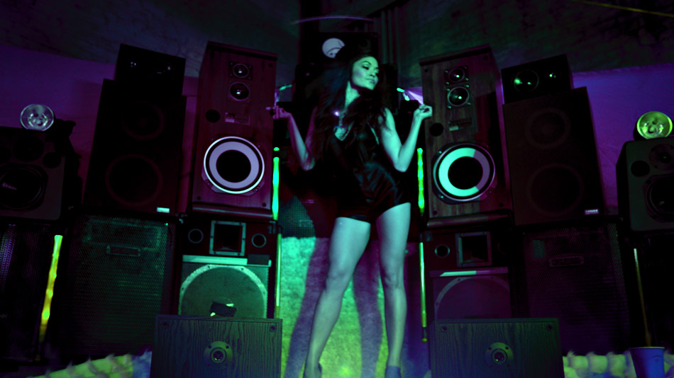
Noel Gallagher – “Dream On”
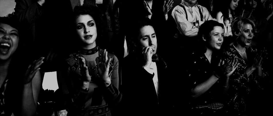
Noel Gallagher steps right into a domestic argument as the referee in “Dream On”, the fourth music video from Noel’s debut album “High Flying Birds”, directed by Mike Bruce. The noir-themed boxing match features some well-known faces, including stunt actress Zoe Bell (Kill Bill, Inglourious Basterds) running husband Troy Mittleider ragged around the ring, with Omar Doom (Inglourious Basterds) and Brent De Boer (Dandy Warhols) among the spectators.
“Dream On” is my fourth collaboration with Mike Bruce, Salvador Lleo and the rest of this talented crew. Both the black & white look and camera motivation for this music video were clearly inspired by Scorsese’s classic “Raging Bull”, but it was “The Hurricane”, shot by cinematographer extraordinaire Roger Deakins ASC, that Salvador referenced most for examples of fighting styles. As the colourist, my challenge was to capture that dynamism in the grade but at the same time retain the elegance and subtlety in the images that Salvador had captured.
Lights, Camera & Scissor Lifts
“Dream On” was shot at the Hollywood Rentals stage up in Sylmar, a place where Cinemtographer Salvador Lleo tries to take his projects to whenever possible: “They have a huge array of grip and lighting gear, and the head manager Luis Barroso always treats us really well and is very accommodating with budgets”. Amongst his lighting package were nine 6K Space Lights, rigged 20′ above the ring with full silk. These lights were then wrapped with duvetyne to create a massive soft box, with the boxing ring acting as a kind of bounce light for the actors. “There aren’t many ways to light a ring other than from above since the camera is moving all around the set”. Rounding up the lighting setup were multiple old school 1K photo floods in the background to create depth, as well as four 5Ks on the floor with large chimeras for fill.

In terms of cameras, Salvador used the Red Epic paired with Cooke S4i lenses for nearly all setups, except for the slow motion shot right at the end of the video that was captured using the Diablo CAM at 800fps. “Shooting high speed is a painfully slow process. You need a ton of light and it takes a long time to play back the results”. Both cameras were rated at 3200 Kelvin, with the Red’s ISO set to a low 320 while the Diablo was set to 500.
Along with his super mobile telescopic 9-28′ Technocrane that has replaced his regular tripod, Salvador employed a scissor lift to create an in-camera effect of the boxer floating above the ring. Initially, this was intended to be a green screen setup but instead Salvador and the crew had the boxer lean back on the edge of the lift to create the effect. Being the last shot of the day, Troy was completely exhausted. “Troy was in real pain trying to stay parallel to the lift. I don’t think he needed to do much acting…he was really suffering!” quips Salvador. Another small victory for in-camera FX!
Grading with Zones
Another technique I often use to manipulate black and white images is based around the concept of an ‘adaptive’ zone system, or breaking up an image into a number of gradations that represent exposure values. My approach is to define separate low/mid/high sections using whatever tool is available on the colour corrector of choice (I use Ranges on the Pablo). The sum of all the ‘zones’ adds up to the total exposure of the image, from the blackest to the brightest pixel. These ‘zones’ are defined according to the level of control you need in a specific area of the image, which in turn is based on the type of look you are trying to recreate. For example, if you were to create a noir-type grade, you may decide to ‘weight’ your selections 40/40/20 (lows/mids/highs), which would give you more control in the low to mid range of the image, versus a skip bleach selection (20/40/40), which would give you finer control of the highlights. This may all sound very technical, but it’s actually very intuitive, in a large part because I use a ‘hicon’ key mode to define each separate zone, as I’m doing for my noir-look in the images below. The white/grey area defines the zone, with very little range being allotted to the Highlights region.


Each zone can be manipulated using master lift, gamma and gain. In addition to the nine control points spread across the three zones (lows/lift, lows/mids, mids/gain, etc.), I also use overall lift, gamma and gain to adjust the picture as a whole, giving me a total of twelve control points for the entire image. All of this can be achieved on a single layer of colour, giving me incredible control over the image. I also find this zone process beneficial because there is a natural ‘balance’ built into the qualification process since the zones are interdependent of each other.

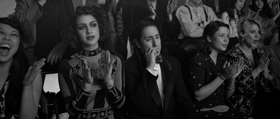
The before and after images above show how I used the zones to sculpt the images in Dream On. For the crowd shots, I created a feeling of the spectators emerging from the shadows, suppressing the lows, mids and highlights separately without relying on keys of any kind. For the actual boxing shots, I made sure that I allotted most of the zone to the mid to highlight region, which gave me finer control over the skin tones. By then pulling the gain away from the gamma I was able to get some striking contrast in the skin tones without losing all of my detail in the shadows. The overall result of using this technique is a more organic look that doesn’t feel like all that you’ve done is to desaturate the image and crank the contrast!

You can check out more before and after stills in the gallery.
Also, there is a great behind the scenes little video shot by Brent De Boer himself using his Flip camera! It can be found here. Finally, Noel talks about the experience of making the record High Flying Birds in a brilliant little documentary on Vimeo.
Justin Bieber – “Santa Claus Is Coming to Town”

Justin Bieber gets into the festive spirit with this theatrically released music video, timed to coincide with the animated feature “Arthur Christmas”. Directed by Charles Oliver and shot in a warehouse in downtown Los Angeles, the music video meshes a Steampunk version of Santa’s Grotto complete with wind-up dolls reminiscent of the classic birthday party scene in Chitty Chitty Bang Bang. This was my first time working with this creative team, and an ideal opportunity to combine my skills as both a colourist and stereo specialist.
“Santa Claus Is Coming to Town” was shot and released theatrically in stereoscopic 3D. This was Charles’ second project shot in this medium: “I was very pleased to work in 3D again. The first project I did in 3D was a year earlier – a piece for The League of Extraordinary Dancers (LXD) called MATCHED“. No doubt Charles’ work on “The LXD” and his own dance background was the reason why Scooter Braun, Justin’s manager, approached Charles with the project. “As a young kid, I was in musical theater and toured various countries as part of a performing group. From there, I started teaching dance for a few summers as a way to not have to work for my father’s construction company. I don’t think there is film musical made that I haven’t seen, especially the old ones.”
Camera, Lights & Stereo Rigs
Cinematographer Alice Brooks was the eye behind the lens, continuing her collaboration with Charles Oliver, which started with The LXD series. The cameras used were Red Epics paired with Zeiss Ultra Prime lenses, ranging from 20mm to 85mm. To a large extent the selection of camera came down to choice of stereo rig, which in this case was the Helios Rig provided by ParadiseFX. “It’s a great rig, very reliable. We only had it go down once on a two-day shoot, which is rare for 3D”, Alice recalls. The Red Epic’s small form factor also makes it the perfect choice for smaller, more lightweight stereo rigs, which is a good thing since 99% of the music video was shot on steadicam, with Nick Franco operating. Supervising the stereo onset was veteran stereographer Max Penner.
The camera was rated at 800 ISO and 5000 Kelvin, yielding an overall rusty warm palette in the original photography. “We were going for a desaturated, industrial feel, while intending to make the color red pop.” The warehouse itself was dressed in a very monochromatic way, with cold concrete floors and cinder blocks, but there was enough red in the costumes that I was able to isolate and create good colour contrast. However, the surrounding brick walls were also red, which I wanted to treat in order to bring the focus to the dancers. The lighting Alice designed helped hugely in this respect, giving the dancers good separation from the background: “We used lots of large backlights that were rigged in the ceiling and we skip-bounced all of our front light into the concrete floor. The floor was very dirty and the concrete was grey. It gave this really beautiful cool glow. We brought in smaller sources to cross-light and edge-light from time to time too.”
From RAW to Real
When it comes to ‘transferring’ RAW images into something that will give you flexibility in the timing suite, there are literally thousands of permutations. Answering some basic questions allows you to make the right choices at this critical stage. The most important variable for me is what the final deliverable will be, followed by the nature of the material itself. Regardless of whether you are going out to film or not, I always like to start with a Log-like image. In cases where the primary deliverable is a DCP vs. film (more and more these days), I rely on a small number of density curves I have built that emulate an Input LUT. The nature of the material dictates which curve I use to get the image to a good starting point.
For this music video, I used a REDlogFilm gamma curve and picked REDcolor over REDcolor2 as my colour space. REDcolor gives me a little more saturation in the ‘negative’, which is better than adding it later on with the potential of introducing noise. As usual, from here I established my base contrast and density level. Again, the choices here are endless, but generally at this stage I try to confine myself to using density and gain controls: limiting my options helps me get to where I am going faster.


The Steampunk Look
We tried various grades with Alice that we would present to Charles the next day. We generally pushed towards a much cooler palette, with varying degrees of blue. After experimenting with half a dozen looks, we settled on what we referred to as our ‘Steampunk Look’ – a cool, shadowy image with glowing highlights and red costumes bleeding through. Our coolness didn’t come in the form of a blue tint though, we simply added ‘white’ to the scene. Care was taken to ensure that the image didn’t feel ‘monochromatic’ by retaining enough colour in the image.
Neutralising the colours involved adding a ton of blue gain, as well as taking out blue points using printer lights (printer lights work in reverse as you are theoretically working on the negative). This got rid of the rusty tint, but left us with a desaturated image. From there I began sculpting, using a luminance key to select and suppress the shadows and low mid tones, which was also where the background fell. On the other end of the scale, I used a hicon key to pick off the highlights and really bloom them, adding both gain and defocus. For the red costumes and skin tones, I selected the upper range of reds (leaving out the darker red bricks) and slowly eased them back into the picture, pushing the saturation a little further. A final S-curve pulled it all together and gave the image more ‘snap’.

Every music video has challenges, especially when you add the element of stereo into the mix. However, not having the talent available until the day before the shoot presented a unique challenge, especially for a dance-based video. Charles approached the problem from a different angle: “we knew we would not be able to teach Justin any choreography before the day of the shoot. Alice and I worked with Tom (Production Designer) to create a space that could be broken up and shot in sections, each covering different parts of the song. Then I worked with Galen (Choreographer) to create both freestyle and tightly choreographed sections that would work in that space. The result gave us plenty of options when it came time to cutting the video. It’s actually not my preferred method of working – I would much rather create a fluid piece with contiguous choreography and have our lead in the center of that dance the whole time. But frankly, I was surprised to see how pleased I was with the result of this different approach.”
You can check out more before/after images by visiting the Gallery.
For more work from the creative team, please visit the respective websites of Charles Oliver and Alice Brooks.
King Fantastic – “On Q”

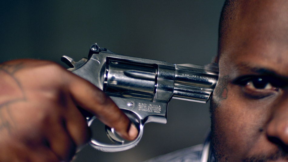
Hip-Hop Artist King Fantastic spins the loaded gun in this daring music video as seen through the eyes of director Randal Kirk II. On Q is the follow-up to “Why? Where? What?”, a video about a maid who vandalizes the home she is tasked with cleaning while dancing to King Fantastic’s song. That video got over a million hits, so the pressure was on for Randal to deliver another blockbuster. He recalls “when I started coming up with the concept, I was fond of all the gun sounds in the audio production of the track and the sexy female vocals.” Randal eventually decided on using famous alternative pin-up models, engaged in a game of Russian strip roulette. “The song glorifies the gangster lifestyle. My message in the video is that you love the lifestyle so much you that you die for it and enjoy every minute!”
On Q was shot on a Red One MX camera using Zeiss Super Speed lenses. It is a pairing that a number of DPs I have worked with prefer, as they combine the softer qualities of these older lenses with the ultra-high resolution of modern cameras. Brett Pawlak elaborates: “These days for me it really comes down to the aesthetic of lenses, how they hold flares and how they shoot wide open. That is where you really see the characteristics of the lens and get interesting looks”. That is perhaps the reason why the raw images already had a natural ‘grit’ to them.
While the Red One has become a staple of music videos and commercials due to its affordability, availability and the great images it can expose, Brett also explains that “it is a camera that I know well, and there is no question as to what it can do when pushed. It’s very good at holding saturation, and since Randal was looking for a pop look, I picked the Red as I knew that it would POP”.
Brett’s lighting package consisted of a couple of 4x Kinos, 2′ Kinos and a handful of Par Cans. “Those lights give me the most variety that I know I can work with, on a budget”. He also had some HMIs and regular tungsten units, but prefers open-faced lights over fresnels: “I’d rather start with more light since I can always diffuse and shape with flags. An open-faced 2K is close to the output of a 4K, so when you need light, on a budget, that means a whole lot!”
The Club Looks

For the Club Scene, Randal really wanted something special. He and Brett had spent some time studying a similar scene in the film “Black Swan” and concluded that those colour changes were being achieved in post – “we lit [the scene] with one solid gel colour. I decided to light the club up blood-red. It wasn’t until we transcoded the footage and Brett played with the colour and achieved a rough black light colour by pulling out the red.” This gave Randal the confidence that the look they wanted could be achieved in post. Despite this, Randal still pushed for some in-camera effects, such as placing a prism over the lens to distort the image. From there the images were treated by Chad Simcox, the editor and motion graphics artist, augmenting the camera effects with a custom filter similar to a kaleidoscope effect.
This became the starting point for the four looks I would go on to create, the most interesting of which was my ‘Neon Look’. As we started to push the colours, this ended up being Randal’s favorite look in the entire video!
I started out by setting my contrast level, with my blacks pretty rich to play against the saturated colours I was planning on creating. The second step was the interesting one, which basically added a ton of blue to the highlights and a good amount to the mid tone. This skewed the already present red towards a magenta tone, creating some interesting interactions between the original red and the added blue.

Now, with a new ‘electric’ base, I picked a broad range of reds/magentas as the inputs colours and boosted the saturation by over 300%. This made the cooler foreground stand out against the much warmer ‘background’. The next step was a technique that I use from time to time: ‘phased vignettes’. This is the name I give to a vignette which has had it’s hue (phase) rotated. I pulled the red background almost back to my manufactured blue and darkened it. An additional layer of colour boosting the saturation really made the colours pop, much to Randal’s satisfaction!
Glamorizing Violence
Randal was clear with his crew from the start: “I wanted the Russian roulette scene to feel like a room that Dexter would make, but with showy lighting to glamorize the violence.” That location ended up being a grimy dark dungeon of a warehouse in downtown Los Angeles. The desire to beautify the violence went as far as the instructions he gave to JusticeFX, the guys doing the VFX. Randal jokes “these kids are incredible. I told them I wanted realistic violence while making it sexy. That’s a hard task to do. These guys really nailed it though!”
For me, it was about creating colour tension, which is something I have written about before. I wanted the warehouse to feel cooler, so I pushed a ton of blue across the board while pulling down hard on the blacks. The saturation in the blue created an almost electric look, while the deep blacks gave the feel that the performers were coming out of the shadows.
From there onwards I treated it like a ‘beauty’ video, focussing on soft, healthy skin tones for the models, creating natural glows around the highlights in their faces and hair, while bringing out the detail in the intricate tattoos they were each adorned with. The juxtaposition between the cool environment and warm and inviting faces creates drama, which is what this music video is all about.
On Q was intended to be a viral video created to promote the brand. Because of the graphic and violent content, it would never air on TV, but Randal is not particularly concerned since he designed it to live on Vimeo. Brett broadly agrees: “If the only version that exists lives on the internet, then that is where it belongs.” This train of thought is not necessarily consigned to just music videos, as our industry shifts from a broadcast-style way of distributing content to niche-casting, delivered either by streaming platforms like Netflix or Hulu, or directly from the web itself through sites such as YouTube and Vimeo.
You can check out the final music video on Vimeo and more stunning visuals by visiting the Gallery.
For more work from the creative team, please visit their respective websites: Randal Kirk, Brett Pawlak and Chad Simcox.
