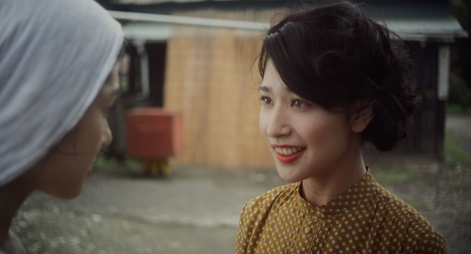
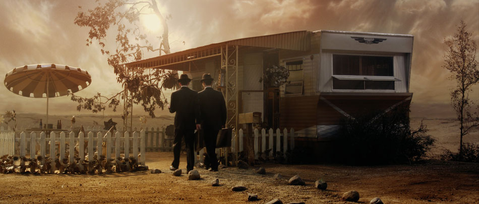
“Tsuyako”

My collaboration with Cinematographer Salvador Lleo continues with Tsuyako, a story set in postwar Japan, where a factory worker and mother must decide between duty and love, her family and freedom. The short was directed by Mitsuyo Miyazaki in her home town back in Japan.

The five and a half day shoot was a gruelling one, with 14 hours of footage for a running time of 27 minutes. Capturing that amount of footage in that short amount of time also meant that compromises had to be made, specifically with the lighting setups of each scene. Welcome to the world of Indy filmmaking!
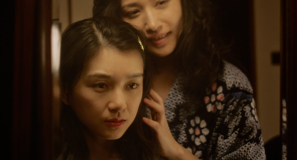
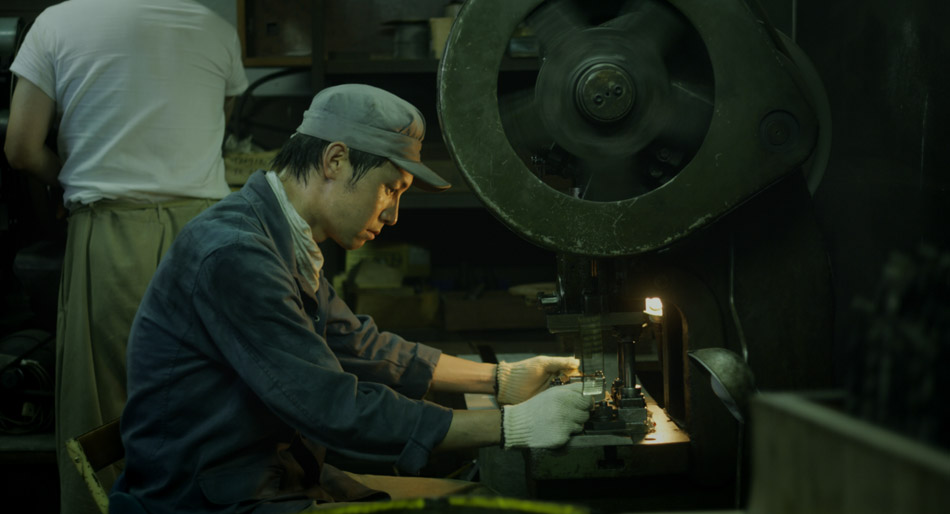
The images that Salvador has captured for Tsuyako do justice to the textures and the nuances that come from hundreds of years of aging. This is the kind of stuff that is hard to reproduce on a soundstage, and from the images below you can see why. The weathered wood, the scratched steel, the dirt and grime and hard graft are all on display. For Tsuyako, Salvador used a set of standard speed Zeiss lenses T2.1, along with his Red One camera. He felt that “the low contrast and soft quality of the glass helps to round off the ‘digital edge’ of a super high resolution digital camera such as the Red One”. And he’s right, because in the absence of film stocks, you need to make the glass work harder in order to create the images that you want. Salvador’s philosophy is that “the pairing of old and new was optimal for creating a more organic and filmic image that is in tune with the period piece”.
The factory scenes were a lot of fun to colour time, specifically because of the way that Salvador used fluorescent lighting: as a fill light to his warmer tungsten key light. The secret to working with any fluorescent source from a colour timing perspective is avoiding clipping. Although this may sound like common sense, it is even more profound when using this kind of light source, because fluorescents tend to leave a horrible green ‘residue’ around the clipped areas vs. daylight or tungsten. Keep the whites legal though and you will get some strong yellow/green seeping through the image that will add body to any industrial-type setting.
Tsuyako recently won the Future Filmmaker Award at the 2011 Palm Spring International Shortfest. You can read about the awards in the festival press release here, as well as in the Hollywood Reporter and Variety.
For more stills from the movie, visit the Gallery.
You can reach Salvador Lleo’s personal website here.
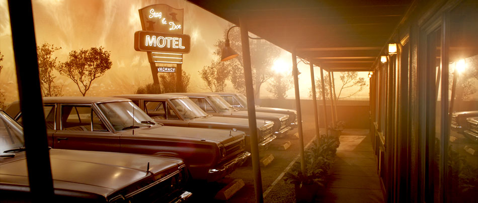
The Smell Of Success
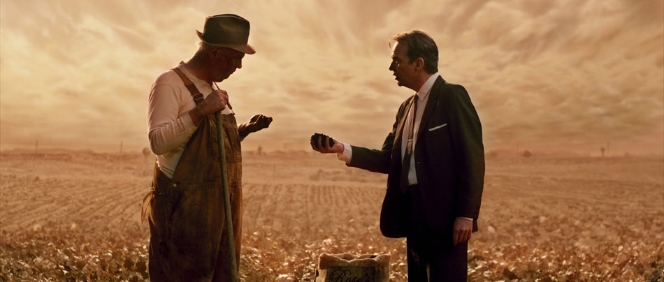
It’s hard to believe that the sweeping fields in The Smell Of Success are nothing more than soundstages at Melody Ranch Studios in Santa Clarita! Expertly lensed by David Mullen, ASC, the story is about a manure salesman in 1960s heartland America, and even though the gags are overdone at times, the images ooze quality. Pun intended ;)
Timing this movie was challenging, especially because the DP was not available during the DI. As a starting point David had sent me a handful of stills, which evoked the overall ‘feel’ of the picture. A further challenge was the fact that the movie had already gone through a lengthy preview process, which left it with a lifeless sepia look and little colour separation. This was far from the painterly look both the DP and the Production Design department had planned for.
After untangling what had already been done, I started with a clean slate. This movie was shot on the Red One camera long before the upgraded MX sensor became available, and as such before Red’s FLUT colour science offerings. I picked RedLog for my gamma curve, giving me maximum detail in the highlights. The Zeiss Ultra Primes and Angenieux zooms David used gave me crisp images with excellent definition – a good starting point.
I started by discovering what was in the image, playing mostly with contrast and density and pulling out all the nuances that I knew existed in the ‘negative’; I was right – David had captured some remarkable, ‘filmic’ images, tempering the sharpness of digital cinematography with Classic Soft Blacks and Smoque filters. Through his lighting he created a soft overhead skylight for the outdoor farm scenes, using a combination of daylight Kinos, HMI lighting balloons or Lumapanels, the effects of which can be seen in the ‘Midday’ and ‘Afternoon’ images below.
Even though the gorgeous images had a well designed earthen palette, I still felt that some subtle accents could be used to signify the different times of day.


Seeing the same colour tint over the course of an entire movie soon nulls the effect, and so to keep the eye ‘entertained’ I experimented by adding graduated pinks into the dramatic skies earlier on in the day. This combined well with the hard sunlight being simulated by the 18K HMI. I qualified the clouds and pulled back on the luminance so that I wouldn’t tint the brightest parts. I then brought the gamma down to expose a little more detail in the clouds, and offset the colour by adding a hint of orange. This created a nice transition between the horizon and the clouds.
For later on in the day, I followed the same technique but used less pink. I also wanted to make the clouds feel heavy, almost like they’re engulfing the foreground. I turned to S-curves for this, giving me contrast in the ‘body’ of the clouds while snapping the highlights and deepening the blacks. At times the clouds almost look like they’re touching the ground!
For the afternoon I replaced the pink with orange, especially in the mids and the blacks, giving the ground a sweltering and humid feel. This worked well with David’s afternoon setup – a tungsten 12-light HPL MaxiBrute to simulate the warmer sunlight late in the day. By the time we reach ‘golden hour’, the sky is on fire, with the dipping sun blasting through the trees. For this I actually composited two identical layers over each other, blew out the base layer and blurred the whites. I then used a Soft Light blending mode on the top layer, which I also keyed through to reveal the base. The blending mode provides a nice transition between the two layers.
The whole treatment is in keeping with the whimsical nature of the story, and despite the added ‘texture’, I feel remains true to the cinematography.

I also had a little fun with the ‘high-on-mushrooms’ night scene, where I played with a stylized violet-blue wash and stark contrast. I also kept the blacks a little cooler than I normally would. This is one example of where you can use saturation to really fill in an image in the absence of mid tones. Overall, the movie has a very painterly quality.
For more stills from The Smell Of Success, click here.
To see more of David Mullen’s work, check out his website.
Do It

Do It is a short directed by Steve Petersen, Co-founder and Creative Director at Big Machine Design. This was Steve’s first foray into the medium of filmmaking, and an attempt to prove that he could tell a story in a format longer than the 30 second TV spots he has mastered over the years.

The story is about Bernie, a tormented pharmacy clerk who has delusions of putting society right by killing the current ineffective mayor and replacing him with another. Tormented by his demons and his inability to act, Bernie’s’ vivid fantasies get him into trouble more than once, and prove to him that ultimately the only way to fix the problem is to come up with a plan and just Do It!
Contrasting Looks
Coming from the graphic design world, Steve is a very visual director, and for Do It he incorporated many graphic elements into his movie: graffiti splattering across the walls as Bernie wanders the streets at night, depicting his inner thoughts, as well as hand drawn title cards that break up each act. Steve also wanted this ‘superhero comic style’ to be present in all the live action sequences. For example, Bernie tries to overcome his loneliness and low self-esteem by fantasizing about being superhuman. In this altered state he becomes the hero, beating up the bad guys and saving the day. When he comes down from his ‘high’, we are back in his dreary world. Steve wanted to match the framing and the pace of each scene with recognisable colour cues to signify the state Bernie was in, augmenting the intense graphical style.
The challenge was to balance the intense look Steve wanted with some ‘breather’ scenes that would give the audience time to reset their eyes! If everything is super intense all the time, the effect quickly wears off. Luckily, the story provided opportunities for a more mellow palette in some scenes, particularly the ones where Bernie is going about his drab and mediocre life.
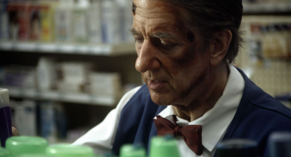
For all the pharmacy scenes, I decided to use a muted and cooler palette. I started off by balancing out the blacks and highlights, and then dialing down the saturation by 20%, which is a substantial amount on a well exposed image. I also added a slight blue tint to the mid tones. This gave me a good base and starting point.
All the bottles on the shelves and Bernie’s blue uniform still felt very vivid, so I qualified both the blues and greens and brought those down separately. I left the reds where they were because I didn’t want to desaturate the skin tones further.
To give the image a little bit of ‘snap’, I used a luminance key to select the highlights and then brought up the gain, which added contrast to Bernie’s face. I also let the highlights burn off a little, pulling the eye further away from Bernie’s blue uniform that still felt a little pronounced. Bringing the saturation down further would have made it look monochromatic.
Heightened Reality
For the images below, which I fondly referred to as the ‘Abbey Road’ setup, I started off by stretching the image to the point where my brightest areas (car on the right) were clipping. When I’m going for a high contrast look, I usually try to either crush the blacks or blow out the highlights, rarely doing both. This avoids the much dreaded ‘video look’. I then warmed up the highlights, knowing that I’d get red ‘contamination’ in the sky, but I would take care of that later on. For my blacks I went more towards green; the combination of red highlights and green blacks pushes orange into the mid tones, picking up the warmth in the buildings and the tarmac.
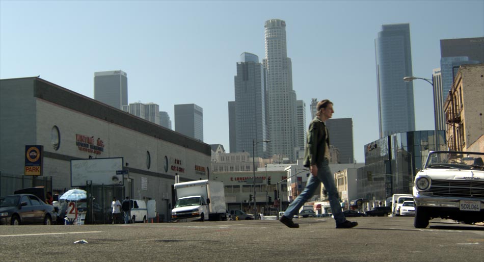

Then I treated all the primaries separately, blasting saturation in the blues and to a lesser extent the greens, while reducing the saturation in a narrow band of reds. This gave me rich red highlights from my base correction, without the excessive tint in the skin tones. I then burned off the corners with a strong vignette, while qualifying the sky inside of the shape and boosting the gain a little. This created a halo effect coming from behind the skyscrapers in the background. I also then took out the red I had introduced in my base correction.
Finally I did an overall grade, pulling the highlights and mid tones towards a cooler palette, and again boosting overall saturation. I almost always do a grade on top of all my other corrections, largely because this has the effect of rolling all the colours into one unified look.
You can visit the Do It gallery by using the following link.
