37 Seconds

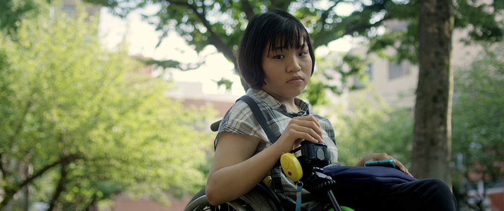
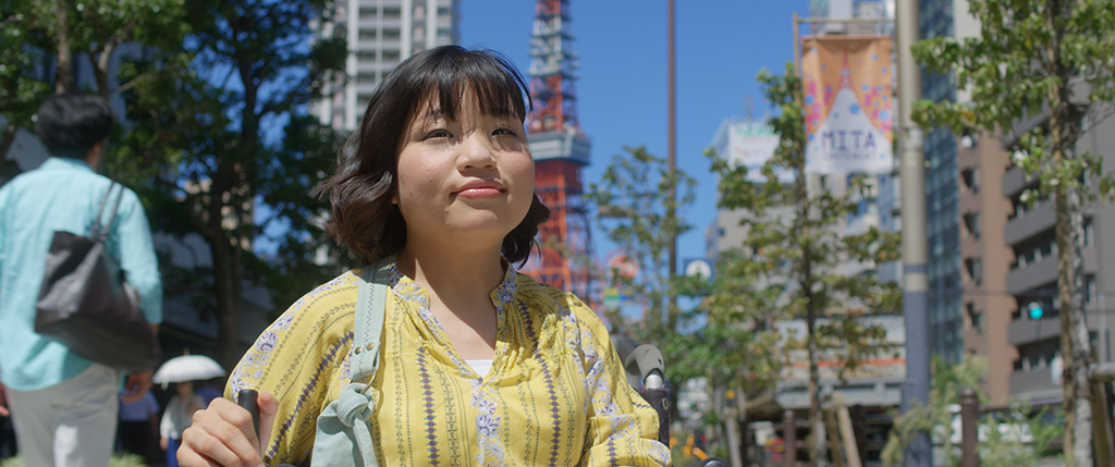
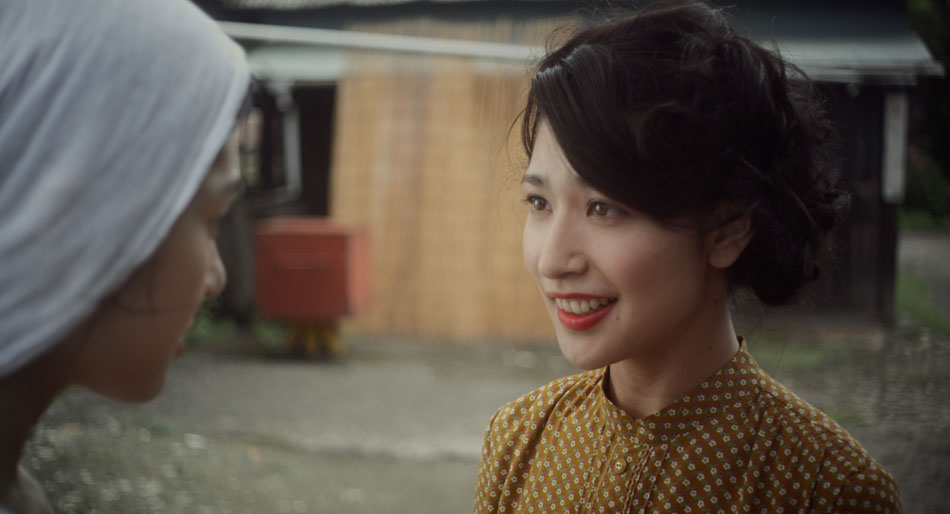
In the context of time, 37 seconds isn’t much, but for Yuma Takada, it’s the difference between living a normal life, versus the one she leads as a person suffering from cerebral palsy. This coming of age movie tells the story of an aspiring, disabled manga artist as she struggles to overcome an overbearing mother, a devious and capricious friend, and the sad memories of a childhood without a father, on her way to achieving her artistic dream and finding her freedom.

The eponymous movie is director Hikari’s first feature film, and packs considerable emotional punch. A little background; Hikari and I have worked together for the better part of a decade. Back in 2012 I graded Tsuyako, her award-winning short film, and in 2013 A Better Tomorrow, which premiered at Cannes later that year. I’ve always loved Hikari’s passion and her desire to tell difficult, gut-wrenching stories. With 37 Seconds beautifully photographed on location in Japan and Thailand, I couldn’t wait to get stuck into the visuals, but first I needed to understand Hikari’s vision and the motivations of Yuma as she navigates a world of adult comics, drag queens and a raging intergalactic war!
From script to casting and back again
Hikari’s bold decision to cast Mei Kayama, a young actress with cerebral palsy, in the lead role is perhaps serendipitous in hindsight, as she adds a dimension to Yuma that perhaps is only possible with an actress who struggles with each movement, every take. “Mei rides an electronic wheelchair, which makes blocking quite challenging. Since she was a first-time actress, we planned for 45 shooting days which was 10 days more than what we would normally schedule”, Hikari recalls.
What is even bolder is her decision to change course as a result of casting Mei: “The script was originally about a young woman who was paralyzed but once I auditioned Mei – who has cerebral palsy but not paralyzed (as the script called for) – I changed the story to fit her physicality.” It’s this appetite for risk-taking, as well as a willingness to adjust to new opportunities as they present themselves, that is a hallmark of a successful Indie filmmaker.
Moving with the flow
37 Seconds was produced in association with NHK, Japan’s national broadcaster. In a world where 4K TV inches closer to becoming the norm, and with NHK historically being a technology trailblazer, certain requests were made to the filmmakers. Stephen Blahut, the cinematographer, explains how this affected his choice of camera: “The film had certain obligations that meant we had to plan for a 16:9 aspect ratio and 4K deliverable.” Thankfully the movie was shot in 2018, where you could have had your pick of any number of 4K+ cameras. For his A Camera, Stephen went with the Red Dragon, a 6K camera, and a set of Cooke S4 lenses, as well as 100mm Zeiss macro lens for detail shots.
It’s primarily with this setup that the filmmakers achieved one of the most standout features of 37 Seconds, the striking photography. It is both static and dynamic, dramatic yet sensitive. Stephen elaborates: “Hikari and I discussed this early on. At the start we wanted to distance the audience from Yuma, establishing them as sort of voyeurs. (We) kept the camera back and chose to have longer takes with locked off frames. I find this method encourages the audience to actively engage and think about what is going on in the frame, rather than swiftly moving past the image. It’s strenuous and rewarding at the same”.
“As the film progresses we desired to push into Yuma’s interior space and introduced dynamic elements to the shot structure. As far as striking a balance is concerned, this came through in-depth conversation between Hikari, who is also a cinematographer, and myself. We spoke at length about the relationship from scene to scene and what we were building to.”
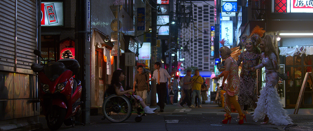
The primary setup worked great for the majority of the movie, but there were certain scenes were the camera and the crew needed to be inconspicuous. Stephen explains: “One particular series of shots chronicles Yuma moving through the infamous Kabukichō red-light district in Tokyo. Given the nature of the environment it was essential to air on the side of caution. With a background in street photography, I traveled to the district to get a sense of the space. Hikari and I scouted the location, establishing both angles and a path for the lead actress to travel so we could be as efficient as possible on the day of the shoot. We paired down the personnel to a skeleton crew of myself, the director, and a few other team members that would hold at a distance. We opted for a Sony AS7ii paired with a DJI Ronin S Gimbal. The small package made us look like a documentary or maybe even made me look like a tourist. We were in and out in under an hour!”
A Look For All Seasons
Part of securing financing for any movie is the ‘package’ put together for potential investors. This typically includes the logline and memorable sound bites, as well as brief biographies of key cast and crew. What always stand out though are the glitzy pictures used to convey the overall ‘feel’ of the movie. In the case of 37 Seconds, both Hikari and Stephen collaborated on these pictures, their efforts culminating in a Look Book. “It was a great project for me to work on because I became acquainted with (Hikari’s) intentions, and an invaluable document in my opinion for the director, the colourist, and cinematographer. It can really establish a clear touch point for the film”, Stephen reasons.
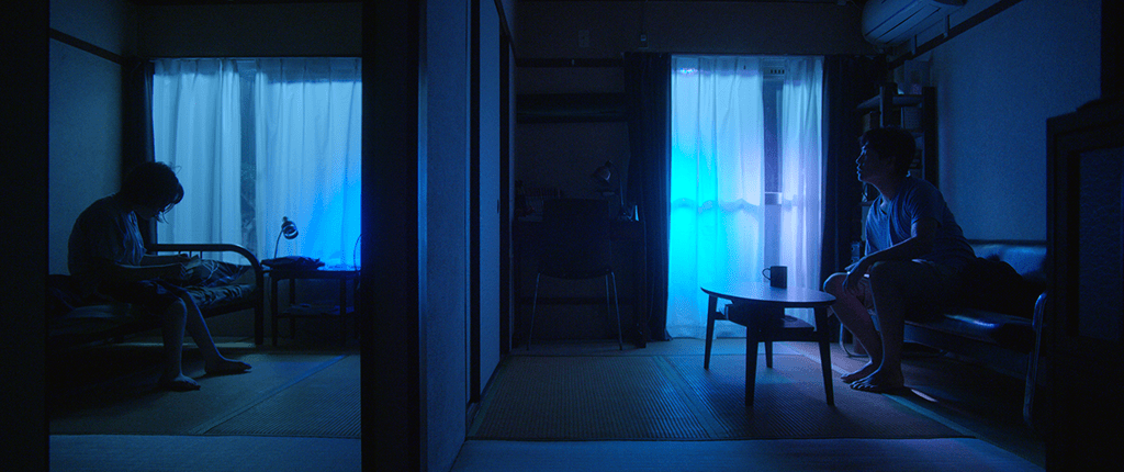
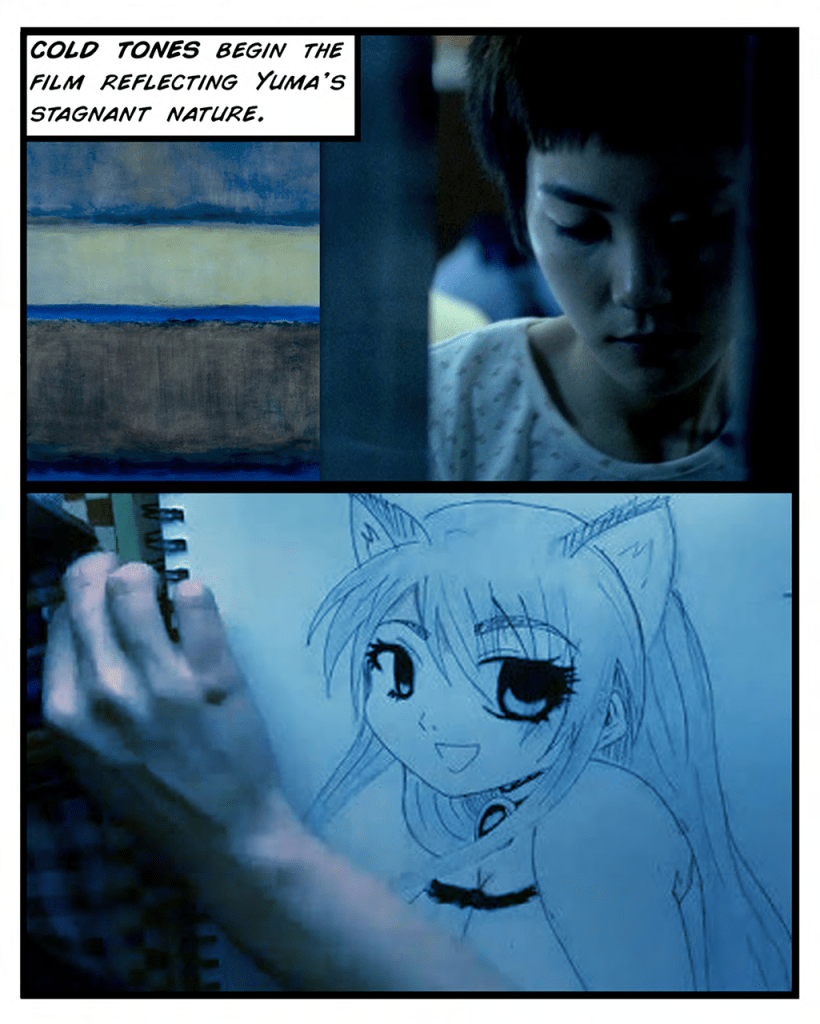
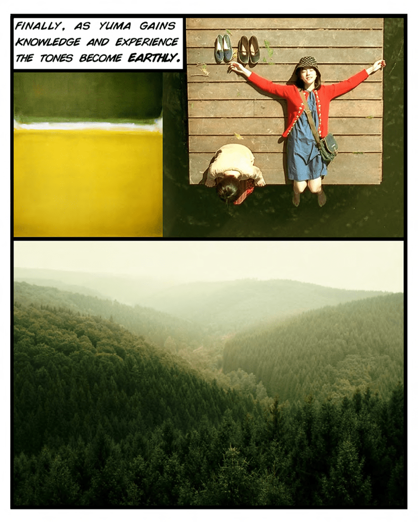
Early on, Hikari envisioned her movie going through three different Looks, or phases: cold Tokyo, representing Yuma’s stagnant situation; passion scenes, which included Yuma discovering Tokyo’s night scene and her experience at the Love Hotel, and earthy tones, as Yuma grows as a person through knowledge and experience. Each look would reinforce Yuma’s journey and state of mind.

Before a single frame was shot, Hikari, Stephen and myself brainstormed these ideas over a Skype call between Tokyo and LA. There were the different sections of the movie, which needed to flow in and out of each other organically, as well as specific scenes such as the Love Hotel, which would be bathed in a strong magenta light. That intensity would be pushing up against the primary camera’s colour gamut, I observed at the time.
With these ideas in mind, I was sent some early test footage to create various Looks. These included interiors under both daylight and night time conditions (tungsten and fluorescent), as well as a few shots lit to simulate the aforementioned love hotel setup. I banked these Looks and refined them over time leading up to the DI of the movie.
From Look Book to Reality
From a colourist’s perspective, a Look Book provides some guidelines. While few movies fit into neat, pre-defined sections like this, it does inform you as to how to treat certain scenes, certain situations. At the same time, the movie and the protagonist are complex. Their emotions go on a roller coaster ride and take us, the audience, with them. Stephen agrees: “We wanted to keep the look book in mind when shooting the film but felt no obligation to adhere to the system we created. It really became more of guideline in the end”.

With ideas swirling, I thought about the stylized look of manga characters, with accentuated, inky lines and strong contrast, not dissimilar to a Japanese person’s slick black hair against skin that is typically paler. Getting that contrast right is tricky; traditional ‘linear’ controls such as lift, gamma and gain can easily lob off shadows and dock highlights on their way to adding contrast, and an S-Curve can stretch out the mid tone, leaving it ‘thin’. Therefore, I turned to Soft Light. This blend mode is based on the relationship of shadows and highlights to 50% grey; anything lighter than mid grey gets brighter and anything darker gets heavier. By starting off with ‘gentle contrast’ in each scene, I could use a Soft Light and opacity to control the ‘inkiness’ of the shadows, giving me progressive contrast and snappier highlights. Then if I needed a shot to be brighter or darker, I simply used overall gamma to bounce the mid tone up or down, without affecting the black/white anchor points or relative contrast. This proved crucial as we continued to refine the tone of the film; “Mei had much more of an innocent look than I anticipated, and her disability was very different than what it was in the original script, so we went more towards a brighter tone”, Hikari recalls.
To complement my blending mode approach, I decided on a ‘bias-based’ technique for the colour treatment. This forgoes the ‘typical’ clean whites/blacks approach, which all too often can suck the life out of a picture, stepping over the subtle differences of shadows tinting one way while the highlights sway in another direction. By choosing to bias the colour of the image, you respect the original photography, yet augment it with the style that is required.

For this I turned to Curves. For the majority of Tokyo scenes, I used the Blue/Cyan curves, particularly the -> Saturation and -> Density curves to gives those colours extra depth. These adjustments bend the image towards colder tones, without the coolness riding roughshod over the warmer colours, which is so important for healthy looking skin tones. Similarly, for Thailand, I used the Green/Yellow curves to capture the beauty of the jungle and the stickiness of the humidity, again keeping the other warm colours at a baseline that made sense.
By using this bias based approach to grading the movie, we were able to control how much ‘Thailand’ we wanted, or how much ‘Tokyo’. For example, when Yuma returns home in the end, Stephen wanted her to bring back a bit of Thailand with her, to signify the warmth she was bringing back to her mother. I simply used my Thailand grade and picked 50% opacity, and now we had a subdued warmth as we combined the original Tokyo look with some ‘heat’ from Thailand.
Challenging conventions
Forcing a scene that is warm earlier in a movie to a colder tone later on is something we see repeatedly, and many times it looks fake and forced. This technique is often used to enforce the emotional state of the characters, or to express the overall mood of the scene. However, in the scene where the mother confronts Yuma after going through her possessions, the tsuchikabe walls in Yuma’s house can’t suddenly turn blue because she’s having a confrontation with her mother. Did someone swap out the light bulbs?!

So I went with the photography of the scene, which was more naturally lit but also had a strong key light. I increased the gain significantly, while dropping the mid tones deeper, which has the effect of thrusting the characters into the limelight. Then I pushed some very strong vignettes, rotating them from shot to shot to make sure they weren’t hiding any faces. The vignettes serve to separate the characters from the background, and to heighten the conflict between them.
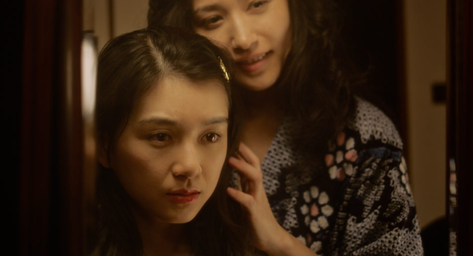
For the Love Hotel, we can see a clear thread between the Look Book, the early tests we did, and the final result we ended up with. The strong magenta is a bold choice, and a welcome one. The colour has become anathema in grading circles, and in my mind that is a problem, as this gorgeous colour can represent passion just like the colour red, but at the same time adds overtones of sleaze and ambiguity. The magenta that bathes the Love Hotel is a culmination of the use of that colour, as we build up to it from the point where Yuma begins to discover the Tokyo night life. From the scene where Yuma encounters the drag queens, to her detour into the famous Kabukichō red-light district, Hikari and I had a few arm wrestles over how much magenta we should ‘creep in’, but in the end we both felt that its use made the picture richer and more layered.
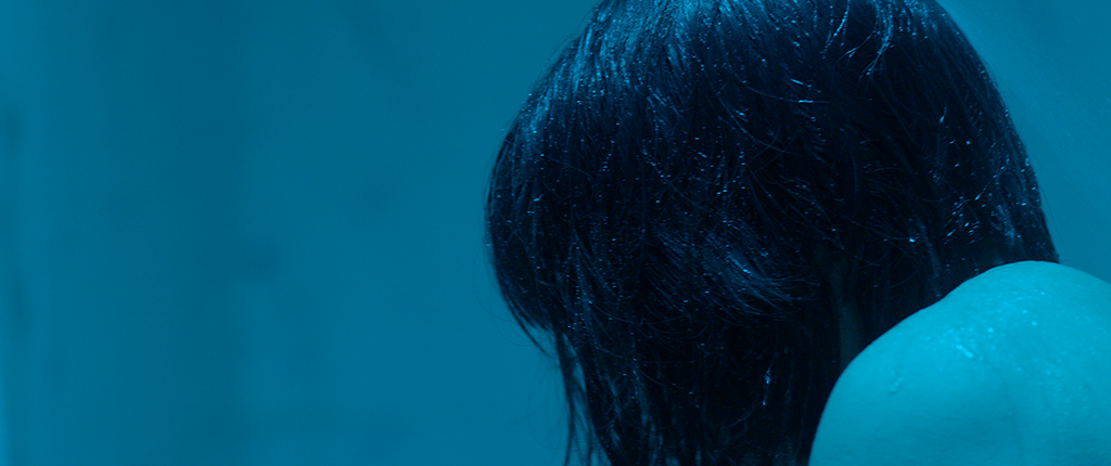
In a final ‘twist’ to our magenta journey, we swing wildly to a sea of cyan as Yuma washes her shame in the bathroom. The saturation of the cyan against the Soft Light, dense black deliver the punch and conclusion to this episode of Yuma’s self-discovery.
Distance? What distance!
With the movie having such an unconventional plot, it should come as no surprise that the DI was anything but conventional. With the director, DP and colourist all located in different parts of the world, we needed a way to communicate our ideas and address notes over a robust feedback channel, regardless of time zone. Enter Frame.io, a leader in the world of cloud-based video review and collaboration.
From the very first Skype call I had with both the director and DP, to the remote review sessions, to the exchange of media through Frame.io, this is a project that could not have been executed using the ‘traditional’ way. As a big fan of the service, I’d used Frame.io on countless smaller projects (shorts, music videos), but never on a feature. A 4K feature, and one that would require regular uploads, deliveries to and from multiple vendors, and a paper trail for every step of the way. So we rolled up our sleeves and took the plunge.
On studio pictures, remote services between your creative team members is not a big deal, and that’s because the client pays a pretty penny to have those services available to them. But what about the independent filmmaker, who often has similar demands, but pockets that are more holey than deep? That’s where services like Frame.io enter the picture. Hikari recalls the transition to working this way: “At first it was challenging because of the time difference. But then it became so much easier because of the ease-of-use of Frame.io; I was able to review all the reels as they progressed through colour, share my thoughts down to the specific section of the image, and receive feedback from Milton, our colourist. Being able to work interactively this way meant that I could still work closely with Milton, even though I was in Japan, which was wonderful!”
Our utilization of Frame.io didn’t end with remote reviews. After delivering VFX pulls to multiple vendors through Frame.io, and realizing that it made the process so much more efficient, we moved more and more of our day-to-day activities to Frame.io; VFX deliveries back to us (versus hard drives), reel turnovers, complete with Avid Bins, media and offlines, and communication between team members all benefitted from the process. We reviewed entire reels. Created manifests out of CSV exports. We came 90% close to approving the final movie, all while achieving phenomenal transfer speeds. We became so comfortable with the process that uploading hundreds of gigabytes of data a day became common practice.
The strength of a service like Frame.io is not merely the wonderfully thought out and crafted tools that the company offers, or even the open Application Programming Interface (API) that allows you to customize the service to your heart’s content. The opportunity comes in the risk that it encourages the filmmaker to take, to replace ‘traditional’ processes with disruptive ones, which streamline the moviemaking process as a whole. For that we thank the hard working NY-based team at Frame.io.
Remember to smile!
Just like Hikari’s decision to take a gamble on Mei, and change the script to reflect her reality, Hikari’s message is bold yet nuanced: “Don’t hold back. Allow experiences to happen, because you never know what doors they may open. And remember to have fun with it all”. I don’t know any filmmaker worth their salt who would disagree with that statement!
37 Seconds Premiered at the 69th Berlin Film Festival to critical acclaim. It won both the Audience Award as well as the CICAE Art Cinema Award under the prestigious Panorama section. It is also an official selection at the Toronto International Film Festival 2019. The movie was produced by knockonwood, Inc. Films Boutique has picked up sales and Netflix is the worldwide distributor.
You can check out the trailer on YouTube, as well as follow the journey on Instagram. For more stills from the movie, make your way over to the 37 Seconds Gallery.
All images courtesy of Knockonwood Inc.
Dragonslayer

The award-winning ‘Dragonslayer’ tells the story of ‘Screech’, a lost kid falling in love in the suburbs of Fullerton, California. “[Dragonslayer] is a portrait of a new generation of kids from the rotting suburbs of inland California, and a celebration of what makes them so unique” comments Tristan Patterson, the director of the documentary.
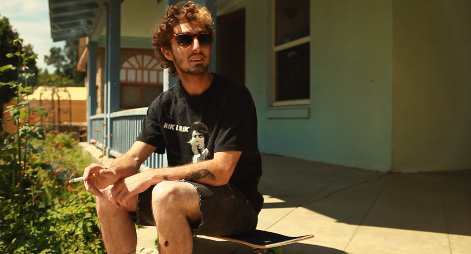
Dragonslayer was lensed by Eric Koretz, and was my second collaboration with this Cinematographer. The documentary was filmed off and on over the course of a year and a half.
Most times documentaries can pose a challenge for a colourist; the very nature of these narratives usually leads to compromised images, hastily filmed in order to ‘capture the moment’. However, I found that with Dragonslayer, this wasn’t your typical documentary!

Eric used the Canon 5D Mk2 as his primary camera outfitted with a variety of lenses: the Canon L series 24-70 and 70-200 zoom lenses, a must in the run and gun world of docs, as well as an 85 T1.2 for all the low light night stuff. When time permitted, a set of Zeiss ZF 21, 35, 50 and 100 lenses were used. The superior sharpness and optical quality offset the inconvenience of using the primes.
Dragonslayer differs from many other skateboarder movies I’ve seen in that it is shot with a more filmic aesthetic, both in terms of the framing and the pace; crazy wide-angle lenses and crash zooms are out, replaced with a more sensitive approach that feels fresh and less pretentious. The colour choices reflect this, and I worked hard to bring out what was already there, striking a balance between the rawness of the ‘negative’ whilst striving for cohesiveness and uniformity. For a colourist there is something very satisfying about the fact that the audience will never see what the ‘befores and afters’ looked like!
Happy Accidents
The filmmakers also gave Screech a Kodak Zi8 to record his own stunts with. The camera is capable of capturing HD @ 720p, but in one of the those ‘fortunate’ accident moments, Screech flipped the switch to record standard definition!
Instead of fighting the ‘compromised’ images or trying to find a way to ‘fix’ them, I accentuated them further by pumping a lot of saturation in the blues and greens while keeping the skin tones ‘healthy’. One thing I didn’t want to do was stretch the contrast like crazy in order to bury the noise. Instead, I floated the blacks a little and pushed in some grain to hide some of the more offensive noise. The vibrant look goes with Screech’s ‘elevated’ state as he skateboards his way through life. And let’s just say that the use of recreational drugs are rampant in this movie!


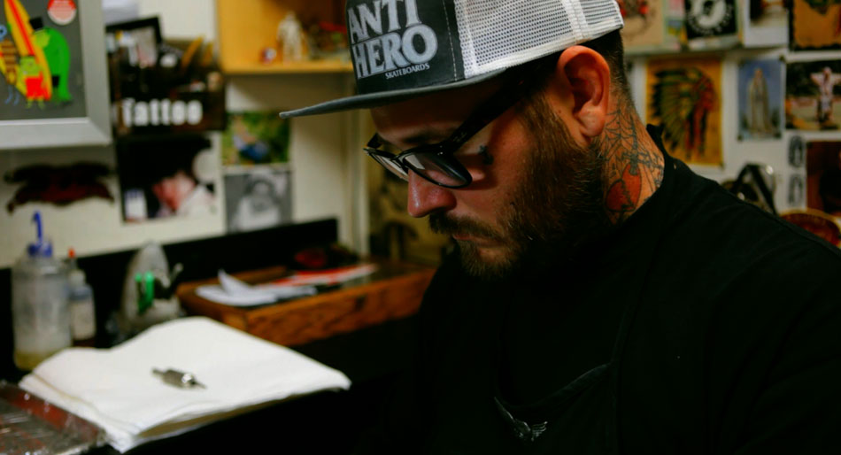
Tattoo Parlour
Another scene we had a little fun with was the Tattoo Parlour. We really wanted to accentuate the intricate tattoos on display, as well as the vibrant colours bouncing off the walls and the posters. Compared with the natural and softer palette of the rest of the documentary, we wanted this to feel more grungy, more raw. I achieved this by pushing a good amount of cyan in the blacks, and offsetting the coolness with yellow in the mid tones. I then punched the oranges and the reds but protected the skin tones so that they wouldn’t go nuclear! Saturation can be a powerful tool for storytelling, but you need to know where to use it; without being selective you can end up with an image that looks like it’s made of candy!
‘Dragonslayer’ has been an award magnet ever since it hit the festival scene. It recently won the Best International Documentary at the hotDOCS Canadian International Documentary Festival. That’s in addition to the two awards it won at SXSW – Grand Jury Prize For Documentary Feature and Best Cinematography.
To watch the trailer visit the official website here. The filmmakers also have a Facebook page for the movie. Also for more stills from the movie check out the Gallery.
To stay up to date with Eric Koretz’s latest work, visit his website.
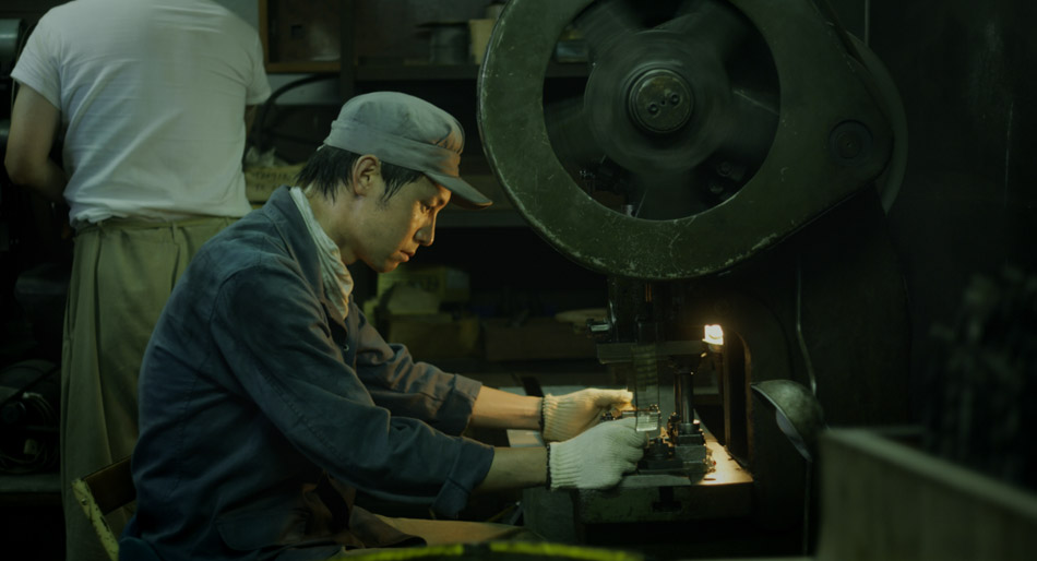
“Tsuyako”

My collaboration with Cinematographer Salvador Lleo continues with Tsuyako, a story set in postwar Japan, where a factory worker and mother must decide between duty and love, her family and freedom. The short was directed by Mitsuyo Miyazaki in her home town back in Japan.

The five and a half day shoot was a gruelling one, with 14 hours of footage for a running time of 27 minutes. Capturing that amount of footage in that short amount of time also meant that compromises had to be made, specifically with the lighting setups of each scene. Welcome to the world of Indy filmmaking!
The images that Salvador has captured for Tsuyako do justice to the textures and the nuances that come from hundreds of years of aging. This is the kind of stuff that is hard to reproduce on a soundstage, and from the images below you can see why. The weathered wood, the scratched steel, the dirt and grime and hard graft are all on display. For Tsuyako, Salvador used a set of standard speed Zeiss lenses T2.1, along with his Red One camera. He felt that “the low contrast and soft quality of the glass helps to round off the ‘digital edge’ of a super high resolution digital camera such as the Red One”. And he’s right, because in the absence of film stocks, you need to make the glass work harder in order to create the images that you want. Salvador’s philosophy is that “the pairing of old and new was optimal for creating a more organic and filmic image that is in tune with the period piece”.
The factory scenes were a lot of fun to colour time, specifically because of the way that Salvador used fluorescent lighting: as a fill light to his warmer tungsten key light. The secret to working with any fluorescent source from a colour timing perspective is avoiding clipping. Although this may sound like common sense, it is even more profound when using this kind of light source, because fluorescents tend to leave a horrible green ‘residue’ around the clipped areas vs. daylight or tungsten. Keep the whites legal though and you will get some strong yellow/green seeping through the image that will add body to any industrial-type setting.
Tsuyako recently won the Future Filmmaker Award at the 2011 Palm Spring International Shortfest. You can read about the awards in the festival press release here, as well as in the Hollywood Reporter and Variety.
For more stills from the movie, visit the Gallery.
You can reach Salvador Lleo’s personal website here.
