37 Seconds

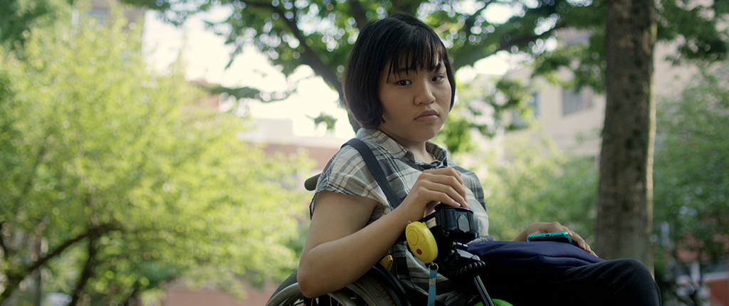
In the context of time, 37 seconds isn’t much, but for Yuma Takada, it’s the difference between living a normal life, versus the one she leads as a person suffering from cerebral palsy. This coming of age movie tells the story of an aspiring, disabled manga artist as she struggles to overcome an overbearing mother, a devious and capricious friend, and the sad memories of a childhood without a father, on her way to achieving her artistic dream and finding her freedom.

The eponymous movie is director Hikari’s first feature film, and packs considerable emotional punch. A little background; Hikari and I have worked together for the better part of a decade. Back in 2012 I graded Tsuyako, her award-winning short film, and in 2013 A Better Tomorrow, which premiered at Cannes later that year. I’ve always loved Hikari’s passion and her desire to tell difficult, gut-wrenching stories. With 37 Seconds beautifully photographed on location in Japan and Thailand, I couldn’t wait to get stuck into the visuals, but first I needed to understand Hikari’s vision and the motivations of Yuma as she navigates a world of adult comics, drag queens and a raging intergalactic war!
From script to casting and back again
Hikari’s bold decision to cast Mei Kayama, a young actress with cerebral palsy, in the lead role is perhaps serendipitous in hindsight, as she adds a dimension to Yuma that perhaps is only possible with an actress who struggles with each movement, every take. “Mei rides an electronic wheelchair, which makes blocking quite challenging. Since she was a first-time actress, we planned for 45 shooting days which was 10 days more than what we would normally schedule”, Hikari recalls.
What is even bolder is her decision to change course as a result of casting Mei: “The script was originally about a young woman who was paralyzed but once I auditioned Mei – who has cerebral palsy but not paralyzed (as the script called for) – I changed the story to fit her physicality.” It’s this appetite for risk-taking, as well as a willingness to adjust to new opportunities as they present themselves, that is a hallmark of a successful Indie filmmaker.
Moving with the flow
37 Seconds was produced in association with NHK, Japan’s national broadcaster. In a world where 4K TV inches closer to becoming the norm, and with NHK historically being a technology trailblazer, certain requests were made to the filmmakers. Stephen Blahut, the cinematographer, explains how this affected his choice of camera: “The film had certain obligations that meant we had to plan for a 16:9 aspect ratio and 4K deliverable.” Thankfully the movie was shot in 2018, where you could have had your pick of any number of 4K+ cameras. For his A Camera, Stephen went with the Red Dragon, a 6K camera, and a set of Cooke S4 lenses, as well as 100mm Zeiss macro lens for detail shots.
It’s primarily with this setup that the filmmakers achieved one of the most standout features of 37 Seconds, the striking photography. It is both static and dynamic, dramatic yet sensitive. Stephen elaborates: “Hikari and I discussed this early on. At the start we wanted to distance the audience from Yuma, establishing them as sort of voyeurs. (We) kept the camera back and chose to have longer takes with locked off frames. I find this method encourages the audience to actively engage and think about what is going on in the frame, rather than swiftly moving past the image. It’s strenuous and rewarding at the same”.
“As the film progresses we desired to push into Yuma’s interior space and introduced dynamic elements to the shot structure. As far as striking a balance is concerned, this came through in-depth conversation between Hikari, who is also a cinematographer, and myself. We spoke at length about the relationship from scene to scene and what we were building to.”
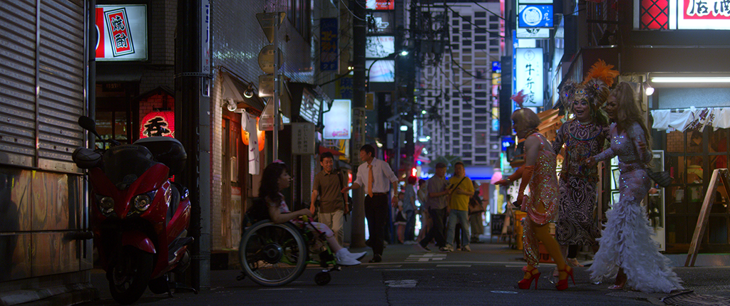
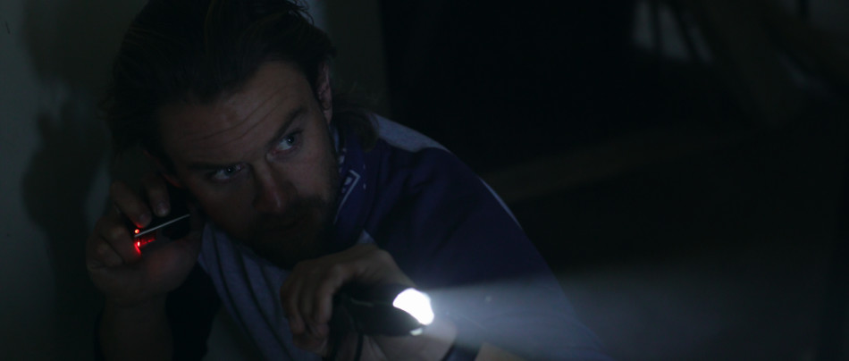
The primary setup worked great for the majority of the movie, but there were certain scenes were the camera and the crew needed to be inconspicuous. Stephen explains: “One particular series of shots chronicles Yuma moving through the infamous Kabukichō red-light district in Tokyo. Given the nature of the environment it was essential to air on the side of caution. With a background in street photography, I traveled to the district to get a sense of the space. Hikari and I scouted the location, establishing both angles and a path for the lead actress to travel so we could be as efficient as possible on the day of the shoot. We paired down the personnel to a skeleton crew of myself, the director, and a few other team members that would hold at a distance. We opted for a Sony AS7ii paired with a DJI Ronin S Gimbal. The small package made us look like a documentary or maybe even made me look like a tourist. We were in and out in under an hour!”
A Look For All Seasons
Part of securing financing for any movie is the ‘package’ put together for potential investors. This typically includes the logline and memorable sound bites, as well as brief biographies of key cast and crew. What always stand out though are the glitzy pictures used to convey the overall ‘feel’ of the movie. In the case of 37 Seconds, both Hikari and Stephen collaborated on these pictures, their efforts culminating in a Look Book. “It was a great project for me to work on because I became acquainted with (Hikari’s) intentions, and an invaluable document in my opinion for the director, the colourist, and cinematographer. It can really establish a clear touch point for the film”, Stephen reasons.
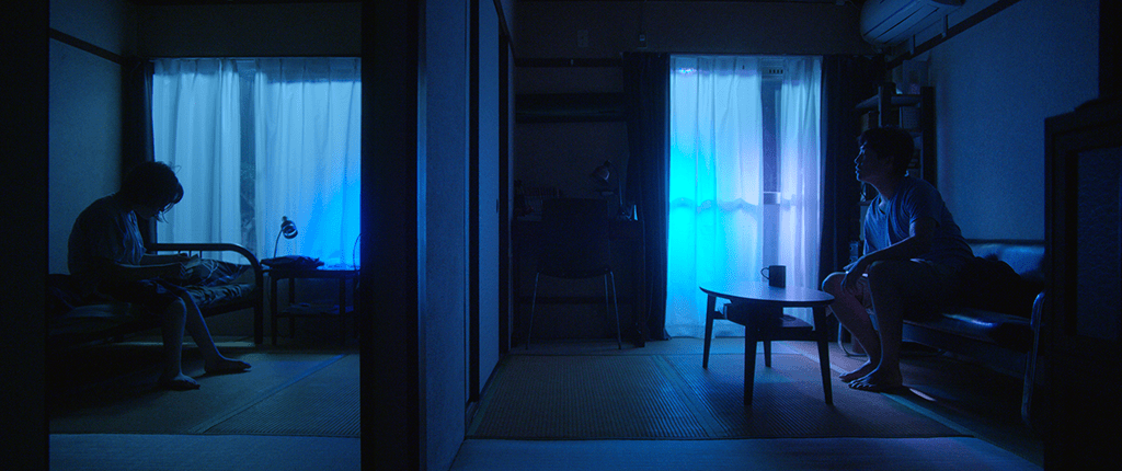
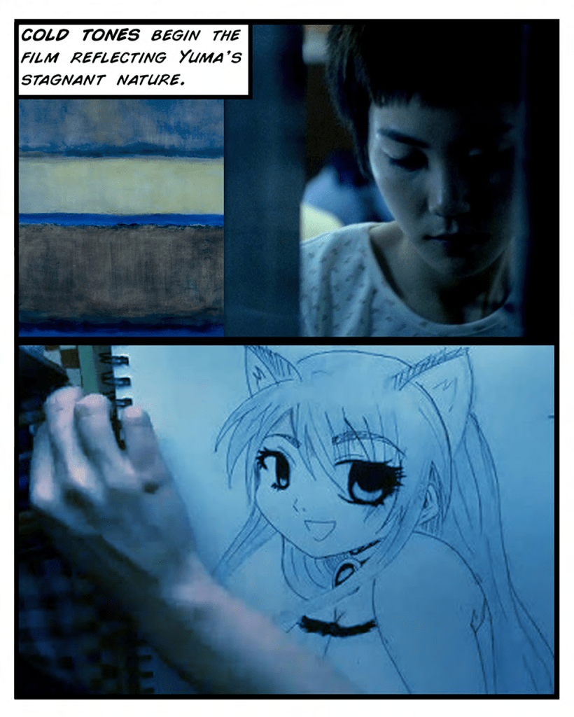
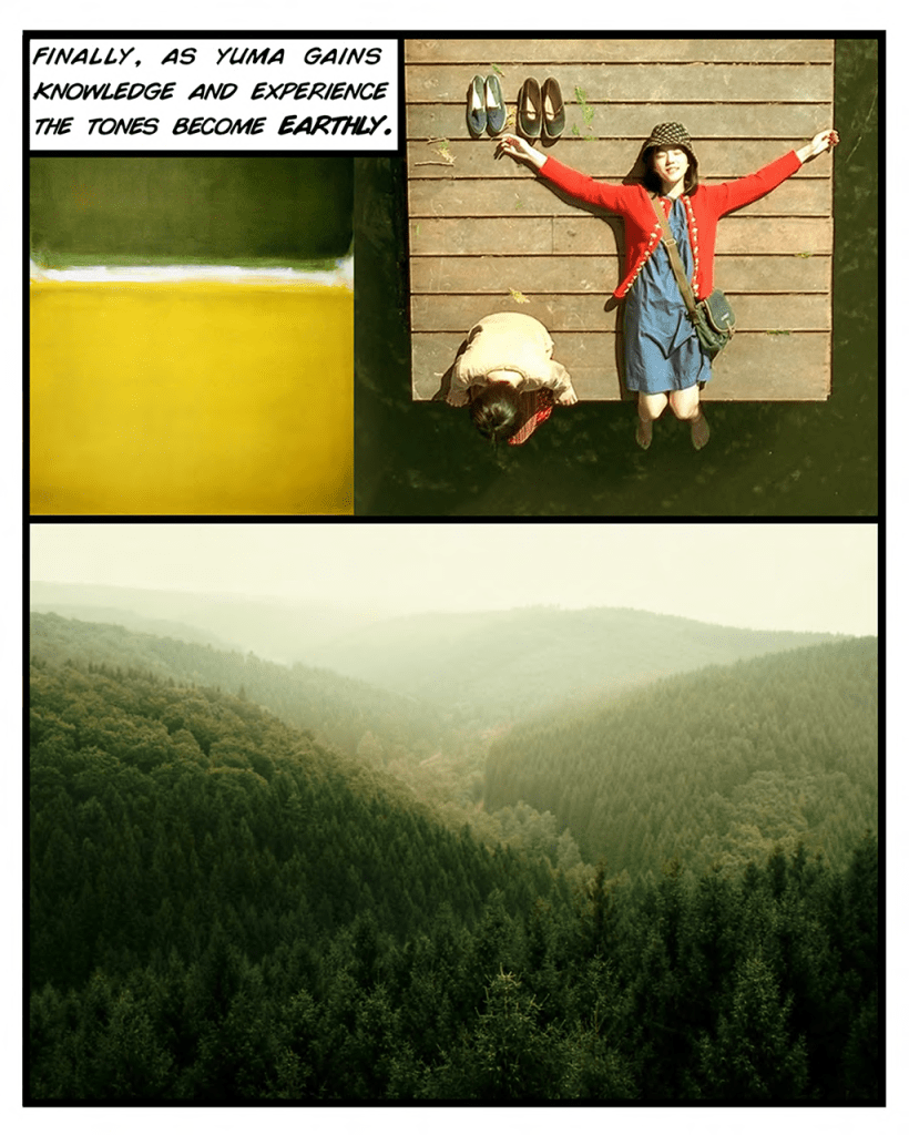
Early on, Hikari envisioned her movie going through three different Looks, or phases: cold Tokyo, representing Yuma’s stagnant situation; passion scenes, which included Yuma discovering Tokyo’s night scene and her experience at the Love Hotel, and earthy tones, as Yuma grows as a person through knowledge and experience. Each look would reinforce Yuma’s journey and state of mind.

Before a single frame was shot, Hikari, Stephen and myself brainstormed these ideas over a Skype call between Tokyo and LA. There were the different sections of the movie, which needed to flow in and out of each other organically, as well as specific scenes such as the Love Hotel, which would be bathed in a strong magenta light. That intensity would be pushing up against the primary camera’s colour gamut, I observed at the time.
With these ideas in mind, I was sent some early test footage to create various Looks. These included interiors under both daylight and night time conditions (tungsten and fluorescent), as well as a few shots lit to simulate the aforementioned love hotel setup. I banked these Looks and refined them over time leading up to the DI of the movie.
From Look Book to Reality
From a colourist’s perspective, a Look Book provides some guidelines. While few movies fit into neat, pre-defined sections like this, it does inform you as to how to treat certain scenes, certain situations. At the same time, the movie and the protagonist are complex. Their emotions go on a roller coaster ride and take us, the audience, with them. Stephen agrees: “We wanted to keep the look book in mind when shooting the film but felt no obligation to adhere to the system we created. It really became more of guideline in the end”.

With ideas swirling, I thought about the stylized look of manga characters, with accentuated, inky lines and strong contrast, not dissimilar to a Japanese person’s slick black hair against skin that is typically paler. Getting that contrast right is tricky; traditional ‘linear’ controls such as lift, gamma and gain can easily lob off shadows and dock highlights on their way to adding contrast, and an S-Curve can stretch out the mid tone, leaving it ‘thin’. Therefore, I turned to Soft Light. This blend mode is based on the relationship of shadows and highlights to 50% grey; anything lighter than mid grey gets brighter and anything darker gets heavier. By starting off with ‘gentle contrast’ in each scene, I could use a Soft Light and opacity to control the ‘inkiness’ of the shadows, giving me progressive contrast and snappier highlights. Then if I needed a shot to be brighter or darker, I simply used overall gamma to bounce the mid tone up or down, without affecting the black/white anchor points or relative contrast. This proved crucial as we continued to refine the tone of the film; “Mei had much more of an innocent look than I anticipated, and her disability was very different than what it was in the original script, so we went more towards a brighter tone”, Hikari recalls.
To complement my blending mode approach, I decided on a ‘bias-based’ technique for the colour treatment. This forgoes the ‘typical’ clean whites/blacks approach, which all too often can suck the life out of a picture, stepping over the subtle differences of shadows tinting one way while the highlights sway in another direction. By choosing to bias the colour of the image, you respect the original photography, yet augment it with the style that is required.

For this I turned to Curves. For the majority of Tokyo scenes, I used the Blue/Cyan curves, particularly the -> Saturation and -> Density curves to gives those colours extra depth. These adjustments bend the image towards colder tones, without the coolness riding roughshod over the warmer colours, which is so important for healthy looking skin tones. Similarly, for Thailand, I used the Green/Yellow curves to capture the beauty of the jungle and the stickiness of the humidity, again keeping the other warm colours at a baseline that made sense.
By using this bias based approach to grading the movie, we were able to control how much ‘Thailand’ we wanted, or how much ‘Tokyo’. For example, when Yuma returns home in the end, Stephen wanted her to bring back a bit of Thailand with her, to signify the warmth she was bringing back to her mother. I simply used my Thailand grade and picked 50% opacity, and now we had a subdued warmth as we combined the original Tokyo look with some ‘heat’ from Thailand.
Challenging conventions
Forcing a scene that is warm earlier in a movie to a colder tone later on is something we see repeatedly, and many times it looks fake and forced. This technique is often used to enforce the emotional state of the characters, or to express the overall mood of the scene. However, in the scene where the mother confronts Yuma after going through her possessions, the tsuchikabe walls in Yuma’s house can’t suddenly turn blue because she’s having a confrontation with her mother. Did someone swap out the light bulbs?!

So I went with the photography of the scene, which was more naturally lit but also had a strong key light. I increased the gain significantly, while dropping the mid tones deeper, which has the effect of thrusting the characters into the limelight. Then I pushed some very strong vignettes, rotating them from shot to shot to make sure they weren’t hiding any faces. The vignettes serve to separate the characters from the background, and to heighten the conflict between them.
For the Love Hotel, we can see a clear thread between the Look Book, the early tests we did, and the final result we ended up with. The strong magenta is a bold choice, and a welcome one. The colour has become anathema in grading circles, and in my mind that is a problem, as this gorgeous colour can represent passion just like the colour red, but at the same time adds overtones of sleaze and ambiguity. The magenta that bathes the Love Hotel is a culmination of the use of that colour, as we build up to it from the point where Yuma begins to discover the Tokyo night life. From the scene where Yuma encounters the drag queens, to her detour into the famous Kabukichō red-light district, Hikari and I had a few arm wrestles over how much magenta we should ‘creep in’, but in the end we both felt that its use made the picture richer and more layered.
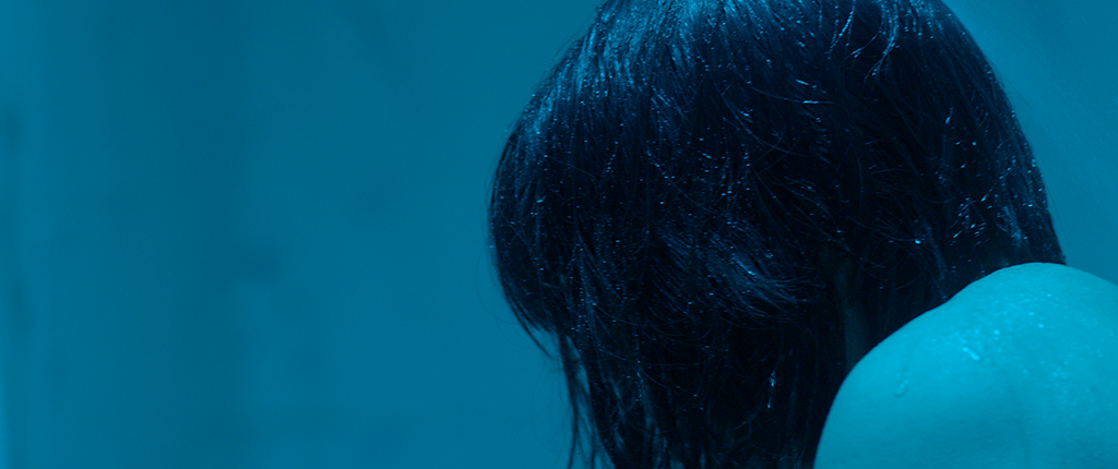
In a final ‘twist’ to our magenta journey, we swing wildly to a sea of cyan as Yuma washes her shame in the bathroom. The saturation of the cyan against the Soft Light, dense black deliver the punch and conclusion to this episode of Yuma’s self-discovery.
Distance? What distance!
With the movie having such an unconventional plot, it should come as no surprise that the DI was anything but conventional. With the director, DP and colourist all located in different parts of the world, we needed a way to communicate our ideas and address notes over a robust feedback channel, regardless of time zone. Enter Frame.io, a leader in the world of cloud-based video review and collaboration.
From the very first Skype call I had with both the director and DP, to the remote review sessions, to the exchange of media through Frame.io, this is a project that could not have been executed using the ‘traditional’ way. As a big fan of the service, I’d used Frame.io on countless smaller projects (shorts, music videos), but never on a feature. A 4K feature, and one that would require regular uploads, deliveries to and from multiple vendors, and a paper trail for every step of the way. So we rolled up our sleeves and took the plunge.
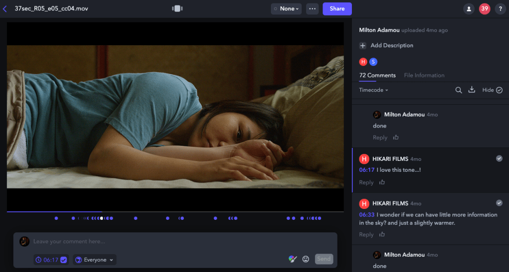
On studio pictures, remote services between your creative team members is not a big deal, and that’s because the client pays a pretty penny to have those services available to them. But what about the independent filmmaker, who often has similar demands, but pockets that are more holey than deep? That’s where services like Frame.io enter the picture. Hikari recalls the transition to working this way: “At first it was challenging because of the time difference. But then it became so much easier because of the ease-of-use of Frame.io; I was able to review all the reels as they progressed through colour, share my thoughts down to the specific section of the image, and receive feedback from Milton, our colourist. Being able to work interactively this way meant that I could still work closely with Milton, even though I was in Japan, which was wonderful!”
Our utilization of Frame.io didn’t end with remote reviews. After delivering VFX pulls to multiple vendors through Frame.io, and realizing that it made the process so much more efficient, we moved more and more of our day-to-day activities to Frame.io; VFX deliveries back to us (versus hard drives), reel turnovers, complete with Avid Bins, media and offlines, and communication between team members all benefitted from the process. We reviewed entire reels. Created manifests out of CSV exports. We came 90% close to approving the final movie, all while achieving phenomenal transfer speeds. We became so comfortable with the process that uploading hundreds of gigabytes of data a day became common practice.
The strength of a service like Frame.io is not merely the wonderfully thought out and crafted tools that the company offers, or even the open Application Programming Interface (API) that allows you to customize the service to your heart’s content. The opportunity comes in the risk that it encourages the filmmaker to take, to replace ‘traditional’ processes with disruptive ones, which streamline the moviemaking process as a whole. For that we thank the hard working NY-based team at Frame.io.
Remember to smile!
Just like Hikari’s decision to take a gamble on Mei, and change the script to reflect her reality, Hikari’s message is bold yet nuanced: “Don’t hold back. Allow experiences to happen, because you never know what doors they may open. And remember to have fun with it all”. I don’t know any filmmaker worth their salt who would disagree with that statement!
37 Seconds Premiered at the 69th Berlin Film Festival to critical acclaim. It won both the Audience Award as well as the CICAE Art Cinema Award under the prestigious Panorama section. It is also an official selection at the Toronto International Film Festival 2019. The movie was produced by knockonwood, Inc. Films Boutique has picked up sales and Netflix is the worldwide distributor.
You can check out the trailer on YouTube, as well as follow the journey on Instagram. For more stills from the movie, make your way over to the 37 Seconds Gallery.
All images courtesy of Knockonwood Inc.
Never Hike Alone

In Never Hike Alone, director Vincent DiSanti dances on the fringes of the biggest horror franchise of all time, Friday the 13th. In this fan movie, we follow Kyle McLeod (Andrew Leighty), an adventure blogger on a mission to find the infamous camping grounds of Crystal Lake. Throughout the movie he documents his progress with his action camera, the entries of which become progressively grimmer, as his survival skills are put to the extreme test in a game of cat and mouse with the camp’s resident serial killer, Jason Voorhees.
The video diary style plays well to a younger audience brought up on Facebook Live and a ‘found footage’ approach to filmmaking popularized by another long running franchise, Paranormal Activity. At the same time there is plenty of meat for lifelong fans to sink their teeth into. Pun not intended!
From the sweeping camera angles to the locations to the design – Never Hike Alone screams of production values typically associated with a studio picture, not an Indie crafted together using blood, sweat and little help from Kickstarter. The result is a movie that adds to the horror lore of Friday the 13th, albeit in an ‘unofficial’ capacity.
The Hidden Location
Like any independent filmmaker knows, one of the hardest things to cheat on a project like this is the design. For a major studio picture, you have the funds and the means to build almost anything you can imagine, either practically or virtually. With Indies, you’re down to whatever you can put together on a shoestring budget, or, for the more resourceful filmmaker, what you can find.
Through a passing conversation with a couple Vince had been working with during the original trailer, they casually mentioned an abandoned camp up the road, College Camp, and whether he’d be shooting there. What followed was something akin to a real-life sleuth investigation that had Vince superimposing a phone image over a paper map, in search of the location equivalent to the holy grail. “I began zooming in and scanning a satellite view of the forest where I eventually found one of the buildings tucked between a grouping of trees. From there I traced a path that seemed like a road leading all the way back to the highway.”
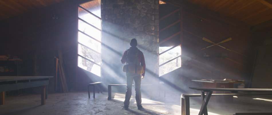
That path led him to College Camp; “from that moment, we knew we had struck gold”. The abandoned camp – with its cavernous main cabin hall, creepy attic and countless rooms and buildings – would fatefully become Camp Crystal Lake in Never Hike Alone, allowing Vince to expand the scope of the story he wanted to tell.
Toys of the Trade
As someone who’s graded a fair share of Indies, I’m used to dealing with cameras of all shapes and sizes. Whether it’s due to budgetary constraints, coverage needs over a compressed timescale, or just the desire to eek the best picture possible out of the most unlikely of cameras, Indie filmmakers have always pushed the boundaries in this area.
At the start of Never Hike Alone, the primary narrative camera was the Sony A7sii. This seemed like the best DSLR choice at the time, producing the most filmic images, but production is rarely just about the final result: “Its major downfall was that it was a difficult camera to rig as it required several accessories that never seemed to work together simultaneously. On top of that, the rig had trouble keeping up with the physical demands of the fight scenes and slowed us down a ton on set”, DiSanti recalls.
CAMERAS USED:
- Red Epic 8K
- Varicam 35
- Sony FS7
- Sony A7sii
- DJI Phantom 3 Professional
- (x2) Go Pro Hero 4 Blacks
ZEISS ZF LENSES:
- 25mm f/2.0
- 35mm f/1.4
- 50mm f/1.4
- 85mm f/1.4
But as luck would have it, cameraman Evan Butka, who’d been renting Vince his beautiful Zeiss lenses for the movie, became enamored with the project. He soon jumped onboard, bringing along his Red Epic 8K camera. “Shooting with the Red made life so much easier from a technical standpoint and of course gave us beautiful 8K images that would give us much more leeway in post.”
In another twist of kindness, Evan introduced Vince to Ben Meredith, another cameraman who would step in when Evan wasn’t available. And what do cameramen have? Cameras – this time a Varicam 35, ideal for low light situations; “We relied on the Varicam to capture a lot of our night and early morning scenes. Overall that camera is a workhorse that never let us down or gave us any issues.”
Finally, to round things off, Co-DP JD Martz brought with him his personal Sony FS7, which ended up becoming the B camera for the majority of the production. “It was great for guerrilla shooting when the main production cameras were not available. Most of the scene of Kyle running from camp with Jason giving chase was shot with that camera.”
Of Lin & Log
Working with many different cameras doesn’t have to be a nightmare; if all the material has a video gamma-style transfer curve (like Rec709), you can create a base by dialing out any differences using a primary grade, upon which you apply your Looks and other tweaks such as sharpness. This was my approach when matching the DJI Phantom shots with the Sony cameras throughout the extreme hiking scenes, as well as the night showdown between Kyle and Jason. For the ‘video diary’ footage though, the intention was to retain a visual difference between the punchy, ultra-sharp Go Pro material, and the more filmic narrative pictures from the Red Epic. As such, I kept the former bright and vivid and let any corrections ride in most instances, even if it meant blowing out highlights. However, for the latter I kept the contrast in check more than I normally would to create a softer look.


The real challenge arose when Log and Lin material were intercut. This happens throughout the movie, especially during the fight and chase scenes. In these instances it is important to consider the final deliverable. “Our original goal was to release the film for free on YouTube, however, we found ourselves with a unique opportunity to premiere at the Telluride Horror Show”, DiSanti informed us when we started testing the pipeline. With that information, I could make some decisions.
This setup for me meant a 709 world (sRGB on most computer screens), and thus I chose to convert my log images to video gamma using a base correction (versus using an output LUT). Since the conversion was ‘live’, I could always dig beneath it to retrieve any blown or crushed details, while reaping the benefits of a ‘homogenised’ timeline, allowing me to easily apply Looks between the Lin and Log material. Since the pictures were pretty much bang on in terms of exposure, we had minimal problems.
For the Red material specifically, the manufacturer gives you a plethora of choices for just about any occasion. Unlike other jobs where I typically choose to work in RedLogFilm space, for Never Hike Alone I chose RedColor2 / RedGamma2 for my colourspace and transfer curve. This gave me rich images with a slightly flatter look, perfect to use as a starting point.
Lake Gloom
Out of the can, the images looked beautiful, but lacked uniformity. This was purely down to the varying capabilities of the cameras, as well as the intercutting style between the video diary shots and the narrative footage. Before considering any specific Look treatments, it was essential to balance everything out.
From a colour perspective, I wanted to create a distinction between the time when Kyle is looking for Camp Crystal Lake, when he actually finds it, when Jason finds him, to the time the terror unfolds in and around the camp and beyond.
For the exteriors near the camp, there was a lot of warmth in the environment; this is Southern California in mid Spring, where any green ground cover can quickly dry out under the bright sun, casting russets and golden hues across the underbrush. Those colours impart a warm and inviting feel, the opposite of the foreboding Look I was aiming for.

To set that tone, I modified a Look I’d used for a past job – June Gloom. Basically, you start by selecting three colours – yellow, red and magenta – from the black point all the way up to the mid tone, with a good deal of feathering into the highlights. Those ranges are then desaturated, leaving behind the cooler colours, but also some life in the skin tones. On first glance the image appears to cool, but it’s misleading: the absence of warmth is what tricks your eye into thinking the image is much bluer. The modification I made to this Look was to further saturate the greens and blues left behind, as well as any warm colours left behind that were key story points.
The result is a creepy, ominous look that repels any inherent warmth in the image (like the fried underbrush). It’s especially effective on cloudier days, which are devoid of brighter highlights.
It’s in the Sky!
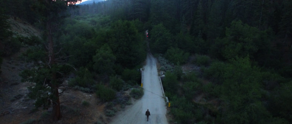
Nothing makes a picture look like a million dollars more than well timed aerial footage, and this movie has plenty of it. “I purchased a [DJI Phantom 3 Professional] and learned to fly it on my own for the production.” DiSanti states. And watching the movie – from the breathtaking reveal over the lake to the epic crane as the ambulance races off leaving Jason in its wake – I would say he didn’t do a half bad job: “The hardest shot in the entire film was definitely the shot where Kyle runs across the log while the camera dollies forward over a large creek.” So if the director thing doesn’t work out Vince, then he can always be a drone operator!
Never Hike Alone premiered at Telluride Horror Show to glowing reviews as well as simultaneously launching online on YouTube. The movie continues to rein in hundreds of thousands of horror fans from around the world, and has ticked up to an astonishing 900K+ views on YouTube. Lifelong fans of the Friday the 13th series haven’t felt this good about a Friday film since the 80s. “What seemed like a pipe dream early on in the process ended up being an experience I will certainly never forget”, DiSanti concludes.
The scope of the project is probably captured best by Greg Emerson, the online editor for the project: “Never Hike Alone was a full throttle 4K DI editorial job: six different camera types with variations in resolution, aspect ratio and bit depth. Digital FX, paint outs, variable re-speeds, reticule overlays…the show had everything that a $100M, big studio film would.”
You can check out the movie on YouTube, as well as more stills by going to the Never Hike Alone Gallery.
For my full interview with director Vincent DiSanti, check out The Search for Camp Crystal Lake.
DGK: Parental Advisory
Randal Kirk skates down familiar territory in his debut feature “DGK: Parental Advisory” – a ghetto fairytale that takes place inside the mind of DGK rider Baby Scumbag, aka Steven Fernandez. The movie combines music video-type narratives with some of the most amazing tricks performed by DGK riders. “The individual stories are abstract, much like a music video, but as a whole they tell a story”. Randal’s idea of combining these two normally different elements was ambitious, and I had the pleasure of helping him craft those images into a finished piece.

“DGK: Parental Advisory” is different from most skate movies that preceded it, both due to the format as well as the story it tells; “DGK is a unique brand in that all its riders have been dealt bad cards in life. Skateboarding became their golden ticket out of that life”, Randal told me when we sat down to discuss the look of the movie. “I wanted to tell a story that captured the heart and soul of the team’s riders.”
The cinematographer that stepped up to the task was none other than Salvador “Vallo” Lleo, someone I have collaborated with many a time before. True to his reputation, Vallo gave us some beautiful, cinematic sequences: “I knew my pictures were going to be intercut with cool-looking fisheye skate board sequences…so to create contrast I steered towards conservative framing and story telling”. But that didn’t mean that Vallo had it easy. “For the exteriors we had no permits and there was a lot of guerrilla-style shooting with the camera on the shoulder, the lens wide open and praying for an image…it brought back memories of my early days as a young film-maker.”
Tools of the Trade
Three Red Epics were used on this movie for the tons of coverage that Randal insisted on. “His energy and passion kept everyone going in the hardest of times”, recalls Vallo. His lenses of choice were the Cooke S4s and for his lighting style, Vallo didn’t have to look far beyond the brand’s name: “Dirty Ghetto Kids is the name of the company. The texture had to be gritty and rough. High contrast situations, mixing vibrant temperatures and super-stylized lighting design”.

Vallo has long left his trusty tripod behind and replaced it with his new Technocrane. It’s ultralight, super fast to move compared to the standard Supertechno and great in tight spaces and remote locations. “This crane is so great and easy to work with that there will be days where the camera would not come off!”
As practical as a crane is, it’s the sweeping shots that it helps capture which make it an amazing storytelling tool. In the last shot of the movie, a wounded Stevie Williams steps out of an ambulance and skates away into the distance. As the crane goes up, dozens of kids skate after him with a gorgeous Downtown LA in the background. “It was a one take shot. Magical! Then Randal next to me shouted ‘OK kids…it’s a wrap!!’ Man, people went nuts! All these kids were hugging me and thanking me for the best experience of their lives. At that moment, it all made sense…and for me, that very moment was the coolest thing I have ever experienced. All the pain and suffering melted away. It reminded me of all the reasons why I came into this business. Not for the money, not the glamour or the fame but for these amazing happy moments that brings people together.”
Glossy with a Twist of Primaries
My approach to colour timing DGK was developed with Randal on previous collaborations, but this time with a twist. Randal explains that “over the years I’ve developed a glossy look for all of my videos that glamorizes the moment…This approach was appropriate for this piece since as a brand DGK has lots of bright and glossy colours in their designs, mixed with edgy/controversial images, much like the art I have made in the past.” The way I translated Randal’s vision to the screen was by giving the music videos a polished, poppy look with deep saturated colours and snappy blacks. However, this time I explored washing entire sequences with primary colours that existed in the pictures, giving them a certain vibrancy and unique signature look. The four images below show this approach.


There are many ways to achieve this effect, and the most basic one involves ramping up the lift/gain for the colour that you want to add, or even using printer lights (actually *subtracting* the colours that you want since you are theoretically working on the negative). This is certainly an option, but for me leaves you with an image which lacks color depth. Adding a wash doesn’t mean that every other color should be suppressed.
Instead, my approach was to use both blending modes and curves. After balancing the image, I threw on a Hard Light, which instantly added contrast, bloomed the highlights and dug into the blacks. Since we were going for drama in this piece, this single action helped get there fast. From here on you are sculpting, and curves gives you pinpoint precision. I increased saturation in my Yellow curve, but then to kill off the orange that was creeping in, I also increased the saturation along the Cyan curve. This is because Cyan sits across from Red, so any movement in either direction is going to affect the opposing colour. If too much Yellow/Cyan crept into parts of the image that I didn’t want it to, with curves its just a matter of adding a break point to contain its effect. I did this in the Cyan curve, because I wanted to retain the warmth in the blacks instead of cooling them off.

Not all images lend themselves to the same approach. For example, the picture above of Stevie Williams from his piece shows an exterior setup, with lots of colourless things in the scene (concrete, chain fence). Throwing on a Hard Light completely blasts the image with too much light, and his face disappears into the shadows. It’s the wrong approach. So for this, I made sure that I kept any gain adjustments in check, while using curves to seep in both colour and gain where I wanted it. The surrounding forest was perked up by adding green saturation, while his cap was brought out by adding saturation in the Red curve. For both primaries I brought down the gamma curve too, deepening the colors and giving them added richness.
Lost Ghetto Kids
“DGK: Parental Advisory” was a dream project for me, a collaboration with two artists I admire, who are always looking at breaking new ground with every shot, every scene, every motif. In the final act, as the skateboarders navigate past the frozen antagonists to overcome the conflict in their lives, Randal sits back and reflects on the project: “I’m visually communicating how skateboarding is these kids’ ticket out of a life of crime, drugs and death. Skateboarding has saved the team riders from all the harsh realities they could have potentially faced in their lives. Through skateboarding they are now living their dreams and the dream of all the lost ghetto kids on the street.”
In a first for this blog I interview Randal Kirk, the director of the movie in Lost Ghetto Kids. Here you can get the scoop on the story development, Randal’s ideas on creating memorable images and how it was to work with the army of kids in “DGK: Parental Advisory”.
For a ton of before and after stills, visit the gallery. Finally, for more work from the creative team, please visit their respective websites: Randal Kirk and Salvador Lleo.
