
Summer Of Love

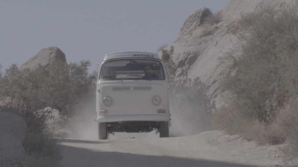
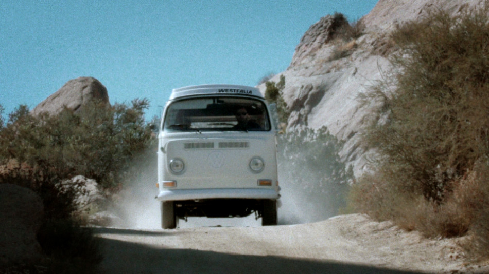
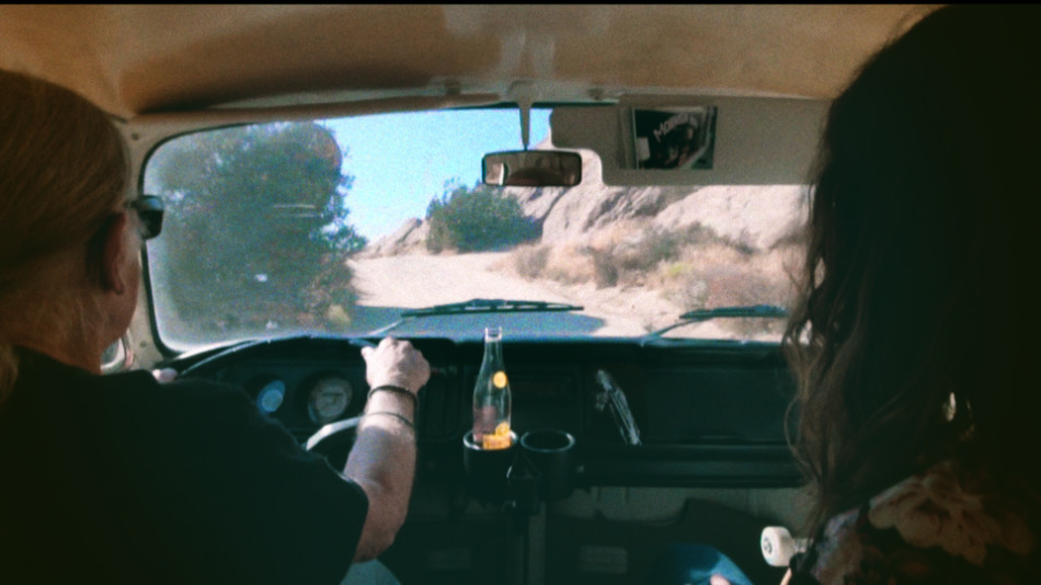
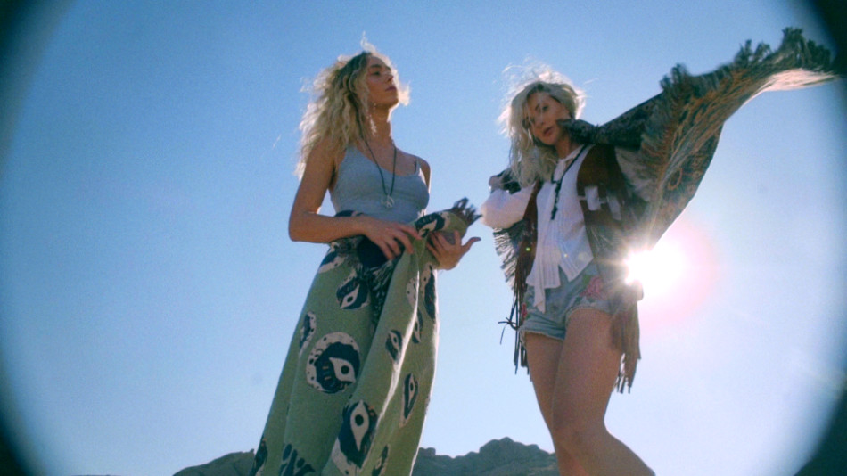
Somewhere near Vasquez Rocks (and a ditch in Santa Clarita), a camper van unleashes a group of revelers chasing a Summer Of Love. At least that’s the vibe the director, Randal Kirk II, was hoping to capture with his latest branded piece for Night:Shift Goods. With hippie-styled attire and rainbow flares galore, as well as a guest appearance from legendary folk musician and photographer Henry Diltz, I’d say he got pretty close!
Old School meets Instagram
Summer of Love is intended to showcase Night:Shift’s home goods collection, marketed towards a diehard Doors fan base. The inspiration for the piece came from watching classic Doors music videos with Director of Photography Gordon Yould; “We felt that an ‘on the road’ vibe would capture the spirit of Jim Morison”, Randal recounts.
But in a world where everything old is new again, that fan base is shifting, and so the intent was to capture a new audience of young fans, without alienating the old timers. “I wanted to cast someone influential in a younger demo that would fit this vibe, so I cast psychedelic skater Richie Jackson, a very popular skater in the social age.”
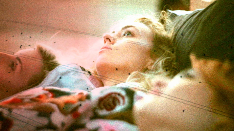
And Richie can skate, though that’s not wholly why Randal cast him for this piece: “Richie has broken away from the core skate scene and is more of an artist using his board as a brush.” That statement dovetails one of the surreal sequences, with Richie bouncing on and off a bed draped in Doors merchandise. It’s a stunt he’s performed on Instagram to an audience that Night:Shift, through Randal, is trying to reach.
This is familiar territory for Randal, who has made his living doing promos for skate and urban clothing companies, viral videos on YouTube and Vine, and genre-bending music videos.
Throw me a camera!

Gordon had some strong opinions on recreating that 60s magic: “when I heard it was for Doors material I instantly blurted out FILM! WE NEED TO SHOOT FILM!” Luckily Randal and Gordon were on the same page: “We were tired of seeing retro pieces shot digitally with Super 8 and flare effects added in post. They’re missing the textures and magic that can be done on film. Digital flare and digital film burns can work, if you augment it with actual film.”
And to get that carefree, organic texture, Gordon decided to go experimental with the film that he used; “I had some old 400′ short ends in a shoebox and figured let’s load ‘em up and see what happens! In the end the film came out a little grainy but kinda cool considering over 10 years of heat and cold fluctuations”
Alongside the two film cameras – an S16 Aaton XTR with an Angenieux 12-240mm Zoom and a S8 Canon 814 – digital coverage came courtesy of two Sony cameras – an FS7 and a A7Sii DSLR. The subject matter and the need to capture tons of B roll necessitated two small crews shooting guerilla-style. It’s debatable which material ended up the A roll and which the B roll!
Putting it all together
When it came to the cut, the services of Andrew Polich were employed, who wrangled all the footage from the various sources. The final piece moves at a good clip, but the combination of slo-mos and longer takes ensure the audience doesn’t feel they’re on a roller coaster. It’s a fine balance, and it works really well! Randal is very vocal on the style: “It might be my ADD but I’ve always cut at a fast pace. The biggest challenge filmmakers face today is keeping the audience tuned in so they won’t grab their phones and check out something else.”
There are a lot of ‘retro’ techniques on display here – sprockets and keycode punching through the left side of the frame, blending modes used to simulate double exposures, and a cute use of multicam.
Enter the Monkey
The combination of that much material from so many different sources created certain challenges, the most glaring of which was the presence of grain, or none at all. To make the visuals flow and feel like one cohesive piece, I had one of two choices: ‘clean up’ the film a little to make it match the Sony material better, or add some texture and grit to the digital pictures to make them look more like film. As a self-confessed film fanatic (my still camera of choice is a Canon AE-1 Program), there was only ever going to be one way. For this I turned to my grain plugin of choice, Film Convert by Rubber Monkey.

Most film grain plugins I’ve used do a great job in three areas: grain profile, correct tone, and controls for applying the grain as a positive or negative effect. Let’s call these the ‘post controls’ of a film grain plugin. However, because there’s no regard for the Transfer Curve or Colourspace of the underlying footage, the applied grain often ends up looking ‘superficial’. The lack of ‘transfer controls’ means the contrast and density of the resulting image is typically off, and you need to tweak the image further to get it to the right place before you can even evaluate the grain. Cumbersome, yes, but this is what we’ve had to deal with for many years.

Film Convert takes a different approach; it gives you direct access to the ‘transfer controls’, allowing you to select both the camera and the profile used during the shoot. Once selected, the film grain is applied, and the default results are great! You can use additional controls – de facto 3-way joyballs, lift/gamma/gain and saturation – to tweak the final result. Film Convert comes in both stand-alone edition (the image above), as well as a plugin for your colour corrector or editor. I use both versions for my work.
Vintage techniques
With the grain out of the way and the blend effects in place, it was time to have some fun. In my mind, The Doors is all about experimentation, freedom and psychedelia. I wanted the grade to reflect this.
I already had a head start with some of the tricks Andrew pulled in the edit, namely using film burns and black & white flips as transitions. I loved the organic effect this had on the footage, and worked towards accentuating that.
For my base grade, I didn’t want the piece to have too much contrast, which would have given it a more ‘modern’ look. So I floated the blacks more than I usually would, and kept the mid tones and highlights a little lighter. The flash frames and film edges gave me the contrast I wanted without having to put that in the image. I also let the exposure ride, sometimes wildly, between shots, which felt more natural to me.
To push the psychedelic look, I relied on key shots and techniques; skies were given a teal, slightly electric treatment, which added to the ethereal quality. Offsetting the teal shadows and skies, I added some warm vignettes; this gives the picture a ‘faded’ look, like old photographs, and also creates colour tension between the warmth and the cooler shadows and skies.
The rainbow flares, which were achieved using practical prism and rainbow filters, were pushed further. Also with the flares, because I was pushing the mids and the highlights just that little bit more, magenta started to wring around the hot spots. Normally I would correct this, but I kept it in, sometimes even accentuating it, to get some interesting, almost cross-processed looks.

Finally for the skate scene, it was gold all the way! This was largely a matter of embracing all the variance in the native photography: the expired super 16mm film, the erratic grain, the layered film and digital effects, all as the sun was setting. I pushed tons more warmth into the shadows, flatlined the blue gain for the digital shots to get that strong yellow highlight, and added more contrast compared to the previous scenes, which gave me those strong, iconic silhouettes.
I think for this job, Gordon sums it up just perfectly: “on the day it was amazing to film with our talents and the legendary [Henry] Diltz. Randal is always great to work with and his visions are a blast to bring to life through cinematography.”
You can check out more stills by going to the Summer Of Love Gallery.
Miles Fisher – “New Romance”

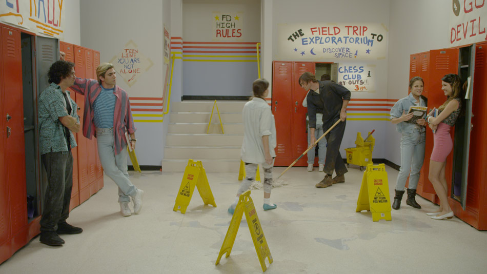
Miles Fisher rounds up his “Final Destination 5” co-stars for his pop single “New Romance”, paying homage to the 90s TV classic “Saved by the Bell”, complete with death-inducing falling lockers and razor-sharp flying records! Directed by Dave Green and shot by Benji Bakshi, the music video spoof is part of Warner Bros. online viral marketing campaign for the movie.
Shot in a single day at Red Studios in Hollywood, it seems appropriate that the camera of choice was the Red One MX, combined with a Cooke Varatol 18-100 zoom lens. This was a single day shoot, and although Dave storyboarded the entire music video, the cast and crew had to move fast to get all the coverage. Zooms are essential in this respect, and came in handy when also pulling off those cheesy zooms!
For lighting, Benji did a great job of lighting the set to look like a 90s sitcom. He used 20 4K supersoft lights, 5 6K spacelights, and relied on Source 4 Leikos for accent. “We built our own grid and rigged all the lighting to an Expression 2 dimmer board for control and practical dimming gags. We prelit all 3 sets so we could meet our schedule”. A few supersofts on stands to move around for fill lights rounded up the lighting package.
Bubble-Gum Look
For New Romance, Benji wanted the images to have a real poppy, bubble-gum look, which in my world translates to bright, saturated colours with warm and healthy skin tones. The debayered image (see below) provided a good starting point, with a rich palette and plenty of fill light to help replicate that classic sitcom look Benji was after. I was happy when I looked at the images and didn’t see any clipping – not a given considering the huge range of exposure between the off white walls, chequered floor and everything in between!

I started off with a simple base grade, using master controls and the joyballs to establish some cleans blacks and highlights. This got rid of some of the green residue I could see creeping into the highlights and the mid tones. From there on it was all about finessing; using a nifty tool called Revolver I was able to quickly qualify up to 10 colours and boost their saturation, swing the hue and generally lower the brightness to bring out the richness in the primaries. Generally with a look like this I prefer to blast the reds, greens, blues and purples, being a little more careful with the reds and yellows, which is where the skin tones sit.
The ability to key back to any colour layer is very important, especially to recover skin tones, shadows and highlights. For this music video I ended up creating different layers to treat each element separately. This was essential for achieving warm but realistic skin tones, as well as for pulling back the clipped walls and floor, a by-product of my attempt to keep the image bright and cheerful. I’m a firm believer of simplicity, but sometimes the simplest looks end up being the toughest to achieve. Having that kind of flexibility gives you a lot of flexibility.
You can check out more stills in the Gallery.
To see more examples of Benji’s work, visit his website.
