
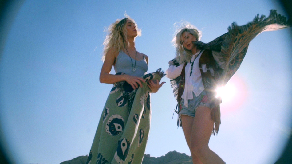
Summer Of Love

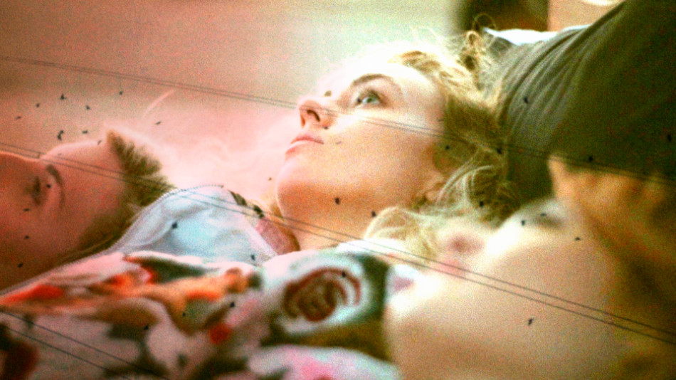
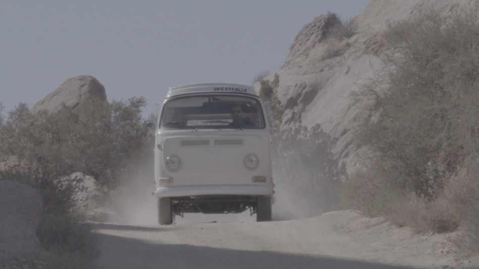
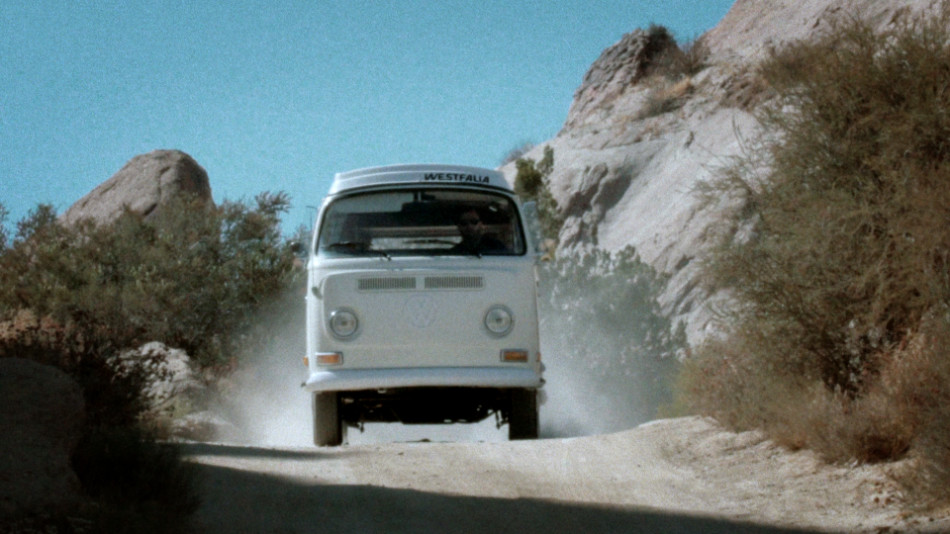
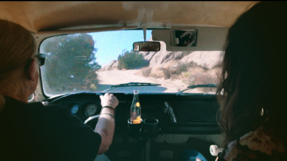
Somewhere near Vasquez Rocks (and a ditch in Santa Clarita), a camper van unleashes a group of revelers chasing a Summer Of Love. At least that’s the vibe the director, Randal Kirk II, was hoping to capture with his latest branded piece for Night:Shift Goods. With hippie-styled attire and rainbow flares galore, as well as a guest appearance from legendary folk musician and photographer Henry Diltz, I’d say he got pretty close!
Old School meets Instagram
Summer of Love is intended to showcase Night:Shift’s home goods collection, marketed towards a diehard Doors fan base. The inspiration for the piece came from watching classic Doors music videos with Director of Photography Gordon Yould; “We felt that an ‘on the road’ vibe would capture the spirit of Jim Morison”, Randal recounts.
But in a world where everything old is new again, that fan base is shifting, and so the intent was to capture a new audience of young fans, without alienating the old timers. “I wanted to cast someone influential in a younger demo that would fit this vibe, so I cast psychedelic skater Richie Jackson, a very popular skater in the social age.”
And Richie can skate, though that’s not wholly why Randal cast him for this piece: “Richie has broken away from the core skate scene and is more of an artist using his board as a brush.” That statement dovetails one of the surreal sequences, with Richie bouncing on and off a bed draped in Doors merchandise. It’s a stunt he’s performed on Instagram to an audience that Night:Shift, through Randal, is trying to reach.
This is familiar territory for Randal, who has made his living doing promos for skate and urban clothing companies, viral videos on YouTube and Vine, and genre-bending music videos.
Throw me a camera!

Gordon had some strong opinions on recreating that 60s magic: “when I heard it was for Doors material I instantly blurted out FILM! WE NEED TO SHOOT FILM!” Luckily Randal and Gordon were on the same page: “We were tired of seeing retro pieces shot digitally with Super 8 and flare effects added in post. They’re missing the textures and magic that can be done on film. Digital flare and digital film burns can work, if you augment it with actual film.”
And to get that carefree, organic texture, Gordon decided to go experimental with the film that he used; “I had some old 400′ short ends in a shoebox and figured let’s load ‘em up and see what happens! In the end the film came out a little grainy but kinda cool considering over 10 years of heat and cold fluctuations”
Alongside the two film cameras – an S16 Aaton XTR with an Angenieux 12-240mm Zoom and a S8 Canon 814 – digital coverage came courtesy of two Sony cameras – an FS7 and a A7Sii DSLR. The subject matter and the need to capture tons of B roll necessitated two small crews shooting guerilla-style. It’s debatable which material ended up the A roll and which the B roll!
Putting it all together
When it came to the cut, the services of Andrew Polich were employed, who wrangled all the footage from the various sources. The final piece moves at a good clip, but the combination of slo-mos and longer takes ensure the audience doesn’t feel they’re on a roller coaster. It’s a fine balance, and it works really well! Randal is very vocal on the style: “It might be my ADD but I’ve always cut at a fast pace. The biggest challenge filmmakers face today is keeping the audience tuned in so they won’t grab their phones and check out something else.”
There are a lot of ‘retro’ techniques on display here – sprockets and keycode punching through the left side of the frame, blending modes used to simulate double exposures, and a cute use of multicam.
Enter the Monkey
The combination of that much material from so many different sources created certain challenges, the most glaring of which was the presence of grain, or none at all. To make the visuals flow and feel like one cohesive piece, I had one of two choices: ‘clean up’ the film a little to make it match the Sony material better, or add some texture and grit to the digital pictures to make them look more like film. As a self-confessed film fanatic (my still camera of choice is a Canon AE-1 Program), there was only ever going to be one way. For this I turned to my grain plugin of choice, Film Convert by Rubber Monkey.

Most film grain plugins I’ve used do a great job in three areas: grain profile, correct tone, and controls for applying the grain as a positive or negative effect. Let’s call these the ‘post controls’ of a film grain plugin. However, because there’s no regard for the Transfer Curve or Colourspace of the underlying footage, the applied grain often ends up looking ‘superficial’. The lack of ‘transfer controls’ means the contrast and density of the resulting image is typically off, and you need to tweak the image further to get it to the right place before you can even evaluate the grain. Cumbersome, yes, but this is what we’ve had to deal with for many years.

Film Convert takes a different approach; it gives you direct access to the ‘transfer controls’, allowing you to select both the camera and the profile used during the shoot. Once selected, the film grain is applied, and the default results are great! You can use additional controls – de facto 3-way joyballs, lift/gamma/gain and saturation – to tweak the final result. Film Convert comes in both stand-alone edition (the image above), as well as a plugin for your colour corrector or editor. I use both versions for my work.
Vintage techniques
With the grain out of the way and the blend effects in place, it was time to have some fun. In my mind, The Doors is all about experimentation, freedom and psychedelia. I wanted the grade to reflect this.
I already had a head start with some of the tricks Andrew pulled in the edit, namely using film burns and black & white flips as transitions. I loved the organic effect this had on the footage, and worked towards accentuating that.
For my base grade, I didn’t want the piece to have too much contrast, which would have given it a more ‘modern’ look. So I floated the blacks more than I usually would, and kept the mid tones and highlights a little lighter. The flash frames and film edges gave me the contrast I wanted without having to put that in the image. I also let the exposure ride, sometimes wildly, between shots, which felt more natural to me.
To push the psychedelic look, I relied on key shots and techniques; skies were given a teal, slightly electric treatment, which added to the ethereal quality. Offsetting the teal shadows and skies, I added some warm vignettes; this gives the picture a ‘faded’ look, like old photographs, and also creates colour tension between the warmth and the cooler shadows and skies.
The rainbow flares, which were achieved using practical prism and rainbow filters, were pushed further. Also with the flares, because I was pushing the mids and the highlights just that little bit more, magenta started to wring around the hot spots. Normally I would correct this, but I kept it in, sometimes even accentuating it, to get some interesting, almost cross-processed looks.

Finally for the skate scene, it was gold all the way! This was largely a matter of embracing all the variance in the native photography: the expired super 16mm film, the erratic grain, the layered film and digital effects, all as the sun was setting. I pushed tons more warmth into the shadows, flatlined the blue gain for the digital shots to get that strong yellow highlight, and added more contrast compared to the previous scenes, which gave me those strong, iconic silhouettes.
I think for this job, Gordon sums it up just perfectly: “on the day it was amazing to film with our talents and the legendary [Henry] Diltz. Randal is always great to work with and his visions are a blast to bring to life through cinematography.”
You can check out more stills by going to the Summer Of Love Gallery.
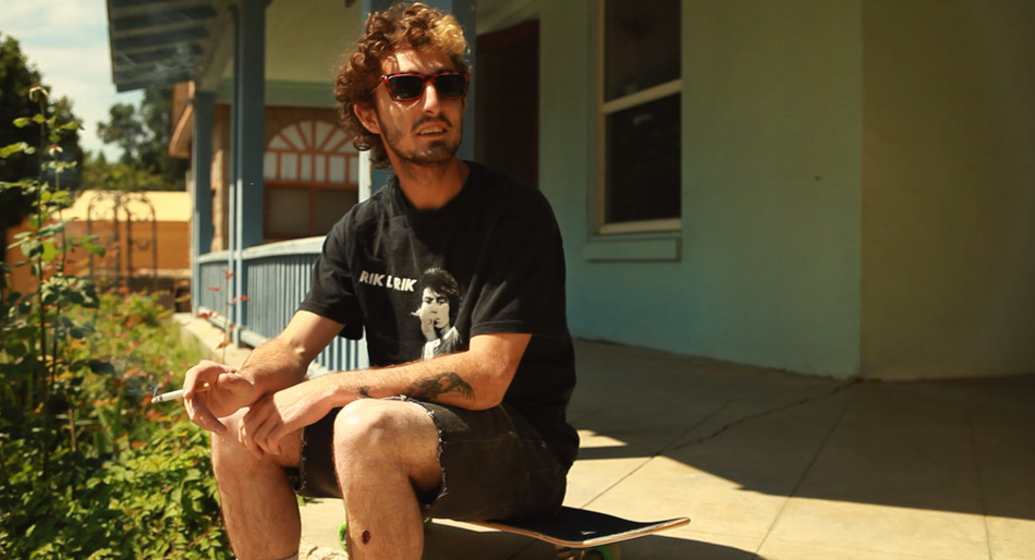
Dragonslayer

The award-winning ‘Dragonslayer’ tells the story of ‘Screech’, a lost kid falling in love in the suburbs of Fullerton, California. “[Dragonslayer] is a portrait of a new generation of kids from the rotting suburbs of inland California, and a celebration of what makes them so unique” comments Tristan Patterson, the director of the documentary.
Dragonslayer was lensed by Eric Koretz, and was my second collaboration with this Cinematographer. The documentary was filmed off and on over the course of a year and a half.
Most times documentaries can pose a challenge for a colourist; the very nature of these narratives usually leads to compromised images, hastily filmed in order to ‘capture the moment’. However, I found that with Dragonslayer, this wasn’t your typical documentary!

Eric used the Canon 5D Mk2 as his primary camera outfitted with a variety of lenses: the Canon L series 24-70 and 70-200 zoom lenses, a must in the run and gun world of docs, as well as an 85 T1.2 for all the low light night stuff. When time permitted, a set of Zeiss ZF 21, 35, 50 and 100 lenses were used. The superior sharpness and optical quality offset the inconvenience of using the primes.
Dragonslayer differs from many other skateboarder movies I’ve seen in that it is shot with a more filmic aesthetic, both in terms of the framing and the pace; crazy wide-angle lenses and crash zooms are out, replaced with a more sensitive approach that feels fresh and less pretentious. The colour choices reflect this, and I worked hard to bring out what was already there, striking a balance between the rawness of the ‘negative’ whilst striving for cohesiveness and uniformity. For a colourist there is something very satisfying about the fact that the audience will never see what the ‘befores and afters’ looked like!
Happy Accidents
The filmmakers also gave Screech a Kodak Zi8 to record his own stunts with. The camera is capable of capturing HD @ 720p, but in one of the those ‘fortunate’ accident moments, Screech flipped the switch to record standard definition!
Instead of fighting the ‘compromised’ images or trying to find a way to ‘fix’ them, I accentuated them further by pumping a lot of saturation in the blues and greens while keeping the skin tones ‘healthy’. One thing I didn’t want to do was stretch the contrast like crazy in order to bury the noise. Instead, I floated the blacks a little and pushed in some grain to hide some of the more offensive noise. The vibrant look goes with Screech’s ‘elevated’ state as he skateboards his way through life. And let’s just say that the use of recreational drugs are rampant in this movie!

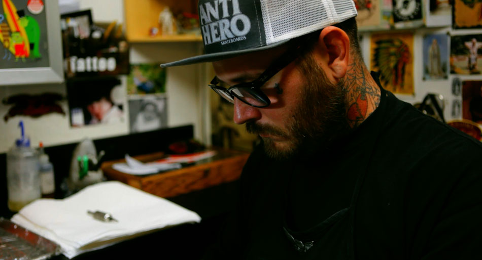
Tattoo Parlour
Another scene we had a little fun with was the Tattoo Parlour. We really wanted to accentuate the intricate tattoos on display, as well as the vibrant colours bouncing off the walls and the posters. Compared with the natural and softer palette of the rest of the documentary, we wanted this to feel more grungy, more raw. I achieved this by pushing a good amount of cyan in the blacks, and offsetting the coolness with yellow in the mid tones. I then punched the oranges and the reds but protected the skin tones so that they wouldn’t go nuclear! Saturation can be a powerful tool for storytelling, but you need to know where to use it; without being selective you can end up with an image that looks like it’s made of candy!
‘Dragonslayer’ has been an award magnet ever since it hit the festival scene. It recently won the Best International Documentary at the hotDOCS Canadian International Documentary Festival. That’s in addition to the two awards it won at SXSW – Grand Jury Prize For Documentary Feature and Best Cinematography.
To watch the trailer visit the official website here. The filmmakers also have a Facebook page for the movie. Also for more stills from the movie check out the Gallery.
To stay up to date with Eric Koretz’s latest work, visit his website.
