The Smell Of Success
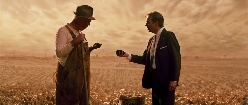
It’s hard to believe that the sweeping fields in The Smell Of Success are nothing more than soundstages at Melody Ranch Studios in Santa Clarita! Expertly lensed by David Mullen, ASC, the story is about a manure salesman in 1960s heartland America, and even though the gags are overdone at times, the images ooze quality. Pun intended ;)
Timing this movie was challenging, especially because the DP was not available during the DI. As a starting point David had sent me a handful of stills, which evoked the overall ‘feel’ of the picture. A further challenge was the fact that the movie had already gone through a lengthy preview process, which left it with a lifeless sepia look and little colour separation. This was far from the painterly look both the DP and the Production Design department had planned for.
After untangling what had already been done, I started with a clean slate. This movie was shot on the Red One camera long before the upgraded MX sensor became available, and as such before Red’s FLUT colour science offerings. I picked RedLog for my gamma curve, giving me maximum detail in the highlights. The Zeiss Ultra Primes and Angenieux zooms David used gave me crisp images with excellent definition – a good starting point.
I started by discovering what was in the image, playing mostly with contrast and density and pulling out all the nuances that I knew existed in the ‘negative’; I was right – David had captured some remarkable, ‘filmic’ images, tempering the sharpness of digital cinematography with Classic Soft Blacks and Smoque filters. Through his lighting he created a soft overhead skylight for the outdoor farm scenes, using a combination of daylight Kinos, HMI lighting balloons or Lumapanels, the effects of which can be seen in the ‘Midday’ and ‘Afternoon’ images below.
Even though the gorgeous images had a well designed earthen palette, I still felt that some subtle accents could be used to signify the different times of day.


Seeing the same colour tint over the course of an entire movie soon nulls the effect, and so to keep the eye ‘entertained’ I experimented by adding graduated pinks into the dramatic skies earlier on in the day. This combined well with the hard sunlight being simulated by the 18K HMI. I qualified the clouds and pulled back on the luminance so that I wouldn’t tint the brightest parts. I then brought the gamma down to expose a little more detail in the clouds, and offset the colour by adding a hint of orange. This created a nice transition between the horizon and the clouds.
For later on in the day, I followed the same technique but used less pink. I also wanted to make the clouds feel heavy, almost like they’re engulfing the foreground. I turned to S-curves for this, giving me contrast in the ‘body’ of the clouds while snapping the highlights and deepening the blacks. At times the clouds almost look like they’re touching the ground!
For the afternoon I replaced the pink with orange, especially in the mids and the blacks, giving the ground a sweltering and humid feel. This worked well with David’s afternoon setup – a tungsten 12-light HPL MaxiBrute to simulate the warmer sunlight late in the day. By the time we reach ‘golden hour’, the sky is on fire, with the dipping sun blasting through the trees. For this I actually composited two identical layers over each other, blew out the base layer and blurred the whites. I then used a Soft Light blending mode on the top layer, which I also keyed through to reveal the base. The blending mode provides a nice transition between the two layers.
The whole treatment is in keeping with the whimsical nature of the story, and despite the added ‘texture’, I feel remains true to the cinematography.

I also had a little fun with the ‘high-on-mushrooms’ night scene, where I played with a stylized violet-blue wash and stark contrast. I also kept the blacks a little cooler than I normally would. This is one example of where you can use saturation to really fill in an image in the absence of mid tones. Overall, the movie has a very painterly quality.
For more stills from The Smell Of Success, click here.
To see more of David Mullen’s work, check out his website.
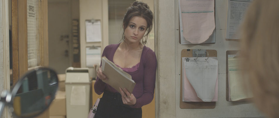
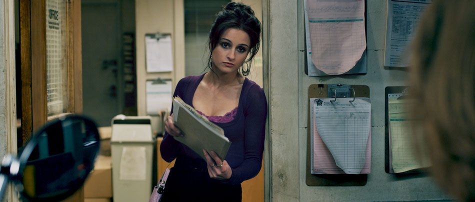
S. Darko

S. Darko was photographed by Marvin V. Rush, ASC, and takes place 7 years after the tragic death of Donnie Darko. The story follows his youngest sister, Samantha, who has run away from home, unable to deal with the loss of her brother. The old adage of “cameras don’t shoot movies, DPs do” certainly rings true with this movie. Shot with an early build of the Red One camera, Marvin’s masterful cinematography adds credibility to this bizarre ‘sequel’ of a cult classic.

For S. Darko, Marvin was working with a constrained budget. This meant that in order to be able to afford such goodies as a techno crane, he needed to make compromises, and this came in the selection of older and cheaper Zeiss Super Speed lenses. Despite having less sophisticated coatings and not being as sharp compared to modern ones, older lenses are finding a new lease of life being paired with new digital cameras. “Resolution is only one aspect of production. If you a photographing a woman then you don’t necessarily want more resolution”, he quips.
Knowing Your Tools

The majority of filming occurred 50 miles west of Salt Lake City, Utah in the late spring of 2008. This is evident in the dramatic mountain ranges and brilliant clouds floating overhead. “Clouds contain a tremendous range of exposure. If you want to capture all of that detail, you have to bring your exposure down and expose for the brightest part of the cloud”, and thus knowing the ‘native’ ASA of the camera is essential. For the Red One Mysterium sensor, almost all DPs I’ve worked with agree on an ASA of 320 for daylight and 200 for tungsten. Understanding the limits of the capture device is essential. “Doing an accurate latitude test is imperative. What are the blackest blacks and the whitest whites”, Marvin asks rhetorically.
This is a cinematographer who knows his tools. When the gorgeous images rolled into the DI suite, I was pleasantly surprised by just how much detail there was in the clouds, but not at the expense of the faces. I felt that Marvin had captured the maximum amount of latitude the camera was capable of. This allowed me to to really isolate and saturate the sky while bringing out the clouds at the same time. A separate qualification on the faces was used to lift them out the shadows.
Americana
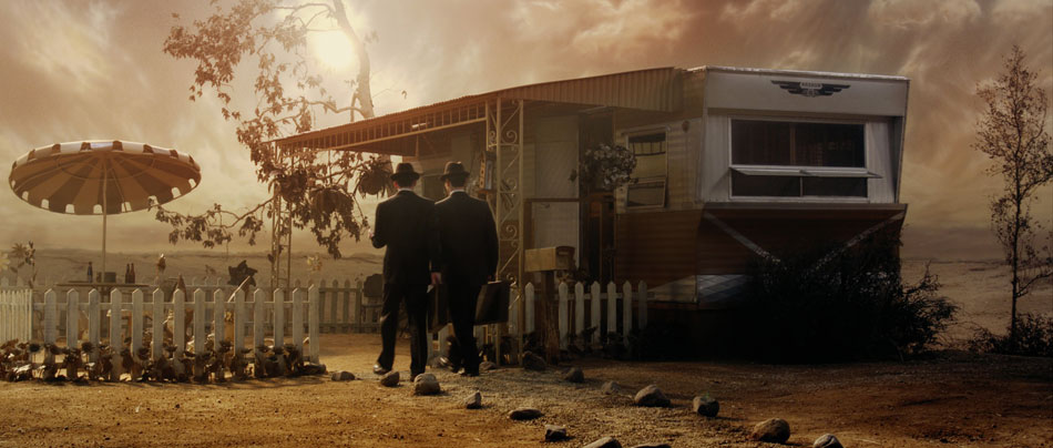
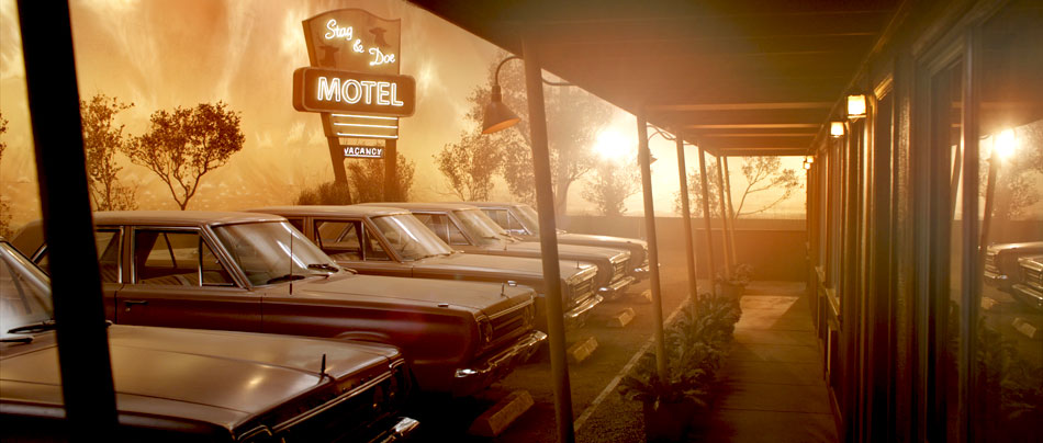
Just as you’d expect with a name like S. Darko, this movie has an oxymoron or two: looming mountain ranges frame rusty graveyards and rinky dinky motels in the middle of nowhere. The Production Design team must have had a hell of a time filling every nook and cranny with the million and one chachkas hanging from the walls. When appropriate, I pushed the colours a little further, made the landscapes a little bolder, and turned those cheap motels a little rustier. There’s a fair amount of folklore strewn throughout this tale, and each scene required a slightly different ‘treatment’ in order to bring out the photography.
The three images below show such a treatment. In the first picture, the RedLog file has the usual low contrast and desaturated look, but the colour separation and strong shadows are still evident. The second picture shows the effects of the LUT and a base grade. Note that the overall temperature of the scene feels cool, and in this instance the RAW file was debayered using 5600K (daylight) and 320ASA. This is how the camera was rated for this scene, and provides a good starting point: the colours feel ‘natural’, with clean blacks/whites and good colour separation. However, this scene takes place much later on in the day, and so I wanted to add a ‘rustier’ tint to it. I did this by adding a good amount of mid brown to the blacks and red to the highlights, but left the mid tones alone; this was to preserve all the subtle blues in the jeans and pamphlets, as well as the greens in the book keeper’s shirt. I finally brought down the shadows and removed some of the red tint from the blacks.


Day-for-Night
In addition to the Red One camera, Marvin used his own Sony EX1 for a very specific reason: time-lapse. The camera’s built-in intervalometer makes up for the fact that it’s a fixed lens camera, producing ‘spectacular’ HD images that cut well with the Red One footage. Marvin shot a time-lapse sequence of a motel in the middle of nowhere during the day with the intention of transitioning the shot into a Day-for-Night during the DI.


Achieving a good Day-for-Night effect is all about good planning. There are certain steps you need to follow in order to get a convincing result.
Usually I start off by bringing down the overall gain and saturation. You can also bring down the lift as well, as long as the blacks don’t get too ‘blocky’. Even though we’re trying to create a night look, we still want to retain the integrity of the image. If you can’t bring down the gain without turning the image into mush then you can pull a luminance key and bring the highlights down by themselves. If I use this approach, I always make sure to use a good amount of softness in the key to avoid any banding.
The next step is to start identifying problematic areas: long shadows indicating a setting sun, bright roads, distracting backgrounds (in this case the rock formations) – all of those need to be treated separately, either by qualifying them or by using custom shapes. Many times I tend to actually bring up the gain on foreground objects, while bringing down the lift and overall density to simulate reflecting moonlight. Sometimes, it also helps to use soft grads to effectively ‘burn off’ distracting areas. In the example above, I have a separate correction on the road, the motel, the cars, the sign and the rocks, as well as a grad on the top part of the frame.
Now with all that sorted, you can finally go in and tint the overall image blue, while further reducing both saturation and gamma. This global adjustment has a unifying effect on all the corrections below it, and is one of the reasons why I wait until this point to tint the image. The other reason is because I want to retain my colour separation as late as possible, retaining the green in the trees, the reds in the sign and the earthen colours of the rocks.
For more S. Darko stills, click here.
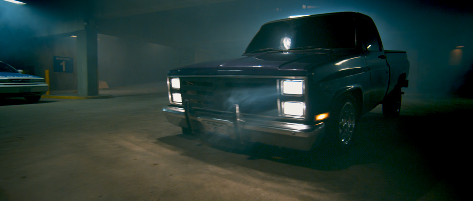
Super Hybrid

Hybrid was my first opportunity to collaborate with John Leonetti, ASC, a great cinematographer and good friend! Looking at the images you’d never guess that half of this feature was shot in almost complete darkness, and with an early build of the Red One camera. John nailed the exposure, and gave us some great images to work with.

Hybrid was shot in the days before the MX upgrade to the Red One camera, a time when every DP was trying to get the most light onto the sensor. The lenses John picked for Hybrid were the Cooke S4s as well as the Angenieux Optimo zooms, both great lenses with very high optical qualities. The camera was rated at ISO 320.
Emergency Lighting
Most of Hybrid takes place in a five-story car park. In the first half of the movie we cut between the various levels, including the office, the mechanics’ workshop and the ramps connecting each level. For these setups John combined different types of lighting: “I mixed kelvins in the practical lighting intentionally to give color separation. We mixed 3200k, incandescent with 5600, daylight and fluorescents which were cool white, blue and green.”
In the second part of the movie, a car crash that takes out the building transformer, emergency lights are triggered, and hence we called this setup ’emergency mode’. John and I decided that as we descended through the levels, the picture would get darker. This required planning, for example knowing how dark we could go on level 2 so that we still had a picture by the time we reached level 5! “You always need somewhere to go,” John would often tell me if he felt we were going too dark.
This setup meant that we ended up grading ‘hero’ shots when John was available, establishing a look for key moments in the story, and then filling in the shots around them when John had left for the day. Using this approach, we knew how dark we should be in each section before committing to grading the entire scene. You always want to use the time with the DP wisely, which is why this technique is quite common with DPs who have a busy schedule.
John is one of those DPs who really gets stuck into a project, colouring his own stills and laying them out to a Pink Floyd soundtrack! The stills were pulls from the original R3D files and coloured onset. He went further than most DPs in that he gave the stills a real punchy, saturated look. After talking about the movie, we definitely felt that we wanted to go for a strong ‘industrial’, gritty look, with rich cyans and blues creeping into the blacks, but not at the expense of the actors’ skin tones. We also wanted to bring out the ‘distressed’ look in the walls, the furniture and the cement floors.
Colour Curves
A strong look doesn’t have to mean an overpowering look devoid of detail; I like to retain the subtleties from the original ‘negative’, and for this type of job I opted to use curves to establish a new ‘base’ instead of using the joyballs. Curves are a very powerful tool but can also be tricky, because unlike the joyballs that are compensating all three primaries at the same time (add red and you take away green/blue at the same time), curves are additive unless you manually compensate. However, this also makes them ideal for making sweeping changes to an image. For example, take the Blue → Blue curve, crash down the black point and you end up with golden blacks, just like that!
In the case of Hybrid, I played mostly with the Red → Red channel, bringing down the black point and then balancing that with the Green → Green channel to push my blacks and mids more towards blue. This is where it pays to know your colour wheel and your additive vs. subtractive way of colouring.
Now with a strongly biased base, anything you build on top will inherit those characteristics. This is when I will switch to the joyballs and master controls and add density and contrast, as well as push the mid tones to a warmer place. This teases apart the picture, giving you that colour separation that keeps the image interesting and ‘real’. I used this approach on most of the movie, except for the darkest scenes where I was trying to conserve as much of the picture as possible!
Dealing with Black

When the majority of your frame is made up of black, there is a tendency to really pull up the gain in an image to bring out anything that constitutes a picture. There are two problems with this: firstly, by pulling the highlights away from the blacks, you are exacerbating the noise level in the blacks, and that’s not a good thing. Secondly, if you push the gain hard enough your skin tones will start to ‘posterize’. Both of these are not good scenarios. What’s else can you do then?
The approach I use is a tiered one. I use the gamma to bring up whatever is visible in the picture up to a comfortable point, ie. before the noise becomes excessive. It’s important to set your pivot points so that the gamma has a minimal effect on your blacks, otherwise you’ll be lifting the noise! Then I’ll use a luminance map to select the brightest areas, and use the gain to pull out any remaining highlights.
It’s important to remember that the goal with these kinds of shots is not to create a perfectly distributed bell-shaped histogram, with lots of body and good highlights. We are merely trying to get a pleasant picture, and as long as the eye catches those highlights and a little bit of mid tone, you should be fine.
You can find more stills of Hybrid here.
