small time storyteller

Latest

Super Hybrid

Hybrid was my first opportunity to collaborate with John Leonetti, ASC, a great cinematographer and good friend! Looking at the images you’d never guess that half of this feature was shot in almost complete darkness, and with an early build of the Red One camera. John nailed the exposure, and gave us some great images to work with.

Super Hybrid by STALLION MEDIA © 2010

Hybrid was shot in the days before the MX upgrade to the Red One camera, a time when every DP was trying to get the most light onto the sensor. The lenses John picked for Hybrid were the Cooke S4s as well as the Angenieux Optimo zooms, both great lenses with very high optical qualities. The camera was rated at ISO 320.
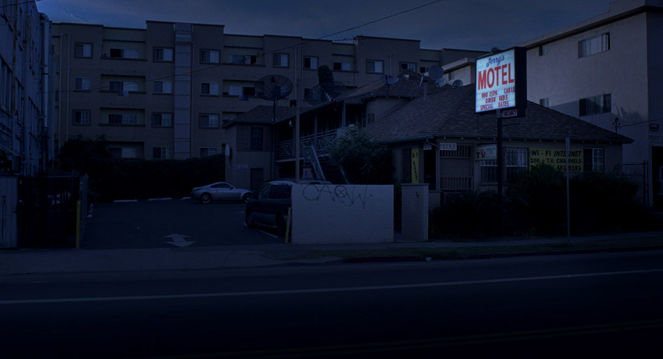
Emergency Lighting

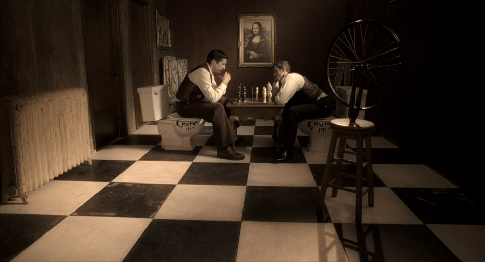
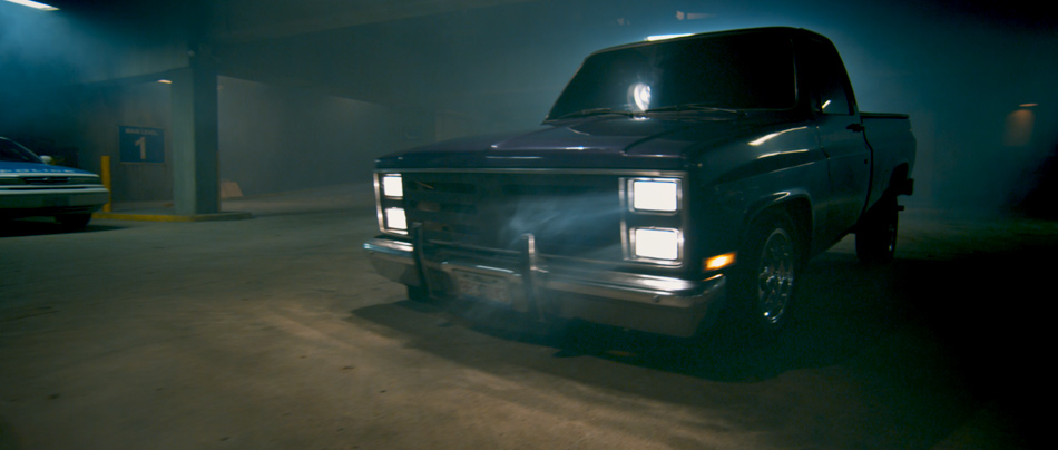
Most of Hybrid takes place in a five-story car park. In the first half of the movie we cut between the various levels, including the office, the mechanics’ workshop and the ramps connecting each level. For these setups John combined different types of lighting: “I mixed kelvins in the practical lighting intentionally to give color separation. We mixed 3200k, incandescent with 5600, daylight and fluorescents which were cool white, blue and green.”

In the second part of the movie, a car crash that takes out the building transformer, emergency lights are triggered, and hence we called this setup ’emergency mode’. John and I decided that as we descended through the levels, the picture would get darker. This required planning, for example knowing how dark we could go on level 2 so that we still had a picture by the time we reached level 5! “You always need somewhere to go,” John would often tell me if he felt we were going too dark.

This setup meant that we ended up grading ‘hero’ shots when John was available, establishing a look for key moments in the story, and then filling in the shots around them when John had left for the day. Using this approach, we knew how dark we should be in each section before committing to grading the entire scene. You always want to use the time with the DP wisely, which is why this technique is quite common with DPs who have a busy schedule.

Debayered Image
Industrial Look

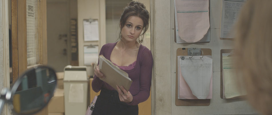
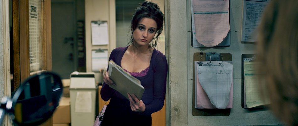
John is one of those DPs who really gets stuck into a project, colouring his own stills and laying them out to a Pink Floyd soundtrack! The stills were pulls from the original R3D files and coloured onset. He went further than most DPs in that he gave the stills a real punchy, saturated look. After talking about the movie, we definitely felt that we wanted to go for a strong ‘industrial’, gritty look, with rich cyans and blues creeping into the blacks, but not at the expense of the actors’ skin tones. We also wanted to bring out the ‘distressed’ look in the walls, the furniture and the cement floors.

Colour Curves

A strong look doesn’t have to mean an overpowering look devoid of detail; I like to retain the subtleties from the original ‘negative’, and for this type of job I opted to use curves to establish a new ‘base’ instead of using the joyballs. Curves are a very powerful tool but can also be tricky, because unlike the joyballs that are compensating all three primaries at the same time (add red and you take away green/blue at the same time), curves are additive unless you manually compensate. However, this also makes them ideal for making sweeping changes to an image. For example, take the Blue → Blue curve, crash down the black point and you end up with golden blacks, just like that!

Emergency Mode: Level 3

In the case of Hybrid, I played mostly with the Red → Red channel, bringing down the black point and then balancing that with the Green → Green channel to push my blacks and mids more towards blue. This is where it pays to know your colour wheel and your additive vs. subtractive way of colouring.

Now with a strongly biased base, anything you build on top will inherit those characteristics. This is when I will switch to the joyballs and master controls and add density and contrast, as well as push the mid tones to a warmer place. This teases apart the picture, giving you that colour separation that keeps the image interesting and ‘real’. I used this approach on most of the movie, except for the darkest scenes where I was trying to conserve as much of the picture as possible!

Dealing with Black

The Darkest moment in the movie

When the majority of your frame is made up of black, there is a tendency to really pull up the gain in an image to bring out anything that constitutes a picture. There are two problems with this: firstly, by pulling the highlights away from the blacks, you are exacerbating the noise level in the blacks, and that’s not a good thing. Secondly, if you push the gain hard enough your skin tones will start to ‘posterize’. Both of these are not good scenarios. What’s else can you do then?

The approach I use is a tiered one. I use the gamma to bring up whatever is visible in the picture up to a comfortable point, ie. before the noise becomes excessive. It’s important to set your pivot points so that the gamma has a minimal effect on your blacks, otherwise you’ll be lifting the noise! Then I’ll use a luminance map to select the brightest areas, and use the gain to pull out any remaining highlights.

It’s important to remember that the goal with these kinds of shots is not to create a perfectly distributed bell-shaped histogram, with lots of body and good highlights. We are merely trying to get a pleasant picture, and as long as the eye catches those highlights and a little bit of mid tone, you should be fine.

You can find more stills of Hybrid here.

Dada

By nature, shorts are made to attract an audience, either for festivals by first time directors launching their careers, or many times because a financier/studio wants to see what the filmmakers are capable of on a smaller scale. This makes shorts the perfect vehicles for experimentation, and this was certainly true for Dada, an absurd story of two brothers obsessed with stealing Marcel Duchamp’s shovel back from their arch nemesis: a greedy, drunken, perverted aristocrat. The story is set in the roaring twenties, with the kind of production design and wardrobe that entails.

Dada © 2008

Director of Photography Francisco Bulgarelli wanted something special, almost fantastical to support the story. The film he kept referencing was Delicatessen, Jean-Pierre Jeanet’s masterpiece with its intense visual style. In light of this, I decided to give this period piece a kind of painterly, tinted look, with a twist: I wanted the pictures to look like those old photographs from the turn of the 20th century that we’re all used to seeing. They always seem so dark, probably because of the slow lenses of the day and the lack of interior light. I wanted the characters to feel like they were being engulfed by darkness!

Log Base
Tinted Look

In the chess scene, I started off with a base grade, playing with contrast and density and making sure that I had good colour separation. Even though sometimes my intentions are to really push an image, I always want to start off from a neutral point as a reference. The next step was creating a luminance key starting with the blacks and going into the mid tones. I really crashed down the saturation and the gamma here, and this is the single most important step for creating that painterly effect. It’s a very different effect to hitting the blacks with the lift and black saturation, and depending on the application, I sometimes use it when creating sepia or tinted looks.

Then I pushed in the tint, in this case desaturated red in the gain, while using my gamma to counter the mid tones. This helped to keep the blacks clean further down, and has a gentler effect than shifting the pedestal. Finally, I used a custom spline in the shape of a bell to create a vignette, and then finished it off by slightly glowing the highlights to simulate the light coming through the top right window. Voila!

In the above setup, I kept the tinted look but took advantage of the direct lighting to flush the skin tones with gold tones. The red curtain in the background was also punctuated but at the same time left to recede in the vignette I created in the top corners. The contrast between the red and the gold is a classic combination, and when I added the deep shadows, the whole picture sprung to life!

Dada was a fun little short to colour time, and a great opportunity to try out some new ideas.

You can catch more stills here, or watch the movie by following this link.

2:13

2:13 is one of those movies that can be hard to watch at times. The easiest way to describe it is Se7en meets Saw, with a visual style to match. It’s no coincidence that the Cinematographer is none other than David Armstrong, ASC, creator of the Saw look and one of the most successful franchises in recent years.

2:13 by ANTHEM PICTURES © 2009

The Film Director, Charles Adelman, was the client for this job. Charles was clear about his intentions: he wanted Hicon, ‘gutsy’ images for all of the violent scenes to contrast with the more toned down investigation parts. Then there were the scenes that needed special attention: flashbacks feature regularly in this movie, and he wanted those to feel dreamy yet ‘creepy’. There was a day for night motel shot in broad daylight that was a challenge, and the final interrogation scene had to feel cold and ominous.

Creepy Flashbacks

I’m not a colour purist in the sense that I’ll use whatever tool is right for the look that I’m trying to achieve. For the dream sequences I wanted something special. One of my favorite FX plugins is called Tinderbox DiffusionFilter, and I’ve often used it to soften the harsh lines you sometimes get when CG is composited over live action.
However, you can also use the numerous plugin controls to define edge thresholds, and subsequently ‘bloom’ those edges to create some very interesting glow effects. This technique creates a different look to the usual approach of blurring the highlights and raising the gain, and pushes the effect into the entire image versus just the highlights. It also doesn’t blow out the highlights.

Interrogation Scene

For the final interrogation scene, Charles wanted a very cool, steely look reminiscent of T2. There wasn’t a hint of coolness in the negative as can be seen from the image below, so I had to push the image quite hard to get it where it needed to be. I started off by adjusting the contrast through my print emulation LUT and working with some HSL curves to move the tones towards a cooler palette. Curves allow you to use a broader brush and thus work more organically, avoiding edge issues that can be a problem when using keys to qualify regions of colour. Then I moved onto finessing; inky blacks, silvery highlights with a cool tint, strong vignetting to make Spivey look like he’s emerging from the blackness of the interrogation room. One thing you want to be careful of when creating a cool look is that your skin tones don’t go completely blue, unless you’re working on the sequel to Avatar! Instead, I brought back some of the original skin tones and blended it with the underlying cool image. I snapped the contrast and let some highlights burn off to simulate the harsh lighting of the room and was finally done!

before…
…And after 8 layers of colour!

As much as I love the immediacy of digital acquired images, there is still a lot to be said about the texture of film and its enormous latitude. You can push the negative in all sorts of weird and wonderful ways and it will always perform: the blacks wont block up and the highlights will rolloff nicely instead of clipping hard. That’s film. This is clearly evident in the day for night image below.

Day-for-Night

When faced with a Day-for-Night scenario, one of the things a colourist needs to determine is whether he can pull it off with just colour, or whether it becomes a VFX shot. To answer this question, you need to know what time of day the cinematographer is aiming for. Anything around midnight is going to need incandescent light sources in windows and other small details, and therefore could be cheaper to do in VFX. However, late afternoon or early morning shots can be pulled off with the clever use of colour and some good old-fashioned layering. I call it ‘compositing with colour’.

The images below show the transformation from a mid afternoon shot to a 4am setup. First, we start off with the Raw Log image. After the print emulation LUT is applied, I do an overall treatment: I bring down the blacks a little, the gamma more and the highlights more still. This is to reduce the overall brightness and contrast of the shot. I then bring the saturation down and add blue to the entire image using printer lights. On a log image, this amounts to an equal distribution of blue across the image. The second image shows us where we are at this point. Even though there is a big difference, the image is flat and not very convincing.

Log + LUT
Intermediate
Final Image

Then I move into specifics. I usually qualify the highlights, bring down the gamma a little but pull up the gain. This helps retain contrast in the bright areas as you bring them down, otherwise the image can start to get muddy. The background buildings are isolated from the rest of the image using carefully placed roto-splines, while the actual motel is given a contrast treatment to separate it from the buildings behind it. Graduated masks are used to pull down the road and the buildings on the right, and then the left side of the sky is brought up a little bit to simulate fading moonlight. Finally, the windows are brought up a little bit and tinted blue to accentuate the moonlight spill.

So far so good, but to really sell the shot, I composited the processed image over the raw image, keyed through the highlights using an HSL keyer to expose the original sign, applied a Sapphire Glow to it and then pulled out a bit of blue while saturating the reds in the neon sign. Done!

For a broader selection of stills from this film, click here.

2:13 was colour timed at Steele VFX in Santa Monica.