2:13
2:13 is one of those movies that can be hard to watch at times. The easiest way to describe it is Se7en meets Saw, with a visual style to match. It’s no coincidence that the Cinematographer is none other than David Armstrong, ASC, creator of the Saw look and one of the most successful franchises in recent years.

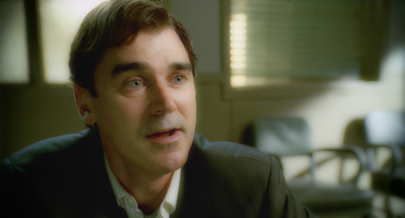
The Film Director, Charles Adelman, was the client for this job. Charles was clear about his intentions: he wanted Hicon, ‘gutsy’ images for all of the violent scenes to contrast with the more toned down investigation parts. Then there were the scenes that needed special attention: flashbacks feature regularly in this movie, and he wanted those to feel dreamy yet ‘creepy’. There was a day for night motel shot in broad daylight that was a challenge, and the final interrogation scene had to feel cold and ominous.
I’m not a colour purist in the sense that I’ll use whatever tool is right for the look that I’m trying to achieve. For the dream sequences I wanted something special. One of my favorite FX plugins is called Tinderbox DiffusionFilter, and I’ve often used it to soften the harsh lines you sometimes get when CG is composited over live action.
However, you can also use the numerous plugin controls to define edge thresholds, and subsequently ‘bloom’ those edges to create some very interesting glow effects. This technique creates a different look to the usual approach of blurring the highlights and raising the gain, and pushes the effect into the entire image versus just the highlights. It also doesn’t blow out the highlights.
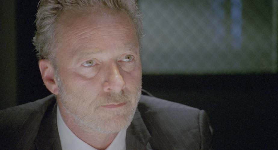
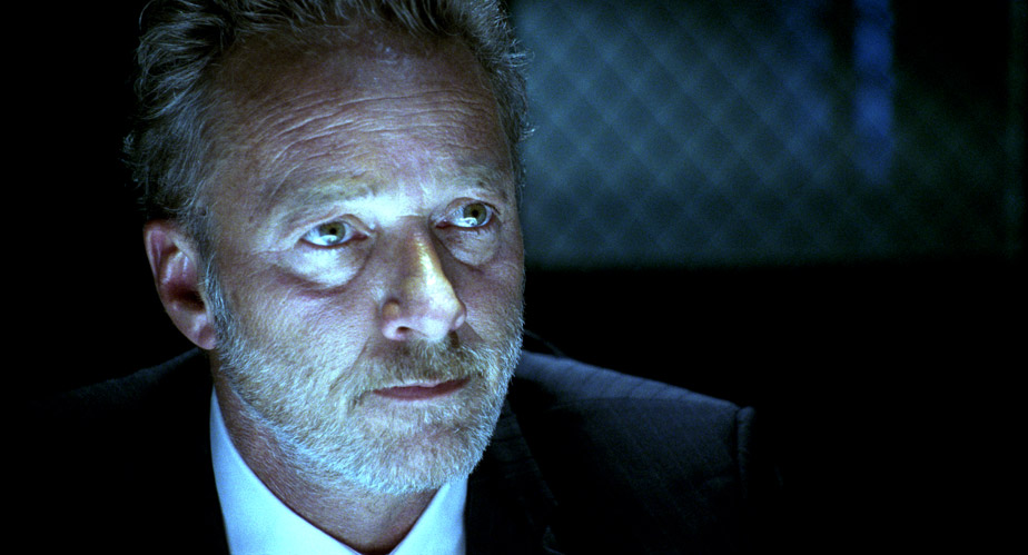
Interrogation Scene
For the final interrogation scene, Charles wanted a very cool, steely look reminiscent of T2. There wasn’t a hint of coolness in the negative as can be seen from the image below, so I had to push the image quite hard to get it where it needed to be. I started off by adjusting the contrast through my print emulation LUT and working with some HSL curves to move the tones towards a cooler palette. Curves allow you to use a broader brush and thus work more organically, avoiding edge issues that can be a problem when using keys to qualify regions of colour. Then I moved onto finessing; inky blacks, silvery highlights with a cool tint, strong vignetting to make Spivey look like he’s emerging from the blackness of the interrogation room. One thing you want to be careful of when creating a cool look is that your skin tones don’t go completely blue, unless you’re working on the sequel to Avatar! Instead, I brought back some of the original skin tones and blended it with the underlying cool image. I snapped the contrast and let some highlights burn off to simulate the harsh lighting of the room and was finally done!
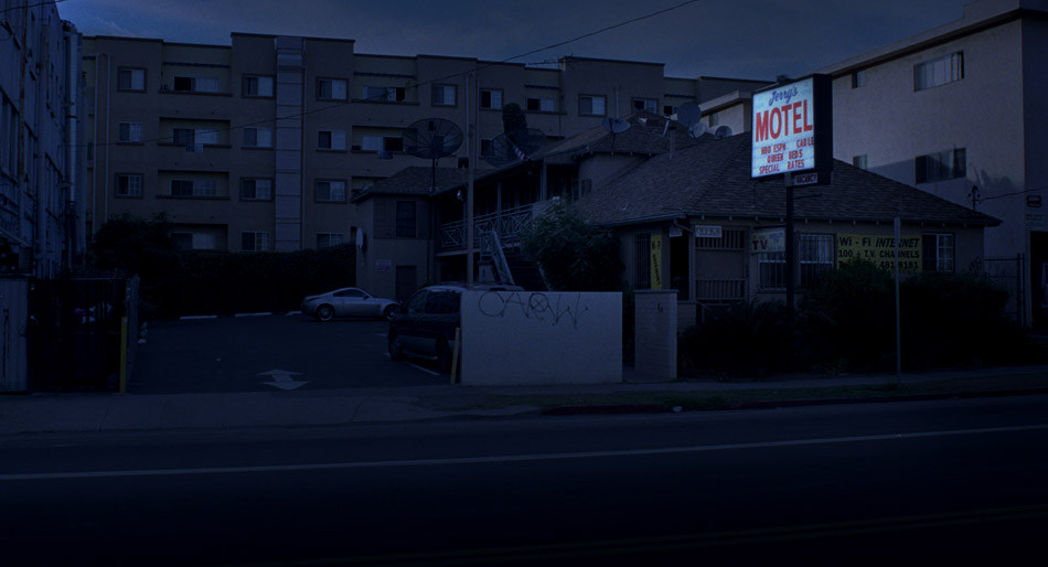
As much as I love the immediacy of digital acquired images, there is still a lot to be said about the texture of film and its enormous latitude. You can push the negative in all sorts of weird and wonderful ways and it will always perform: the blacks wont block up and the highlights will rolloff nicely instead of clipping hard. That’s film. This is clearly evident in the day for night image below.
Day-for-Night
When faced with a Day-for-Night scenario, one of the things a colourist needs to determine is whether he can pull it off with just colour, or whether it becomes a VFX shot. To answer this question, you need to know what time of day the cinematographer is aiming for. Anything around midnight is going to need incandescent light sources in windows and other small details, and therefore could be cheaper to do in VFX. However, late afternoon or early morning shots can be pulled off with the clever use of colour and some good old-fashioned layering. I call it ‘compositing with colour’.
The images below show the transformation from a mid afternoon shot to a 4am setup. First, we start off with the Raw Log image. After the print emulation LUT is applied, I do an overall treatment: I bring down the blacks a little, the gamma more and the highlights more still. This is to reduce the overall brightness and contrast of the shot. I then bring the saturation down and add blue to the entire image using printer lights. On a log image, this amounts to an equal distribution of blue across the image. The second image shows us where we are at this point. Even though there is a big difference, the image is flat and not very convincing.


Then I move into specifics. I usually qualify the highlights, bring down the gamma a little but pull up the gain. This helps retain contrast in the bright areas as you bring them down, otherwise the image can start to get muddy. The background buildings are isolated from the rest of the image using carefully placed roto-splines, while the actual motel is given a contrast treatment to separate it from the buildings behind it. Graduated masks are used to pull down the road and the buildings on the right, and then the left side of the sky is brought up a little bit to simulate fading moonlight. Finally, the windows are brought up a little bit and tinted blue to accentuate the moonlight spill.
So far so good, but to really sell the shot, I composited the processed image over the raw image, keyed through the highlights using an HSL keyer to expose the original sign, applied a Sapphire Glow to it and then pulled out a bit of blue while saturating the reds in the neon sign. Done!
For a broader selection of stills from this film, click here.
2:13 was colour timed at Steele VFX in Santa Monica.

Leave a comment