small time storyteller

Latest

KUDO

Cinematographer Salvador Lleo shoots and directs this latest music video for KUDO. “This is guerilla-style shooting at it’s best – no permits, no lights, no crew!” Lleo jokes. For this one I had to pull out all the stops, charging through a multitude of looks that needed to move with this hip-hop artist’s style.

KUDO in The Studio

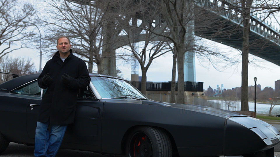
Salvador shot this music video all around Downtown LA – Broadway, bridges, tunnels, the LA river – as well as Hollywood Blvd. He used an upgraded Red One camera with the new MX sensor, combined with a standard set of Zeiss T2.1 lenses. The increased latitude in the blacks was instantly apparent as I started pushing in contrast using S-curves; the blacks remained rich despite being bossed around.

Lotsa Looks

I crafted no less than seven looks for this music video, each covering a different location and mood. We wanted to combine ‘classic’ looks like Hi Con Black & White and Fashion-style photography with a more ‘urban’ approach for Hollywood Blvd, the bridge and tunnel scenes, as well as Poster effects for some sections (see below). Making it all ‘work’ together was a matter of keeping the contrast snappy and the images rich with detail.

Hollywood Boulevard Look

The Hollywood Blvd. look was the most challenging. Initially I used lift and gain to add contrast, and then slightly cooled off the blacks. I picked up the highlights using a luminance key and stretched them almost to clipping point and added some blue. To push in the deep greens and blues into the blacks, I brought down the black point in my red and blue curves. This has the effect of ‘creeping in’ the colour (look in the shadows of the door) vs. oversaturating the image with green/blue.

To give the image some ‘bling’, I did two things: first I applied a soft vignette, rotating the hues at the same time. This was carefully planned, with the blues shifting to rich yellows, creating a warmer outside ring that counter balanced the cooler centre. Then I addded more yellow and saturation to the already golden skin tones and hot highlights, giving me a combination of cool and warm highlights. I call this ‘colour tension’, and this can be quite effective with the right application.

You can see the Befores and Afters in the Gallery.

Poster Effects

A series of freeze frames are used to punctuate this music video. Salvador wanted something special for these. I came up with the idea of turning these frames into graphic-style posters, relying on a tool I unfortunately rarely get a chance to use: Colour Map.

Base Correction
Colour Map Applied
Final Grade

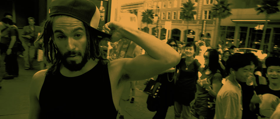
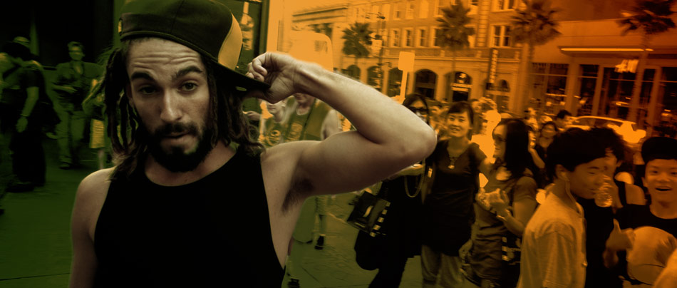
At a basic level, Colour Map allows you to define a gradient in the Pablo Paintbox™ and apply it to an image, replacing the colours in the picture with the hues in the colour map, while retaining the relative luminance values. The effect is extreme, but provides a good starting point for our poster.

Once I had applied the colour map, I then brought back the artist’s skin tones by using an HSL qualifier constrained by a roto-spline. I desaturated the skin tones and pushed a lot of contrast into them. This makes him stand out from the background. To finish it all off, I went back to the Paintbox™ and painted some mattes, which I then used to dodge and burn the corners, creating some variety in the green and orange grads.

The final result shows the ‘poster effect’ I was after, and literally took just a few minutes to create in the colour timing session.

The ‘gas mask’ setup was also fun. Salvador shot this in an open door garage, draping a 20 x 20 unbleached muslin cloth to block out direct sunlight and diffuse KUDO’s edges. For these ‘moving posters’ I cranked up the contrast to whiteout most of the background. I then created a ‘wraparound’ glow effect by qualifying a luminance matte and then growing and blurring the matte, while increasing the gain. Finally, I saturated the blues and used an Unsharp Mask filter with customised settings to create a graphics style look.

KUDO’s Facebook site can be found here:

You can reach Salvador Lleo’s personal website here.

BMW Activates The Future

“What is the future of mobility?”

That is the question BMW poses in its four-part webisode series entitled “Wherever You Want To Go: Four Films About the Future of Mobility”. Influential academics, pioneers, and entrepreneurs stir the imagination with their unique visions of the past, present and future of technology, cities and transportation.

Buzz Aldrin in ACTIVATE THE FUTURE © 2011

The four webisodes are directed by Kurt Mattila. Each episode has a running time of almost 6 mins, and focuses on a particular subject.

Activate The Future was shot on the Canon 5D, a regular in many of todays documentaries. As I have stated before, this lightweight camera offers compelling HD images at an unbeatable price. As the post production tools have improved over the past two years, we have seen the images coming out of this game-changing camera gradually improve. Practically, this means that the bottom end has improved to the point were we are able to capture subtle details without having to expose for the darker areas. You can see this in the image above, where Buzz Aldrin’s suit jacket still has a lot fine detail in the shadows.

Blending Film, VHS & HD

Many times with documentaries, the basic role of the colourist is to ‘even things out’. This is because the material can come from so many different sources: film archives, old TV VHS recordings, and then modern HD video and graphics. Making all of this feel cohesive relies on picking the right approach.

Flying Cars
Driving Into The Future

For all the 1970s flying car infomercials, I was dealing with badly deteriorated VHS tapes, with severe white balance problems, interlacing and sharpness issues. Colour balancing and then sharpening the shots made a dramatic difference. At the same time, I applied subtle blurs to the backgrounds in the graphics and models (above) to blend the surrounding shots better with the stock footage. Most times matching saturation and contrast is enough to bring the images closer.

Each other scene had its own treatment depending on the subject matter, and generally I tried to retain a lot of the mid tone in the image and keep the saturation up. With the right lenses, the Canon 5D already produces some very photographic images, so it was just a matter of giving each scene that little bit extra. For example, in the image below of Mike Musto, Editor-In-Chief of ridelust.com, I decided on a cooler look, a nod towards the steely blue BMW commercials we have all seen over the years. I used printer lights to add an overall blue tint, and then desaturated my blacks a touch. I then qualified the skin tones separately to bring back some of the warmth that I had lost. I finally saturated the blue jeans and the red brakes to give a little extra punch.

Working on mixed format jobs is always a challenge, especially documentaries. Filmmaker’s expectations of what a documentary should look like have changed, and with a job as high a profile as this, the clients were every bit as interested in ‘the look’ as they were in the narrative. As cameras continue to improve, those expectations slowly begin to align with what is possible under a constrained budget, and that’s where the colourist can really make a difference.

You can catch the trailer on YouTube, or check out more stills from the series by visiting out the gallery.

Dragonslayer

The award-winning ‘Dragonslayer’ tells the story of ‘Screech’, a lost kid falling in love in the suburbs of Fullerton, California. “[Dragonslayer] is a portrait of a new generation of kids from the rotting suburbs of inland California, and a celebration of what makes them so unique” comments Tristan Patterson, the director of the documentary.

Dragonslayer was lensed by Eric Koretz, and was my second collaboration with this Cinematographer. The documentary was filmed off and on over the course of a year and a half.

Most times documentaries can pose a challenge for a colourist; the very nature of these narratives usually leads to compromised images, hastily filmed in order to ‘capture the moment’. However, I found that with Dragonslayer, this wasn’t your typical documentary!

Eric used the Canon 5D Mk2 as his primary camera outfitted with a variety of lenses: the Canon L series 24-70 and 70-200 zoom lenses, a must in the run and gun world of docs, as well as an 85 T1.2 for all the low light night stuff. When time permitted, a set of Zeiss ZF 21, 35, 50 and 100 lenses were used. The superior sharpness and optical quality offset the inconvenience of using the primes.
Dragonslayer differs from many other skateboarder movies I’ve seen in that it is shot with a more filmic aesthetic, both in terms of the framing and the pace; crazy wide-angle lenses and crash zooms are out, replaced with a more sensitive approach that feels fresh and less pretentious. The colour choices reflect this, and I worked hard to bring out what was already there, striking a balance between the rawness of the ‘negative’ whilst striving for cohesiveness and uniformity. For a colourist there is something very satisfying about the fact that the audience will never see what the ‘befores and afters’ looked like!

Happy Accidents

The filmmakers also gave Screech a Kodak Zi8 to record his own stunts with. The camera is capable of capturing HD @ 720p, but in one of the those ‘fortunate’ accident moments, Screech flipped the switch to record standard definition!

Instead of fighting the ‘compromised’ images or trying to find a way to ‘fix’ them, I accentuated them further by pumping a lot of saturation in the blues and greens while keeping the skin tones ‘healthy’. One thing I didn’t want to do was stretch the contrast like crazy in order to bury the noise. Instead, I floated the blacks a little and pushed in some grain to hide some of the more offensive noise. The vibrant look goes with Screech’s ‘elevated’ state as he skateboards his way through life. And let’s just say that the use of recreational drugs are rampant in this movie!

Tattoo Parlour

Another scene we had a little fun with was the Tattoo Parlour. We really wanted to accentuate the intricate tattoos on display, as well as the vibrant colours bouncing off the walls and the posters. Compared with the natural and softer palette of the rest of the documentary, we wanted this to feel more grungy, more raw. I achieved this by pushing a good amount of cyan in the blacks, and offsetting the coolness with yellow in the mid tones. I then punched the oranges and the reds but protected the skin tones so that they wouldn’t go nuclear! Saturation can be a powerful tool for storytelling, but you need to know where to use it; without being selective you can end up with an image that looks like it’s made of candy!

‘Dragonslayer’ has been an award magnet ever since it hit the festival scene. It recently won the Best International Documentary at the hotDOCS Canadian International Documentary Festival. That’s in addition to the two awards it won at SXSWGrand Jury Prize For Documentary Feature and Best Cinematography.

To watch the trailer visit the official website here. The filmmakers also have a Facebook page for the movie. Also for more stills from the movie check out the Gallery.

To stay up to date with Eric Koretz’s latest work, visit his website.