small time storyteller

Latest

King Fantastic – “On Q”

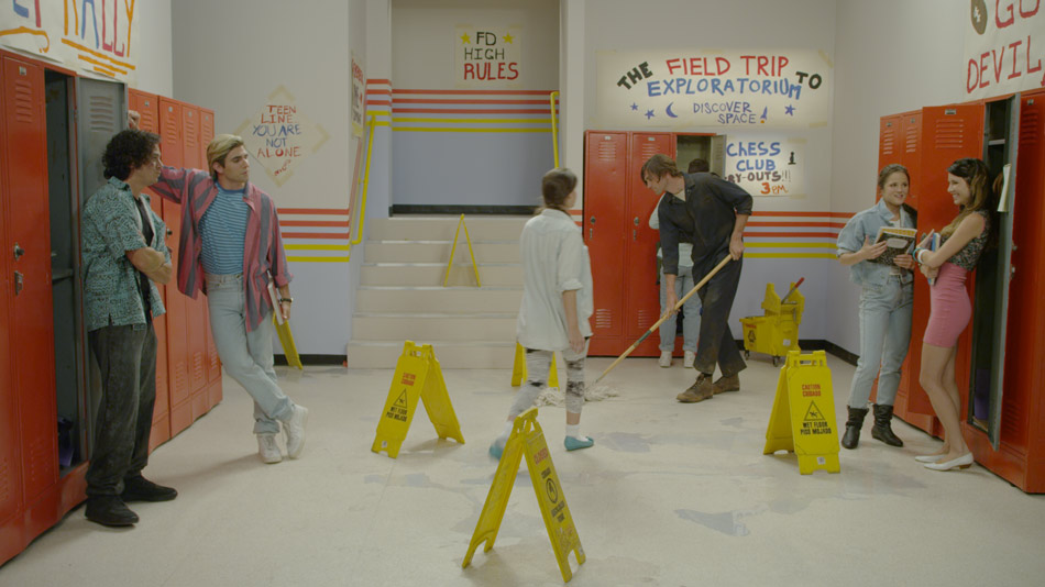
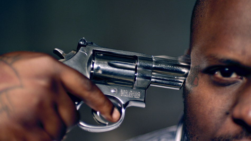
Hip-Hop Artist King Fantastic spins the loaded gun in this daring music video as seen through the eyes of director Randal Kirk II. On Q is the follow-up to “Why? Where? What?”, a video about a maid who vandalizes the home she is tasked with cleaning while dancing to King Fantastic’s song. That video got over a million hits, so the pressure was on for Randal to deliver another blockbuster. He recalls “when I started coming up with the concept, I was fond of all the gun sounds in the audio production of the track and the sexy female vocals.” Randal eventually decided on using famous alternative pin-up models, engaged in a game of Russian strip roulette. “The song glorifies the gangster lifestyle. My message in the video is that you love the lifestyle so much you that you die for it and enjoy every minute!”

“On Q” by KING FANTASTIC © 2011

On Q was shot on a Red One MX camera using Zeiss Super Speed lenses. It is a pairing that a number of DPs I have worked with prefer, as they combine the softer qualities of these older lenses with the ultra-high resolution of modern cameras. Brett Pawlak elaborates: “These days for me it really comes down to the aesthetic of lenses, how they hold flares and how they shoot wide open. That is where you really see the characteristics of the lens and get interesting looks”. That is perhaps the reason why the raw images already had a natural ‘grit’ to them.

While the Red One has become a staple of music videos and commercials due to its affordability, availability and the great images it can expose, Brett also explains that “it is a camera that I know well, and there is no question as to what it can do when pushed. It’s very good at holding saturation, and since Randal was looking for a pop look, I picked the Red as I knew that it would POP”.

Brett’s lighting package consisted of a couple of 4x Kinos, 2′ Kinos and a handful of Par Cans. “Those lights give me the most variety that I know I can work with, on a budget”. He also had some HMIs and regular tungsten units, but prefers open-faced lights over fresnels: “I’d rather start with more light since I can always diffuse and shape with flags. An open-faced 2K is close to the output of a 4K, so when you need light, on a budget, that means a whole lot!”

The Club Looks

Blood Red Look

For the Club Scene, Randal really wanted something special. He and Brett had spent some time studying a similar scene in the film “Black Swan” and concluded that those colour changes were being achieved in post – “we lit [the scene] with one solid gel colour.  I decided to light the club up blood-red. It wasn’t until we transcoded the footage and Brett played with the colour and achieved a rough black light colour by pulling out the red.” This gave Randal the confidence that the look they wanted could be achieved in post. Despite this, Randal still pushed for some in-camera effects, such as placing a prism over the lens to distort the image. From there the images were treated by Chad Simcox, the editor and motion graphics artist, augmenting the camera effects with a custom filter similar to a kaleidoscope effect.

This became the starting point for the four looks I would go on to create, the most interesting of which was my ‘Neon Look’. As we started to push the colours, this ended up being Randal’s favorite look in the entire video!

I started out by setting my contrast level, with my blacks pretty rich to play against the saturated colours I was planning on creating. The second step was the interesting one, which basically added a ton of blue to the highlights and a good amount to the mid tone. This skewed the already present red towards a magenta tone, creating some interesting interactions between the original red and the added blue.

Raw Image
Neon Look

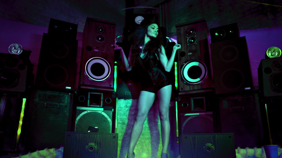
Now, with a new ‘electric’ base, I picked a broad range of reds/magentas as the inputs colours and boosted the saturation by over 300%. This made the cooler foreground stand out against the much warmer ‘background’. The next step was a technique that I use from time to time: ‘phased vignettes’. This is the name I give to a vignette which has had it’s hue (phase) rotated. I pulled the red background almost back to my manufactured blue and darkened it. An additional layer of colour boosting the saturation really made the colours pop, much to Randal’s satisfaction!

Glamorizing Violence

Randal was clear with his crew from the start: “I wanted the Russian roulette scene to feel like a room that Dexter would make, but with showy lighting to glamorize the violence.” That location ended up being a grimy dark dungeon of a warehouse in downtown Los Angeles. The desire to beautify the violence went as far as the instructions he gave to JusticeFX, the guys doing the VFX. Randal jokes “these kids are incredible. I told them I wanted realistic violence while making it sexy. That’s a hard task to do. These guys really nailed it though!”

For me, it was about creating colour tension, which is something I have written about before. I wanted the warehouse to feel cooler, so I pushed a ton of blue across the board while pulling down hard on the blacks. The saturation in the blue created an almost electric look, while the deep blacks gave the feel that the performers were coming out of the shadows.

Colour Tension

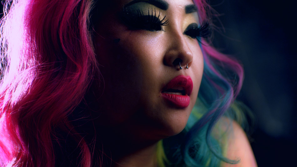
From there onwards I treated it like a ‘beauty’ video, focussing on soft, healthy skin tones for the models, creating natural glows around the highlights in their faces and hair, while bringing out the detail in the intricate tattoos they were each adorned with. The juxtaposition between the cool environment and warm and inviting faces creates drama, which is what this music video is all about.

On Q was intended to be a viral video created to promote the brand. Because of the graphic and violent content, it would never air on TV, but Randal is not particularly concerned since he designed it to live on Vimeo. Brett broadly agrees: “If the only version that exists lives on the internet, then that is where it belongs.” This train of thought is not necessarily consigned to just music videos, as our industry shifts from a broadcast-style way of distributing content to niche-casting, delivered either by streaming platforms like Netflix or Hulu, or directly from the web itself through sites such as YouTube and Vimeo.

You can check out the final music video on Vimeo and more stunning visuals by visiting the Gallery.

For more work from the creative team, please visit their respective websites: Randal KirkBrett Pawlak and Chad Simcox.

Miles Fisher – “New Romance”

Miles Fisher rounds up his “Final Destination 5” co-stars for his pop single “New Romance”, paying homage to the 90s TV classic “Saved by the Bell”, complete with death-inducing falling lockers and razor-sharp flying records! Directed by Dave Green and shot by Benji Bakshi, the music video spoof is part of Warner Bros. online viral marketing campaign for the movie.

“New Romance” by MILES FISHER © 2011

Shot in a single day at Red Studios in Hollywood, it seems appropriate that the camera of choice was the Red One MX, combined with a Cooke Varatol 18-100 zoom lens. This was a single day shoot, and although Dave storyboarded the entire music video, the cast and crew had to move fast to get all the coverage. Zooms are essential in this respect, and came in handy when also pulling off those cheesy zooms!

For lighting, Benji did a great job of lighting the set to look like a 90s sitcom. He used 20 4K supersoft lights, 5 6K spacelights, and relied on Source 4 Leikos for accent. “We built our own grid and rigged all the lighting to an Expression 2 dimmer board for control and practical dimming gags. We prelit all 3 sets so we could meet our schedule”. A few supersofts on stands to move around for fill lights rounded up the lighting package.

Bubble-Gum Look

For New Romance, Benji wanted the images to have a real poppy, bubble-gum look, which in my world translates to bright, saturated colours with warm and healthy skin tones. The debayered image (see below) provided a good starting point, with a rich palette and plenty of fill light to help replicate that classic sitcom look Benji was after. I was happy when I looked at the images and didn’t see any clipping – not a given considering the huge range of exposure between the off white walls, chequered floor and everything in between!

Debayered Image
Final Grade

I started off with a simple base grade, using master controls and the joyballs to establish some cleans blacks and highlights. This got rid of some of the green residue I could see creeping into the highlights and the mid tones. From there on it was all about finessing; using a nifty tool called Revolver I was able to quickly qualify up to 10 colours and boost their saturation, swing the hue and generally lower the brightness to bring out the richness in the primaries. Generally with a look like this I prefer to blast the reds, greens, blues and purples, being a little more careful with the reds and yellows, which is where the skin tones sit.

The ability to key back to any colour layer is very important, especially to recover skin tones, shadows and highlights. For this music video I ended up creating different layers to treat each element separately. This was essential for achieving warm but realistic skin tones, as well as for pulling back the clipped walls and floor, a by-product of my attempt to keep the image bright and cheerful. I’m a firm believer of simplicity, but sometimes the simplest looks end up being the toughest to achieve. Having that kind of flexibility gives you a lot of flexibility.

You can check out more stills in the Gallery.

To see more examples of Benji’s work, visit his website.

World Of Tanks

Roaring across scorched deserts and rumbling across war-torn city streets comes a trailer for the MMO; World Of Tanks. This two minute trailer took director Steven Ilous across the Atlantic to Imagination Studios, where 60 artists worked for 60 days to create this CG extravaganza. The result – a photorealistic trailer for the game that holds the Guinness World Record for the “Most Players Online Simultaneously on one MMO Server”.

World Of Tanks by WARGAMING.NET © 2011

This was my second collaboration with Steven, and a return back to the world of pure CGI, with its own set of challenges. The raw images that Steven brought back with him had a real energy to them, but as great as they looked, Steven was wise enough to know that clean renderered images are simply the beginning of the process, not the end.

Since this was Steven’s first time directing tanks, he needed to rely on certain tricks to convey a sense of scale. Steven; “To prevent consumer confusion, we couldn’t use humans! We tried to offset that by incorporating human artifacts that would subconsciously establish a familiar sense of scale”. You can see this clearly in the shot of a baby doll being crushed by a tank. “I wasn’t quite sure how I would go about applying real world choices to these massive, cumbersome machines. They have a tendency to miniaturize the sets.”

The good news is that colour can help a great deal in this situation. For example, by reducing the contrast and focus on foreground objects, you can kill their volume, and thus reduce the effects of miniaturization. This is one of the tricks we also use in stereoscopic photography and conversion, and it’s amazing how these two simple adjustments can skew the monocular depth cues enough to create a false sense of scale and perspective. We used this technique on the sand dunes in the desert scenes, as well as certain shots in the streets of Berlin.

War-Torn Berlin

To recreate the final days of the allies charging through the streets of Berlin, Steven went into incredible detail: he called a photographer friend in Berlin and asked him to take pictures of the cobblestones as a reference for these scenes. He worked very closely with the Wargaming.net team, who were incredibly knowledgeable and helpful. Ultimately this attention to detail paid off in the colour session, because the images we were starting with had subtle details and realistic textures.

Original Render
Primary Grade
Final Composite

For most Berlin shots, I used contrast and density to establish a base grade, which instantly revealed a magenta tint in most shots. Pushing green into the blacks and mid tones helped, but also reduced the intensity of the flames, which I didn’t want. To fix this, I created a secondary correction for the flames, dialing back some of the original warmth. Even with this addition though, the flames felt anaemic.

At this point we started experimenting with blending modes. Just like with Photoshop or any other compositing application, the Quantel Pablo allows you to freely combine the colour tools with paint and compositing, and that includes blending modes. We composited the colour corrected shot over itself and then played with modes like Screen and Overlay. Screen worked particularly well, bringing out the flames nicely. However, I wanted the effect to spare the shadows, so I used a simple luminance key and opacity slider to ‘mix in’ just the right amount of vibrance and contrast.

This is one thing I love about working with a system that allows you to ‘composite with colour’: what would normally take many layers of colour to achieve on a pure colour grading system can simply be achieved using a blending mode and an opacity slider in the Pablo!

Tanks with presence

Diffusion vs. Sharpening

Many times with CG there is a requirement to use diffusion filters to even out some of the sharpness you get with certain renderers. However, for World Of Tanks we wanted to retain a lot of the sharpness for the tanks themselves. The answer was an unusual approach: we diffused many of the shots using some light grain, before colouring them and finally selectively sharpening them to bring back some of the ‘crispness’. The effect has an almost documentary-like feel to it, and works particularly well with the exteriors.

The bridge above shows this effect. The diffusion combines nicely with all the particle FX, adding to the overcast and dull sky. Where there is contrast though, the ‘unsharp mask’ filter brings out the detail, giving the tanks a real presence and overall a more modern look to the piece.

You can check out more stunning visuals by visiting the Gallery.

For more examples of Steven’s work, visit his website by following this link.