La Nostalgia del Sr. Alambre

This is one of the prettiest pieces that I’ve ever worked on! Animator extraordinaire Jonathan Ostos Yaber combines stop motion animation with CG and matte paintings to bring to life the story of a Puppet Artist who chases his dream all the way to the big city, leaving behind what he loves for what he desires most.

There is a specific discipline when working with images that are already both vibrant and exceptional, quite often the case with stop motion and CG. The very richness of the images can also be the problem, and focussing the attention of the audience becomes the main task. For Sr. Alambre, I used many soft vignettes to create some ‘spot lighting’, and also blurs the foreground and the edges in some shots to simulate shallower depth of field.

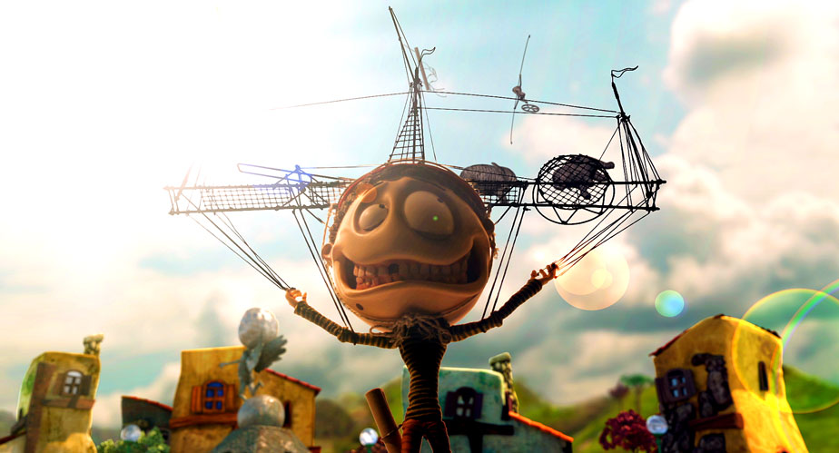
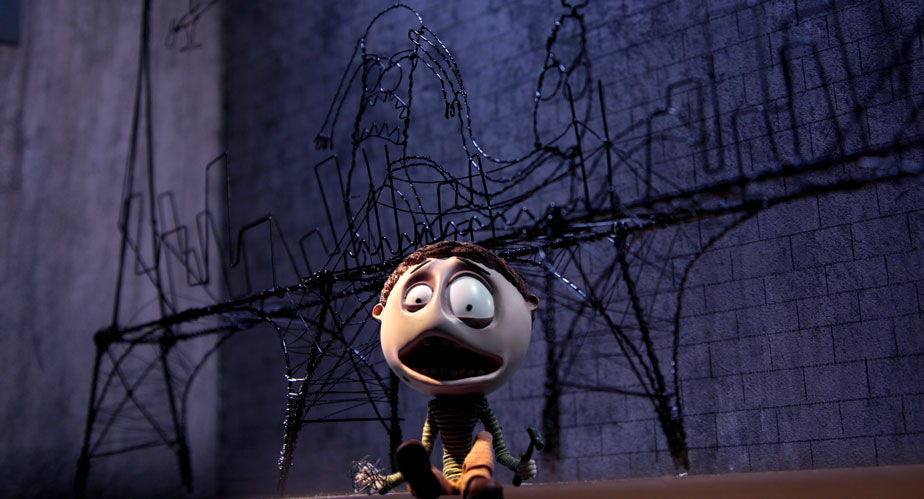
As beautiful as these three images were to begin with, they all had their challenges. The first one felt flat and looked like a night scene lit up by a tungsten moon! I simulated some mixed lighting by pushing some blue in the shadows around the characters, but kept their skin tones warm to indicate the light reflecting off the canvas. Some soft vignetting also helps focus the eye. The second image is much more surreal, and therefore I augmented much of the pastel colours with some saturation in the mid tones while retaining cleaner highlights. The third image is all about drama, and shows an example of selective blurring to simulate a shallower depth of field. I also isolated Sr. Alambre using some qualifiers to lift him from the background, and snapped the contrast to create an almost Hi Con look.
Sr. Alambre is one of those shorts that’s a real labour of love. The thought and effort that’s gone into it is evident, and the story is relatable to any artist who’s struggling to make it big. It’s been an Official Selection in so many festivals the filmmakers have lost count!
Check out the gallery for more stills from the movie, or watch this festival darling in its entirety on Vimeo.
Dada

By nature, shorts are made to attract an audience, either for festivals by first time directors launching their careers, or many times because a financier/studio wants to see what the filmmakers are capable of on a smaller scale. This makes shorts the perfect vehicles for experimentation, and this was certainly true for Dada, an absurd story of two brothers obsessed with stealing Marcel Duchamp’s shovel back from their arch nemesis: a greedy, drunken, perverted aristocrat. The story is set in the roaring twenties, with the kind of production design and wardrobe that entails.
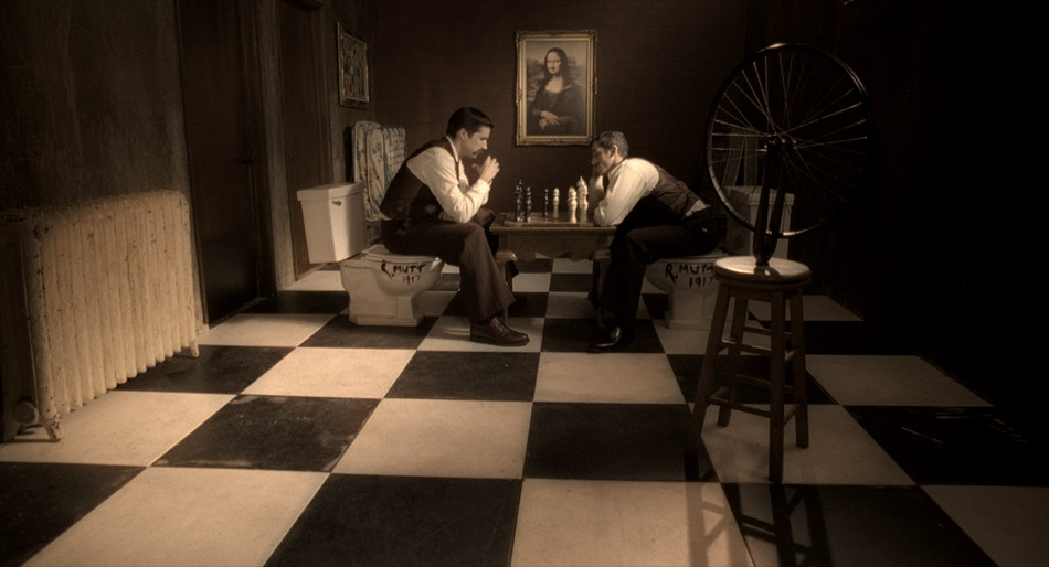
Director of Photography Francisco Bulgarelli wanted something special, almost fantastical to support the story. The film he kept referencing was Delicatessen, Jean-Pierre Jeanet’s masterpiece with its intense visual style. In light of this, I decided to give this period piece a kind of painterly, tinted look, with a twist: I wanted the pictures to look like those old photographs from the turn of the 20th century that we’re all used to seeing. They always seem so dark, probably because of the slow lenses of the day and the lack of interior light. I wanted the characters to feel like they were being engulfed by darkness!


In the chess scene, I started off with a base grade, playing with contrast and density and making sure that I had good colour separation. Even though sometimes my intentions are to really push an image, I always want to start off from a neutral point as a reference. The next step was creating a luminance key starting with the blacks and going into the mid tones. I really crashed down the saturation and the gamma here, and this is the single most important step for creating that painterly effect. It’s a very different effect to hitting the blacks with the lift and black saturation, and depending on the application, I sometimes use it when creating sepia or tinted looks.
Then I pushed in the tint, in this case desaturated red in the gain, while using my gamma to counter the mid tones. This helped to keep the blacks clean further down, and has a gentler effect than shifting the pedestal. Finally, I used a custom spline in the shape of a bell to create a vignette, and then finished it off by slightly glowing the highlights to simulate the light coming through the top right window. Voila!

In the above setup, I kept the tinted look but took advantage of the direct lighting to flush the skin tones with gold tones. The red curtain in the background was also punctuated but at the same time left to recede in the vignette I created in the top corners. The contrast between the red and the gold is a classic combination, and when I added the deep shadows, the whole picture sprung to life!
Dada was a fun little short to colour time, and a great opportunity to try out some new ideas.
You can catch more stills here, or watch the movie by following this link.
