small time storyteller

Latest

Do It

Do It is a short directed by Steve Petersen, Co-founder and Creative Director at Big Machine Design. This was Steve’s first foray into the medium of filmmaking, and an attempt to prove that he could tell a story in a format longer than the 30 second TV spots he has mastered over the years.

Do It by BIG MACHINE DESIGN © 2009

The story is about Bernie, a tormented pharmacy clerk who has delusions of putting society right by killing the current ineffective mayor and replacing him with another. Tormented by his demons and his inability to act, Bernie’s’ vivid fantasies get him into trouble more than once, and prove to him that ultimately the only way to fix the problem is to come up with a plan and just Do It!

Contrasting Looks

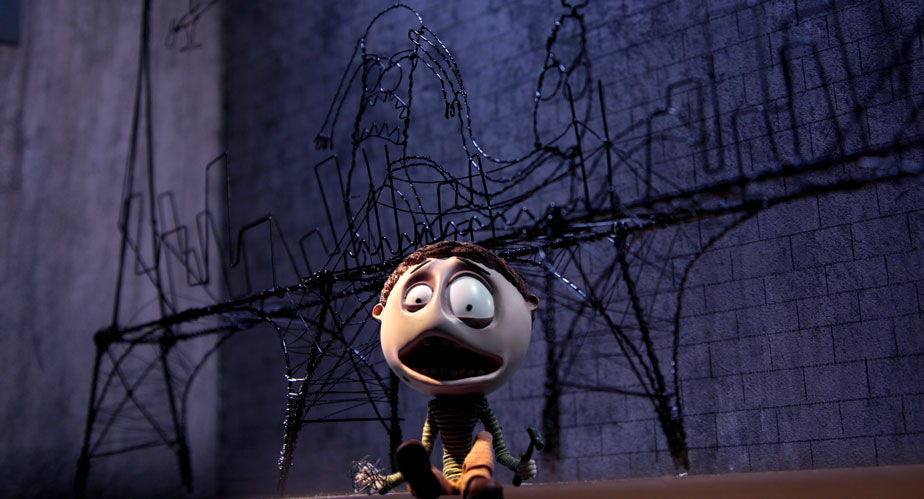
Coming from the graphic design world, Steve is a very visual director, and for Do It he incorporated many graphic elements into his movie: graffiti splattering across the walls as Bernie wanders the streets at night, depicting his inner thoughts, as well as hand drawn title cards that break up each act. Steve also wanted this ‘superhero comic style’ to be present in all the live action sequences. For example, Bernie tries to overcome his loneliness and low self-esteem by fantasizing about being superhuman. In this altered state he becomes the hero, beating up the bad guys and saving the day. When he comes down from his ‘high’, we are back in his dreary world. Steve wanted to match the framing and the pace of each scene with recognisable colour cues to signify the state Bernie was in, augmenting the intense graphical style.

The challenge was to balance the intense look Steve wanted with some ‘breather’ scenes that would give the audience time to reset their eyes! If everything is super intense all the time, the effect quickly wears off. Luckily, the story provided opportunities for a more mellow palette in some scenes, particularly the ones where Bernie is going about his drab and mediocre life.

Bernie’s Dreary Existence

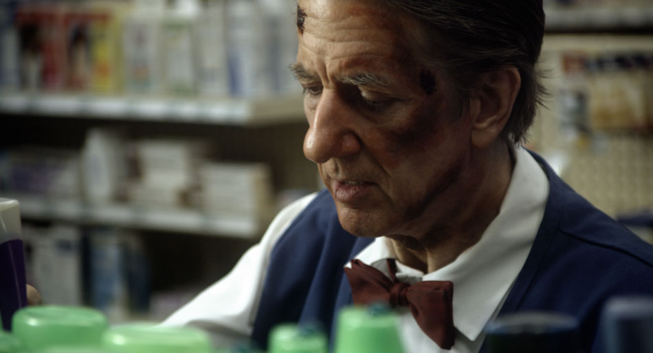
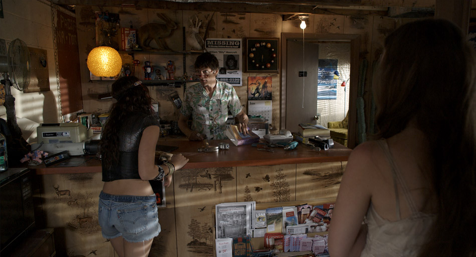
For all the pharmacy scenes, I decided to use a muted and cooler palette. I started off by balancing out the blacks and highlights, and then dialing down the saturation by 20%, which is a substantial amount on a well exposed image. I also added a slight blue tint to the mid tones. This gave me a good base and starting point.

All the bottles on the shelves and Bernie’s blue uniform still felt very vivid, so I qualified both the blues and greens and brought those down separately. I left the reds where they were because I didn’t want to desaturate the skin tones further.

To give the image a little bit of ‘snap’, I used a luminance key to select the highlights and then brought up the gain, which added contrast to Bernie’s face. I also let the highlights burn off a little, pulling the eye further away from Bernie’s blue uniform that still felt a little pronounced. Bringing the saturation down further would have made it look monochromatic.

Heightened Reality

For the images below, which I fondly referred to as the ‘Abbey Road’ setup, I started off by stretching the image to the point where my brightest areas (car on the right) were clipping. When I’m going for a high contrast look, I usually try to either crush the blacks or blow out the highlights, rarely doing both. This avoids the much dreaded ‘video look’. I then warmed up the highlights, knowing that I’d get red ‘contamination’ in the sky, but I would take care of that later on. For my blacks I went more towards green; the combination of red highlights and green blacks pushes orange into the mid tones, picking up the warmth in the buildings and the tarmac.

RedLog + LUT
Heightened Reality

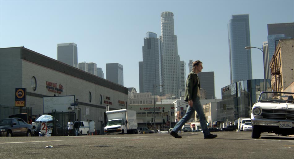
Then I treated all the primaries separately, blasting saturation in the blues and to a lesser extent the greens, while reducing the saturation in a narrow band of reds. This gave me rich red highlights from my base correction, without the excessive tint in the skin tones. I then burned off the corners with a strong vignette, while qualifying the sky inside of the shape and boosting the gain a little. This created a halo effect coming from behind the skyscrapers in the background. I also then took out the red I had introduced in my base correction.

Finally I did an overall grade, pulling the highlights and mid tones towards a cooler palette, and again boosting overall saturation. I almost always do a grade on top of all my other corrections, largely because this has the effect of rolling all the colours into one unified look.

You can visit the Do It gallery by using the following link.

S. Darko

S. Darko was photographed by Marvin V. Rush, ASC, and takes place 7 years after the tragic death of Donnie Darko. The story follows his youngest sister, Samantha, who has run away from home, unable to deal with the loss of her brother. The old adage of “cameras don’t shoot movies, DPs do” certainly rings true with this movie. Shot with an early build of the Red One camera, Marvin’s masterful cinematography adds credibility to this bizarre ‘sequel’ of a cult classic.

S. Darko by SILVER NITRATE © 2009

For S. Darko, Marvin was working with a constrained budget. This meant that in order to be able to afford such goodies as a techno crane, he needed to make compromises, and this came in the selection of older and cheaper Zeiss Super Speed lenses. Despite having less sophisticated coatings and not being as sharp compared to modern ones, older lenses are finding a new lease of life being paired with new digital cameras. “Resolution is only one aspect of production. If you a photographing a woman then you don’t necessarily want more resolution”, he quips.

Knowing Your Tools

The majority of filming occurred 50 miles west of Salt Lake City, Utah in the late spring of 2008. This is evident in the dramatic mountain ranges and brilliant clouds floating overhead. “Clouds contain a tremendous range of exposure. If you want to capture all of that detail, you have to bring your exposure down and expose for the brightest part of the cloud”, and thus knowing the ‘native’ ASA of the camera is essential. For the Red One Mysterium sensor, almost all DPs I’ve worked with agree on an ASA of 320 for daylight and 200 for tungsten. Understanding the limits of the capture device is essential. “Doing an accurate latitude test is imperative. What are the blackest blacks and the whitest whites”, Marvin asks rhetorically.

This is a cinematographer who knows his tools. When the gorgeous images rolled into the DI suite, I was pleasantly surprised by just how much detail there was in the clouds, but not at the expense of the faces. I felt that Marvin had captured the maximum amount of latitude the camera was capable of. This allowed me to to really isolate and saturate the sky while bringing out the clouds at the same time. A separate qualification on the faces was used to lift them out the shadows.

Americana

Just as you’d expect with a name like S. Darko, this movie has an oxymoron or two: looming mountain ranges frame rusty graveyards and rinky dinky motels in the middle of nowhere. The Production Design team must have had a hell of a time filling every nook and cranny with the million and one chachkas hanging from the walls. When appropriate, I pushed the colours a little further, made the landscapes a little bolder, and turned those cheap motels a little rustier. There’s a fair amount of folklore strewn throughout this tale, and each scene required a slightly different ‘treatment’ in order to bring out the photography.

The three images below show such a treatment. In the first picture, the RedLog file has the usual low contrast and desaturated look, but the colour separation and strong shadows are still evident. The second picture shows the effects of the LUT and a base grade. Note that the overall temperature of the scene feels cool, and in this instance the RAW file was debayered using 5600K (daylight) and 320ASA. This is how the camera was rated for this scene, and provides a good starting point: the colours feel ‘natural’, with clean blacks/whites and good colour separation. However, this scene takes place much later on in the day, and so I wanted to add a ‘rustier’ tint to it. I did this by adding a good amount of mid brown to the blacks and red to the highlights, but left the mid tones alone; this was to preserve all the subtle blues in the jeans and pamphlets, as well as the greens in the book keeper’s shirt. I finally brought down the shadows and removed some of the red tint from the blacks.

RedLog file
Base Grade + LUT
Final Grade

Day-for-Night

In addition to the Red One camera, Marvin used his own Sony EX1 for a very specific reason: time-lapse. The camera’s built-in intervalometer makes up for the fact that it’s a fixed lens camera, producing ‘spectacular’ HD images that cut well with the Red One footage. Marvin shot a time-lapse sequence of a motel in the middle of nowhere during the day with the intention of transitioning the shot into a Day-for-Night during the DI.

The blazing sun…
…turns to soft moonlight

Achieving a good Day-for-Night effect is all about good planning. There are certain steps you need to follow in order to get a convincing result.

Usually I start off by bringing down the overall gain and saturation. You can also bring down the lift as well, as long as the blacks don’t get too ‘blocky’. Even though we’re trying to create a night look, we still want to retain the integrity of the image. If you can’t bring down the gain without turning the image into mush then you can pull a luminance key and bring the highlights down by themselves. If I use this approach, I always make sure to use a good amount of softness in the key to avoid any banding.

The next step is to start identifying problematic areas: long shadows indicating a setting sun, bright roads, distracting backgrounds (in this case the rock formations) – all of those need to be treated separately, either by qualifying them or by using custom shapes. Many times I tend to actually bring up the gain on foreground objects, while bringing down the lift and overall density to simulate reflecting moonlight. Sometimes, it also helps to use soft grads to effectively ‘burn off’ distracting areas. In the example above, I have a separate correction on the road, the motel, the cars, the sign and the rocks, as well as a grad on the top part of the frame.

Now with all that sorted, you can finally go in and tint the overall image blue, while further reducing both saturation and gamma. This global adjustment has a unifying effect on all the corrections below it, and is one of the reasons why I wait until this point to tint the image. The other reason is because I want to retain my colour separation as late as possible, retaining the green in the trees, the reds in the sign and the earthen colours of the rocks.

For more S. Darko stills, click here.

La Nostalgia del Sr. Alambre

This is one of the prettiest pieces that I’ve ever worked on! Animator extraordinaire Jonathan Ostos Yaber combines stop motion animation with CG and matte paintings to bring to life the story of a Puppet Artist who chases his dream all the way to the big city, leaving behind what he loves for what he desires most.

Sr. Alambre by Jonathan Ostos Yaber © 2009

There is a specific discipline when working with images that are already both vibrant and exceptional, quite often the case with stop motion and CG. The very richness of the images can also be the problem, and focussing the attention of the audience becomes the main task. For Sr. Alambre, I used many soft vignettes to create some ‘spot lighting’, and also blurs the foreground and the edges in some shots to simulate shallower depth of field.

Mixed Lighting
Surreal Moment
Tragic End

As beautiful as these three images were to begin with, they all had their challenges. The first one felt flat and looked like a night scene lit up by a tungsten moon! I simulated some mixed lighting by pushing some blue in the shadows around the characters, but kept their skin tones warm to indicate the light reflecting off the canvas. Some soft vignetting also helps focus the eye. The second image is much more surreal, and therefore I augmented much of the pastel colours with some saturation in the mid tones while retaining cleaner highlights. The third image is all about drama, and shows an example of selective blurring to simulate a shallower depth of field. I also isolated Sr. Alambre using some qualifiers to lift him from the background, and snapped the contrast to create an almost Hi Con look.

Sr. Alambre is one of those shorts that’s a real labour of love. The thought and effort that’s gone into it is evident, and the story is relatable to any artist who’s struggling to make it big. It’s been an Official Selection in so many festivals the filmmakers have lost count!

Check out the gallery for more stills from the movie, or watch this festival darling in its entirety on Vimeo.