Never Hike Alone

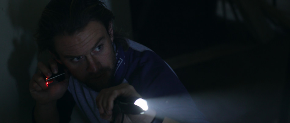
In Never Hike Alone, director Vincent DiSanti dances on the fringes of the biggest horror franchise of all time, Friday the 13th. In this fan movie, we follow Kyle McLeod (Andrew Leighty), an adventure blogger on a mission to find the infamous camping grounds of Crystal Lake. Throughout the movie he documents his progress with his action camera, the entries of which become progressively grimmer, as his survival skills are put to the extreme test in a game of cat and mouse with the camp’s resident serial killer, Jason Voorhees.
The video diary style plays well to a younger audience brought up on Facebook Live and a ‘found footage’ approach to filmmaking popularized by another long running franchise, Paranormal Activity. At the same time there is plenty of meat for lifelong fans to sink their teeth into. Pun not intended!
From the sweeping camera angles to the locations to the design – Never Hike Alone screams of production values typically associated with a studio picture, not an Indie crafted together using blood, sweat and little help from Kickstarter. The result is a movie that adds to the horror lore of Friday the 13th, albeit in an ‘unofficial’ capacity.
The Hidden Location
Like any independent filmmaker knows, one of the hardest things to cheat on a project like this is the design. For a major studio picture, you have the funds and the means to build almost anything you can imagine, either practically or virtually. With Indies, you’re down to whatever you can put together on a shoestring budget, or, for the more resourceful filmmaker, what you can find.
Through a passing conversation with a couple Vince had been working with during the original trailer, they casually mentioned an abandoned camp up the road, College Camp, and whether he’d be shooting there. What followed was something akin to a real-life sleuth investigation that had Vince superimposing a phone image over a paper map, in search of the location equivalent to the holy grail. “I began zooming in and scanning a satellite view of the forest where I eventually found one of the buildings tucked between a grouping of trees. From there I traced a path that seemed like a road leading all the way back to the highway.”
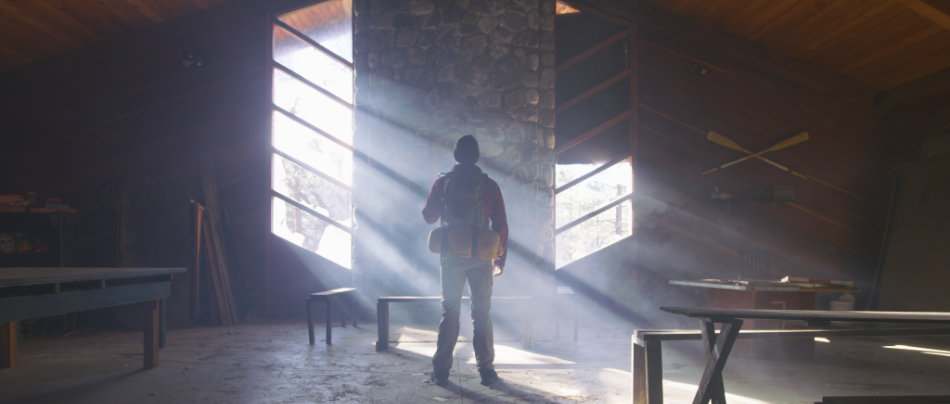
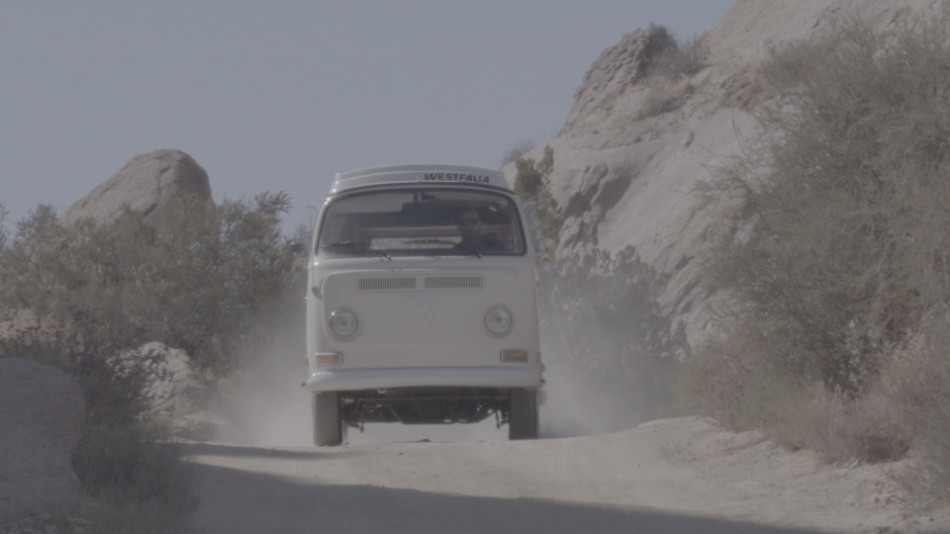
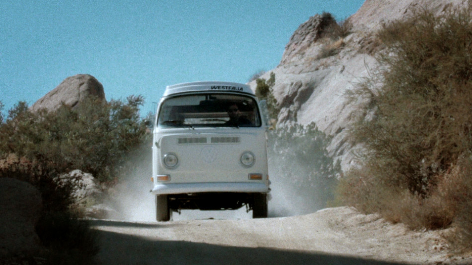
That path led him to College Camp; “from that moment, we knew we had struck gold”. The abandoned camp – with its cavernous main cabin hall, creepy attic and countless rooms and buildings – would fatefully become Camp Crystal Lake in Never Hike Alone, allowing Vince to expand the scope of the story he wanted to tell.
Toys of the Trade
As someone who’s graded a fair share of Indies, I’m used to dealing with cameras of all shapes and sizes. Whether it’s due to budgetary constraints, coverage needs over a compressed timescale, or just the desire to eek the best picture possible out of the most unlikely of cameras, Indie filmmakers have always pushed the boundaries in this area.
At the start of Never Hike Alone, the primary narrative camera was the Sony A7sii. This seemed like the best DSLR choice at the time, producing the most filmic images, but production is rarely just about the final result: “Its major downfall was that it was a difficult camera to rig as it required several accessories that never seemed to work together simultaneously. On top of that, the rig had trouble keeping up with the physical demands of the fight scenes and slowed us down a ton on set”, DiSanti recalls.
CAMERAS USED:
- Red Epic 8K
- Varicam 35
- Sony FS7
- Sony A7sii
- DJI Phantom 3 Professional
- (x2) Go Pro Hero 4 Blacks
ZEISS ZF LENSES:
- 25mm f/2.0
- 35mm f/1.4
- 50mm f/1.4
- 85mm f/1.4
But as luck would have it, cameraman Evan Butka, who’d been renting Vince his beautiful Zeiss lenses for the movie, became enamored with the project. He soon jumped onboard, bringing along his Red Epic 8K camera. “Shooting with the Red made life so much easier from a technical standpoint and of course gave us beautiful 8K images that would give us much more leeway in post.”
In another twist of kindness, Evan introduced Vince to Ben Meredith, another cameraman who would step in when Evan wasn’t available. And what do cameramen have? Cameras – this time a Varicam 35, ideal for low light situations; “We relied on the Varicam to capture a lot of our night and early morning scenes. Overall that camera is a workhorse that never let us down or gave us any issues.”
Finally, to round things off, Co-DP JD Martz brought with him his personal Sony FS7, which ended up becoming the B camera for the majority of the production. “It was great for guerrilla shooting when the main production cameras were not available. Most of the scene of Kyle running from camp with Jason giving chase was shot with that camera.”
Of Lin & Log
Working with many different cameras doesn’t have to be a nightmare; if all the material has a video gamma-style transfer curve (like Rec709), you can create a base by dialing out any differences using a primary grade, upon which you apply your Looks and other tweaks such as sharpness. This was my approach when matching the DJI Phantom shots with the Sony cameras throughout the extreme hiking scenes, as well as the night showdown between Kyle and Jason. For the ‘video diary’ footage though, the intention was to retain a visual difference between the punchy, ultra-sharp Go Pro material, and the more filmic narrative pictures from the Red Epic. As such, I kept the former bright and vivid and let any corrections ride in most instances, even if it meant blowing out highlights. However, for the latter I kept the contrast in check more than I normally would to create a softer look.


The real challenge arose when Log and Lin material were intercut. This happens throughout the movie, especially during the fight and chase scenes. In these instances it is important to consider the final deliverable. “Our original goal was to release the film for free on YouTube, however, we found ourselves with a unique opportunity to premiere at the Telluride Horror Show”, DiSanti informed us when we started testing the pipeline. With that information, I could make some decisions.
This setup for me meant a 709 world (sRGB on most computer screens), and thus I chose to convert my log images to video gamma using a base correction (versus using an output LUT). Since the conversion was ‘live’, I could always dig beneath it to retrieve any blown or crushed details, while reaping the benefits of a ‘homogenised’ timeline, allowing me to easily apply Looks between the Lin and Log material. Since the pictures were pretty much bang on in terms of exposure, we had minimal problems.
For the Red material specifically, the manufacturer gives you a plethora of choices for just about any occasion. Unlike other jobs where I typically choose to work in RedLogFilm space, for Never Hike Alone I chose RedColor2 / RedGamma2 for my colourspace and transfer curve. This gave me rich images with a slightly flatter look, perfect to use as a starting point.
Lake Gloom
Out of the can, the images looked beautiful, but lacked uniformity. This was purely down to the varying capabilities of the cameras, as well as the intercutting style between the video diary shots and the narrative footage. Before considering any specific Look treatments, it was essential to balance everything out.
From a colour perspective, I wanted to create a distinction between the time when Kyle is looking for Camp Crystal Lake, when he actually finds it, when Jason finds him, to the time the terror unfolds in and around the camp and beyond.
For the exteriors near the camp, there was a lot of warmth in the environment; this is Southern California in mid Spring, where any green ground cover can quickly dry out under the bright sun, casting russets and golden hues across the underbrush. Those colours impart a warm and inviting feel, the opposite of the foreboding Look I was aiming for.

To set that tone, I modified a Look I’d used for a past job – June Gloom. Basically, you start by selecting three colours – yellow, red and magenta – from the black point all the way up to the mid tone, with a good deal of feathering into the highlights. Those ranges are then desaturated, leaving behind the cooler colours, but also some life in the skin tones. On first glance the image appears to cool, but it’s misleading: the absence of warmth is what tricks your eye into thinking the image is much bluer. The modification I made to this Look was to further saturate the greens and blues left behind, as well as any warm colours left behind that were key story points.
The result is a creepy, ominous look that repels any inherent warmth in the image (like the fried underbrush). It’s especially effective on cloudier days, which are devoid of brighter highlights.
It’s in the Sky!
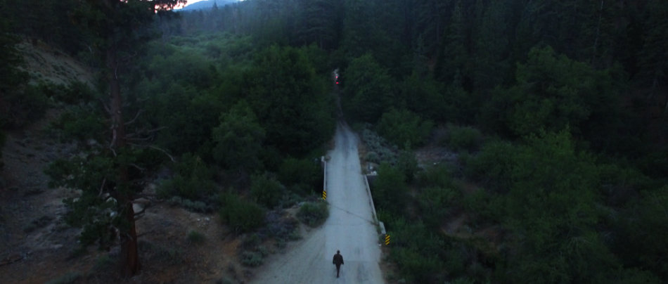
Nothing makes a picture look like a million dollars more than well timed aerial footage, and this movie has plenty of it. “I purchased a [DJI Phantom 3 Professional] and learned to fly it on my own for the production.” DiSanti states. And watching the movie – from the breathtaking reveal over the lake to the epic crane as the ambulance races off leaving Jason in its wake – I would say he didn’t do a half bad job: “The hardest shot in the entire film was definitely the shot where Kyle runs across the log while the camera dollies forward over a large creek.” So if the director thing doesn’t work out Vince, then he can always be a drone operator!
Never Hike Alone premiered at Telluride Horror Show to glowing reviews as well as simultaneously launching online on YouTube. The movie continues to rein in hundreds of thousands of horror fans from around the world, and has ticked up to an astonishing 900K+ views on YouTube. Lifelong fans of the Friday the 13th series haven’t felt this good about a Friday film since the 80s. “What seemed like a pipe dream early on in the process ended up being an experience I will certainly never forget”, DiSanti concludes.
The scope of the project is probably captured best by Greg Emerson, the online editor for the project: “Never Hike Alone was a full throttle 4K DI editorial job: six different camera types with variations in resolution, aspect ratio and bit depth. Digital FX, paint outs, variable re-speeds, reticule overlays…the show had everything that a $100M, big studio film would.”
You can check out the movie on YouTube, as well as more stills by going to the Never Hike Alone Gallery.
For my full interview with director Vincent DiSanti, check out The Search for Camp Crystal Lake.

Summer Of Love

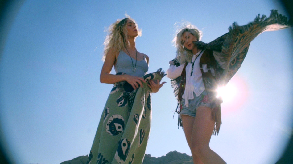
Somewhere near Vasquez Rocks (and a ditch in Santa Clarita), a camper van unleashes a group of revelers chasing a Summer Of Love. At least that’s the vibe the director, Randal Kirk II, was hoping to capture with his latest branded piece for Night:Shift Goods. With hippie-styled attire and rainbow flares galore, as well as a guest appearance from legendary folk musician and photographer Henry Diltz, I’d say he got pretty close!
Old School meets Instagram
Summer of Love is intended to showcase Night:Shift’s home goods collection, marketed towards a diehard Doors fan base. The inspiration for the piece came from watching classic Doors music videos with Director of Photography Gordon Yould; “We felt that an ‘on the road’ vibe would capture the spirit of Jim Morison”, Randal recounts.
But in a world where everything old is new again, that fan base is shifting, and so the intent was to capture a new audience of young fans, without alienating the old timers. “I wanted to cast someone influential in a younger demo that would fit this vibe, so I cast psychedelic skater Richie Jackson, a very popular skater in the social age.”
And Richie can skate, though that’s not wholly why Randal cast him for this piece: “Richie has broken away from the core skate scene and is more of an artist using his board as a brush.” That statement dovetails one of the surreal sequences, with Richie bouncing on and off a bed draped in Doors merchandise. It’s a stunt he’s performed on Instagram to an audience that Night:Shift, through Randal, is trying to reach.
This is familiar territory for Randal, who has made his living doing promos for skate and urban clothing companies, viral videos on YouTube and Vine, and genre-bending music videos.
Throw me a camera!

Gordon had some strong opinions on recreating that 60s magic: “when I heard it was for Doors material I instantly blurted out FILM! WE NEED TO SHOOT FILM!” Luckily Randal and Gordon were on the same page: “We were tired of seeing retro pieces shot digitally with Super 8 and flare effects added in post. They’re missing the textures and magic that can be done on film. Digital flare and digital film burns can work, if you augment it with actual film.”
And to get that carefree, organic texture, Gordon decided to go experimental with the film that he used; “I had some old 400′ short ends in a shoebox and figured let’s load ‘em up and see what happens! In the end the film came out a little grainy but kinda cool considering over 10 years of heat and cold fluctuations”
Alongside the two film cameras – an S16 Aaton XTR with an Angenieux 12-240mm Zoom and a S8 Canon 814 – digital coverage came courtesy of two Sony cameras – an FS7 and a A7Sii DSLR. The subject matter and the need to capture tons of B roll necessitated two small crews shooting guerilla-style. It’s debatable which material ended up the A roll and which the B roll!
Putting it all together
When it came to the cut, the services of Andrew Polich were employed, who wrangled all the footage from the various sources. The final piece moves at a good clip, but the combination of slo-mos and longer takes ensure the audience doesn’t feel they’re on a roller coaster. It’s a fine balance, and it works really well! Randal is very vocal on the style: “It might be my ADD but I’ve always cut at a fast pace. The biggest challenge filmmakers face today is keeping the audience tuned in so they won’t grab their phones and check out something else.”
There are a lot of ‘retro’ techniques on display here – sprockets and keycode punching through the left side of the frame, blending modes used to simulate double exposures, and a cute use of multicam.
Enter the Monkey
The combination of that much material from so many different sources created certain challenges, the most glaring of which was the presence of grain, or none at all. To make the visuals flow and feel like one cohesive piece, I had one of two choices: ‘clean up’ the film a little to make it match the Sony material better, or add some texture and grit to the digital pictures to make them look more like film. As a self-confessed film fanatic (my still camera of choice is a Canon AE-1 Program), there was only ever going to be one way. For this I turned to my grain plugin of choice, Film Convert by Rubber Monkey.

Most film grain plugins I’ve used do a great job in three areas: grain profile, correct tone, and controls for applying the grain as a positive or negative effect. Let’s call these the ‘post controls’ of a film grain plugin. However, because there’s no regard for the Transfer Curve or Colourspace of the underlying footage, the applied grain often ends up looking ‘superficial’. The lack of ‘transfer controls’ means the contrast and density of the resulting image is typically off, and you need to tweak the image further to get it to the right place before you can even evaluate the grain. Cumbersome, yes, but this is what we’ve had to deal with for many years.

Film Convert takes a different approach; it gives you direct access to the ‘transfer controls’, allowing you to select both the camera and the profile used during the shoot. Once selected, the film grain is applied, and the default results are great! You can use additional controls – de facto 3-way joyballs, lift/gamma/gain and saturation – to tweak the final result. Film Convert comes in both stand-alone edition (the image above), as well as a plugin for your colour corrector or editor. I use both versions for my work.
Vintage techniques
With the grain out of the way and the blend effects in place, it was time to have some fun. In my mind, The Doors is all about experimentation, freedom and psychedelia. I wanted the grade to reflect this.
I already had a head start with some of the tricks Andrew pulled in the edit, namely using film burns and black & white flips as transitions. I loved the organic effect this had on the footage, and worked towards accentuating that.
For my base grade, I didn’t want the piece to have too much contrast, which would have given it a more ‘modern’ look. So I floated the blacks more than I usually would, and kept the mid tones and highlights a little lighter. The flash frames and film edges gave me the contrast I wanted without having to put that in the image. I also let the exposure ride, sometimes wildly, between shots, which felt more natural to me.
To push the psychedelic look, I relied on key shots and techniques; skies were given a teal, slightly electric treatment, which added to the ethereal quality. Offsetting the teal shadows and skies, I added some warm vignettes; this gives the picture a ‘faded’ look, like old photographs, and also creates colour tension between the warmth and the cooler shadows and skies.
The rainbow flares, which were achieved using practical prism and rainbow filters, were pushed further. Also with the flares, because I was pushing the mids and the highlights just that little bit more, magenta started to wring around the hot spots. Normally I would correct this, but I kept it in, sometimes even accentuating it, to get some interesting, almost cross-processed looks.

Finally for the skate scene, it was gold all the way! This was largely a matter of embracing all the variance in the native photography: the expired super 16mm film, the erratic grain, the layered film and digital effects, all as the sun was setting. I pushed tons more warmth into the shadows, flatlined the blue gain for the digital shots to get that strong yellow highlight, and added more contrast compared to the previous scenes, which gave me those strong, iconic silhouettes.
I think for this job, Gordon sums it up just perfectly: “on the day it was amazing to film with our talents and the legendary [Henry] Diltz. Randal is always great to work with and his visions are a blast to bring to life through cinematography.”
You can check out more stills by going to the Summer Of Love Gallery.
